德貿
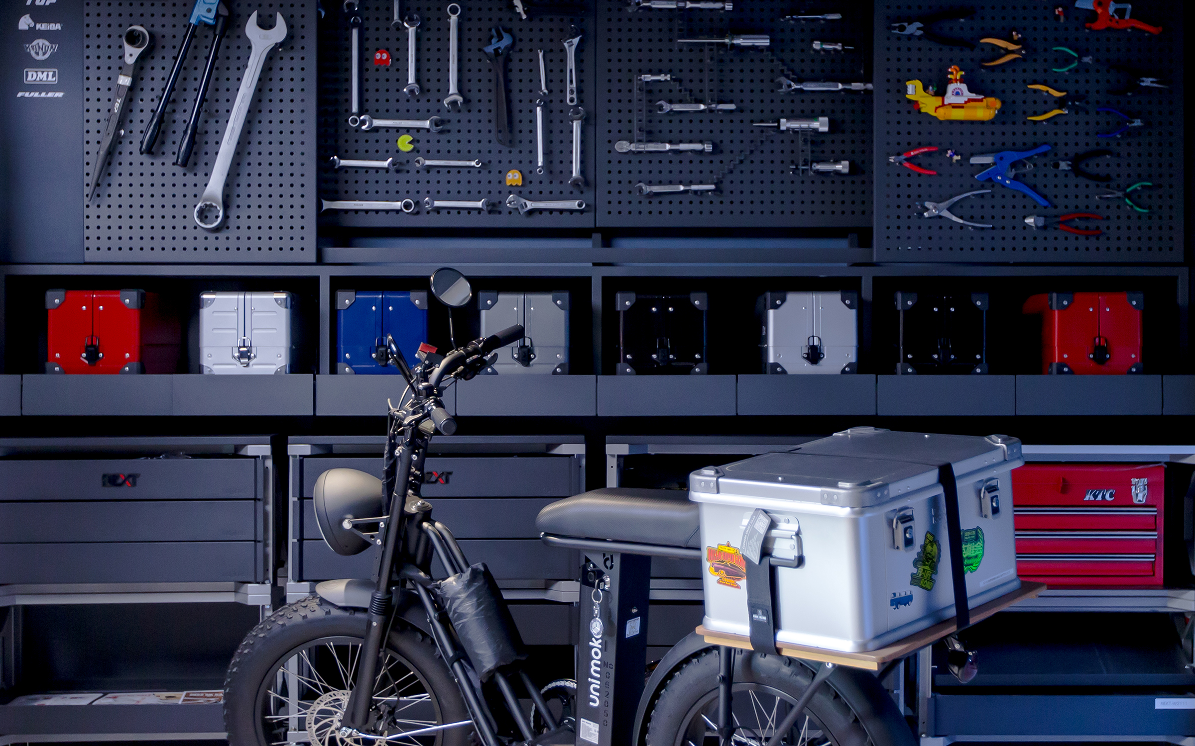
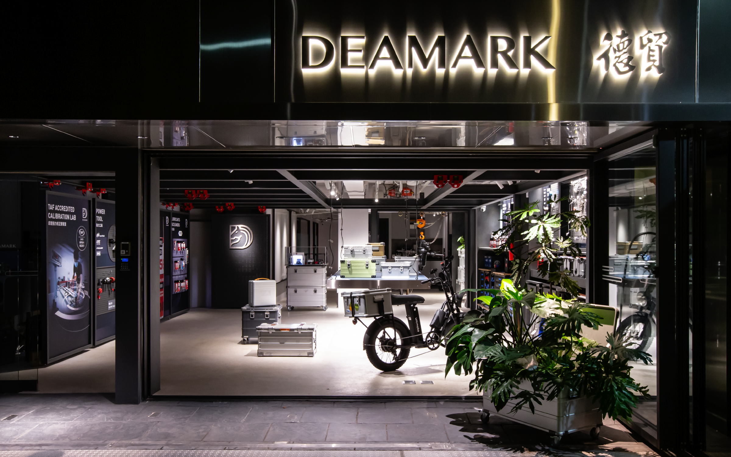
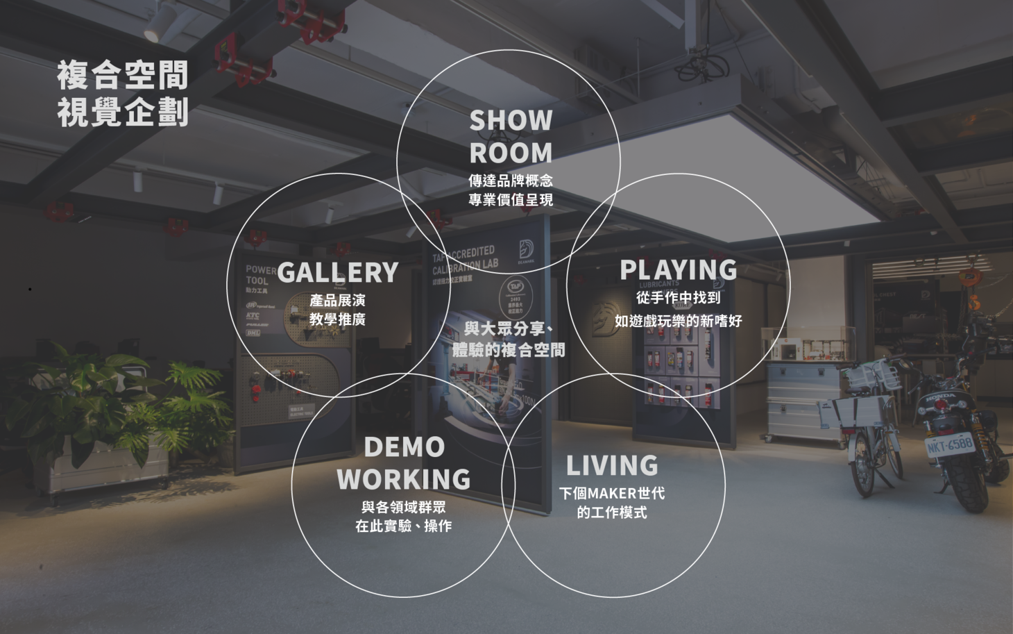
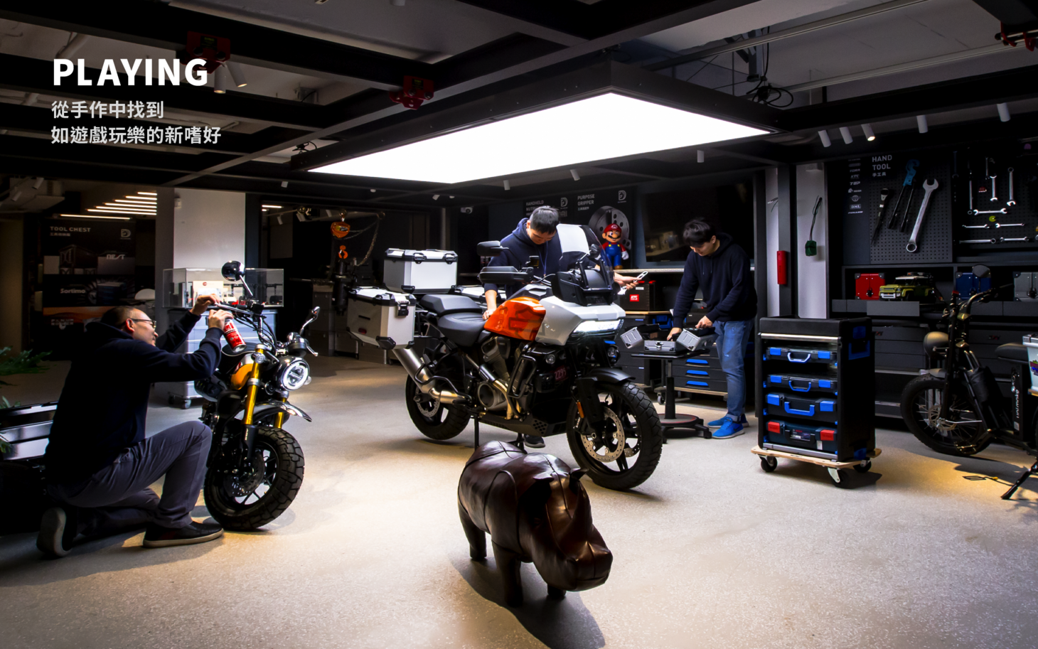
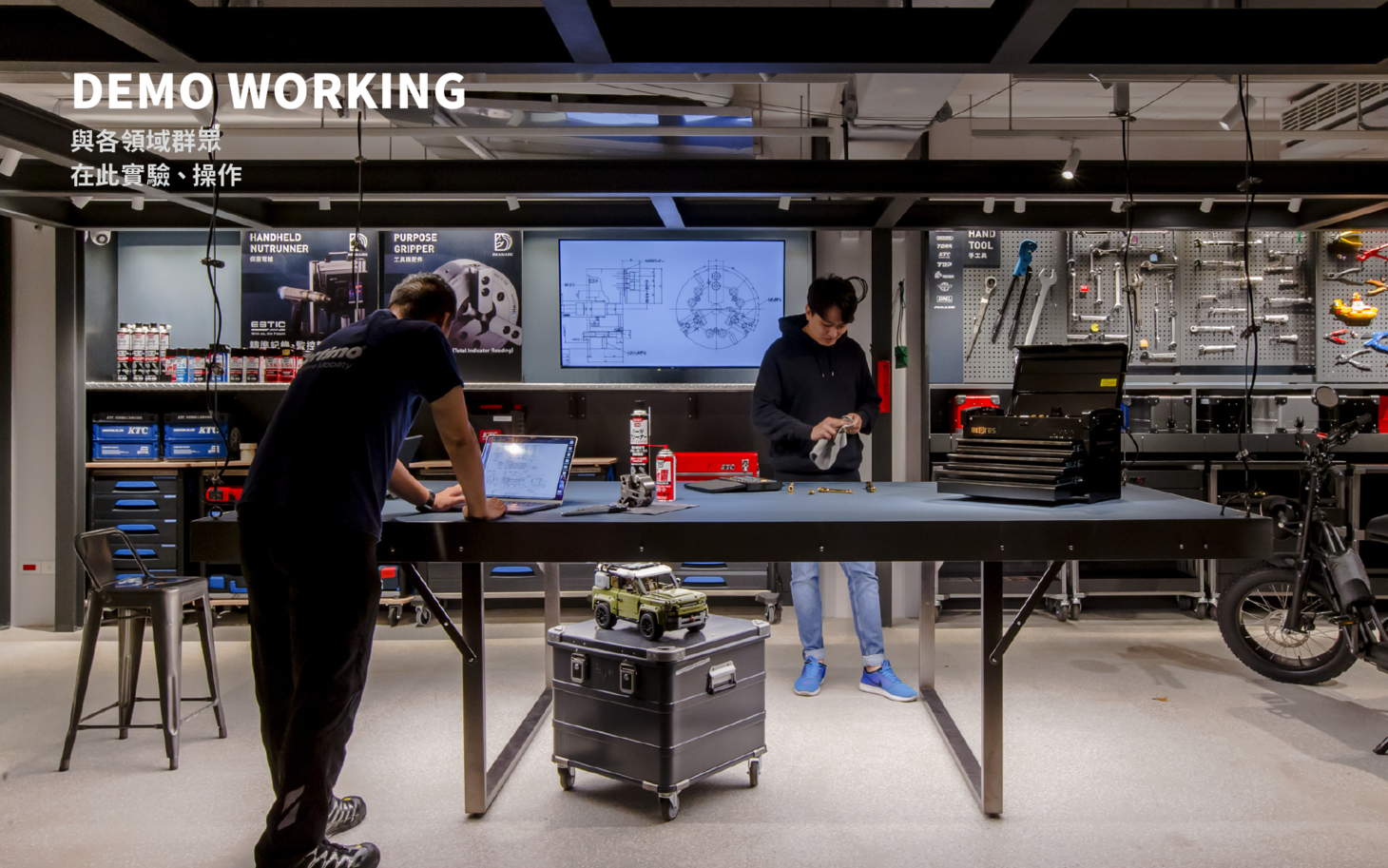
Where it all began – a multi-space for the next three decades Deamark is committed to creating new values where it all began. The rebranding project marks the beginning of the second 30 years for the company. From space, experience, identification design to visual composition, all elements are integrated to update Deamark’s communication strategies and to build its image as a professional agency. The key is to establish the new generation’s business and communication models – it’s an agency that creates human connections with professional tools. Designed to accommodate various scenarios and needs, the space built with H beams is where visitors can try out the most advanced tools, events and exhibitions can be held, live streamed tutorials can be filmed, motorbikes can be repaired and maintained.
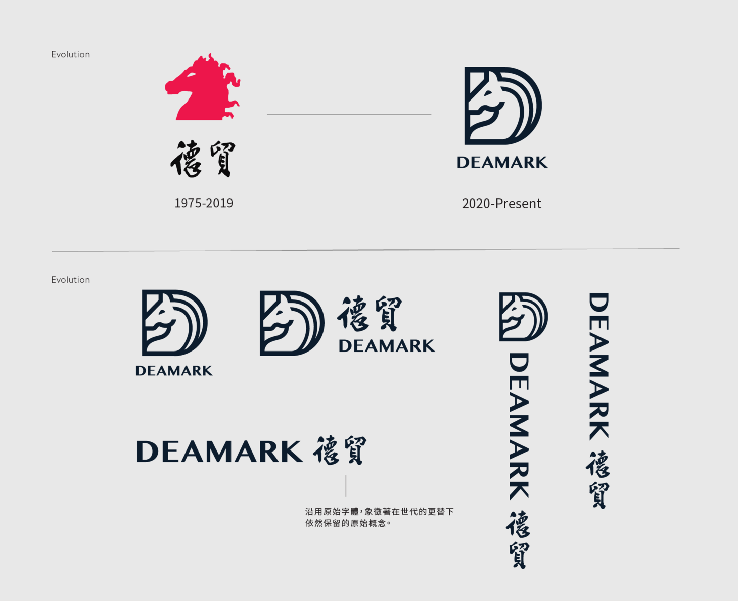
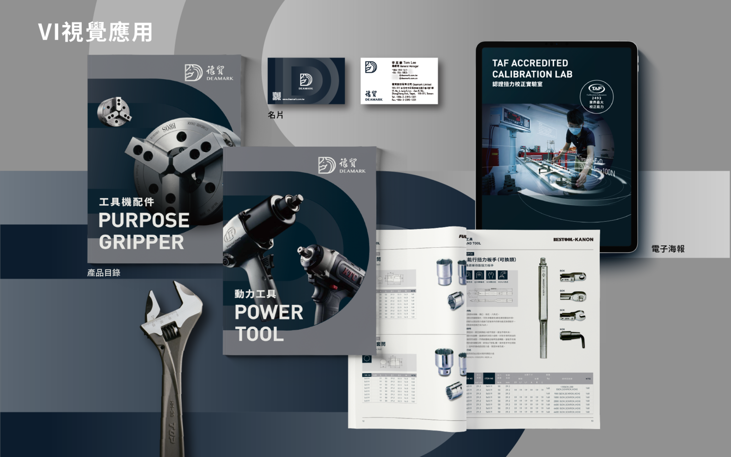
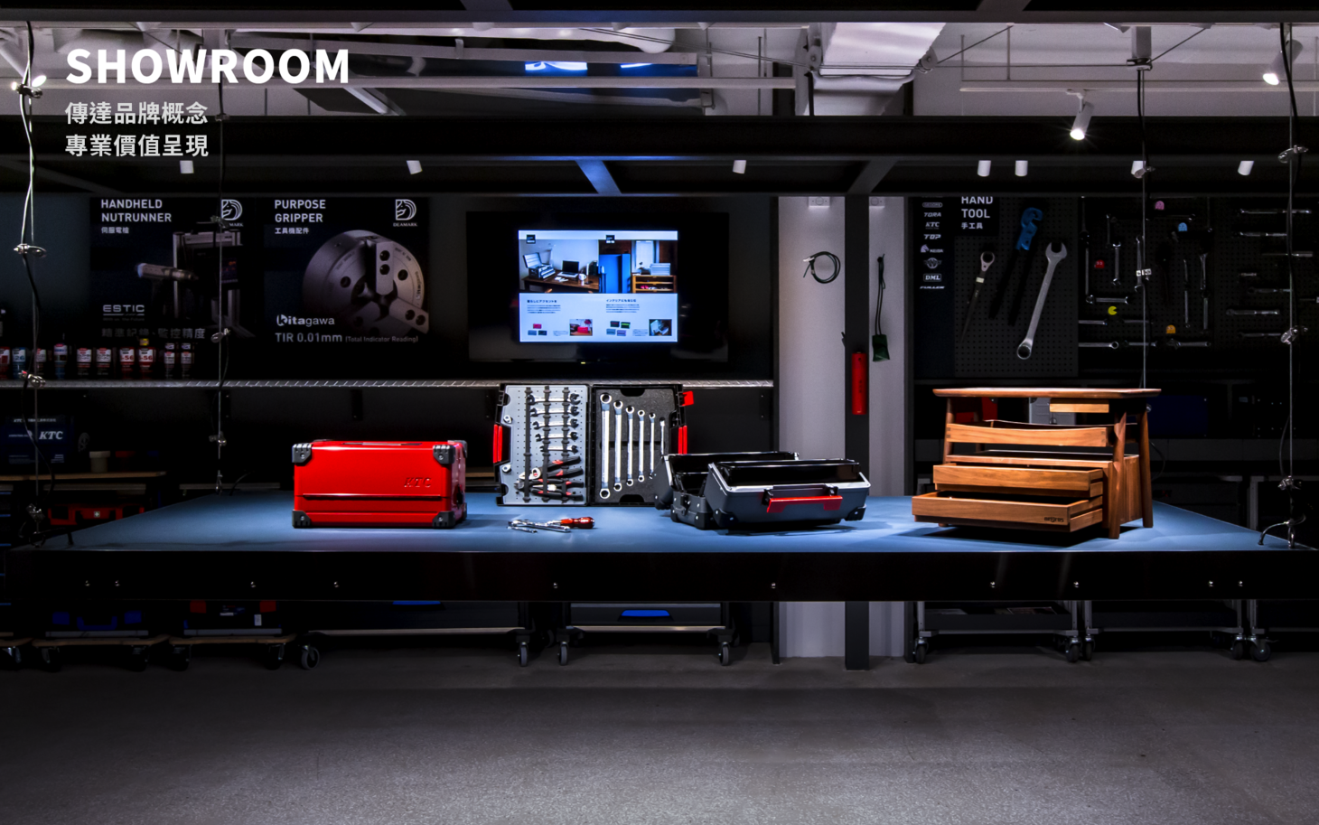
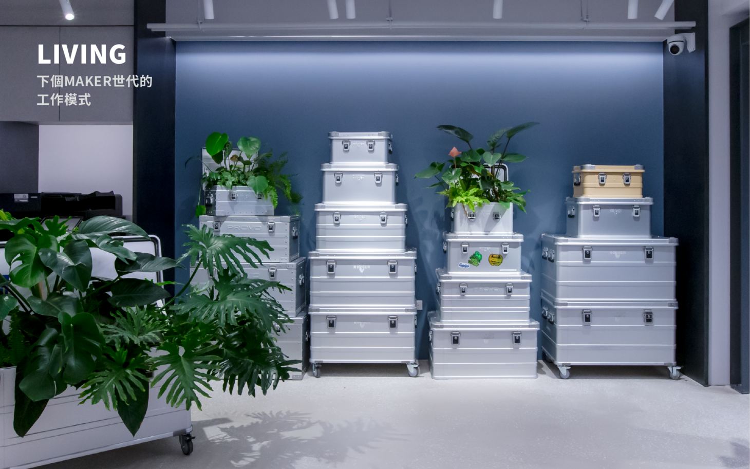
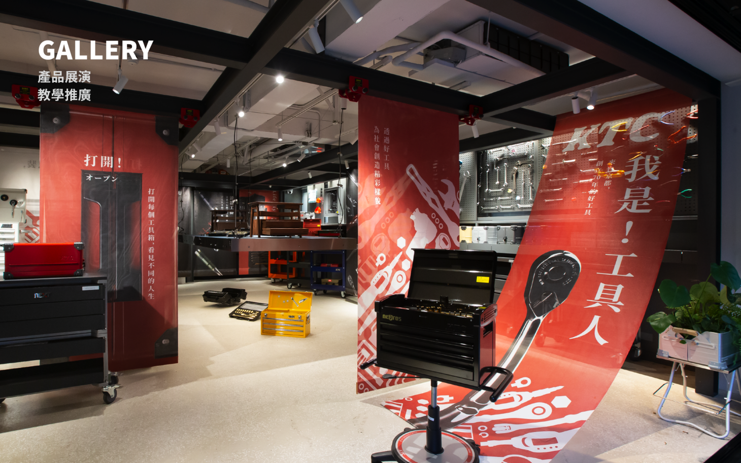
The new space allows the tools to be introduced to the public in a friendly, professional, and interesting way. The multi-space for work, communication, promotion, teaching and display is where stories of the brand are told. The H beam rigging system on the first floor can be used to display heavy equipment; information boards hung on the sliders can be added to showcase featured products and posters. The rigged platform in the center of the space can be used for display, work and lighting. The basement floor has a more relaxing vibe: enjoying coffee in a space surrounded by plant walls and boxes creates the very much needed healing moment. In addition to space design, we also created a consistent look for the company’s logo, palette, posters, story wall, catalog and business card to present its image as a professional agency.
起家的原點 找到下一個五十年的新價值體驗中心 德貿堅持在起家立業的原點,創造新的未來價值,品牌改造是為了迎接下一個五十年的開始,重新整合品牌的溝通策略從空間設計、體驗設計、識別設計到視覺構成,除了塑造德貿代理商的專業形象,更關鍵的是建立新世代的經營與溝通模式,代理商不再只是品牌代理,在專業與理性的工具中,創造人與人的連結。
在空間結構設計中,因人事物的需求與主題而產生不同的場景,這裏可以是最新的工具體驗中心、新產品的發表會、工具教學的直播攝影棚、達人修車廠、重機保養廠、也可以是展覽與活動空間。藉由一個全新的體驗空間,將工具以生活化、專業、有趣的方式分享給大家。 如此結合工作、交流、推廣、教學和展演的複合式體驗空間,即是訴說品牌故事的場域。 一樓空間的H鋼樑吊掛系統,可展示重型機具與滑軌移動的懸吊背板來陳列主題產品和搭配視覺海報。在中間核心區域設計可自動升降的中島平台,結合陳列、工作、照明 ...等 All in One 的功能。地下一樓氣氛轉換成輕鬆的工作環境,圍繞著咖啡、植生牆和植物箱的設計讓日常也有了片刻的療癒。同時也從識別設計、色彩計畫、視覺海報、品牌故事牆、產品目錄、名片的應用中呈現鮮明而一致的專業代理商形象整合。
- Creative Director
- Chia-Hsiao Shih
- Chih-Ling Wang
- Designer
- Shih-Wen Huang
- Yun-Fang Liu
- Yen-Jen Chen
- Project Manager
- Dodo Liu
