以天然材質與感知體驗為核心形塑品牌定位
拓質空間設計以 Touchbeing 為名,強調「觸摸 × 存在」的品牌精神。透過木材、石材等天然材料的質地延伸出純粹空間的感知體驗,讓觀者在環境中細緻感受光線、比例與材質之間的平衡,並在靜心與沉澱中找到與空間的對話。
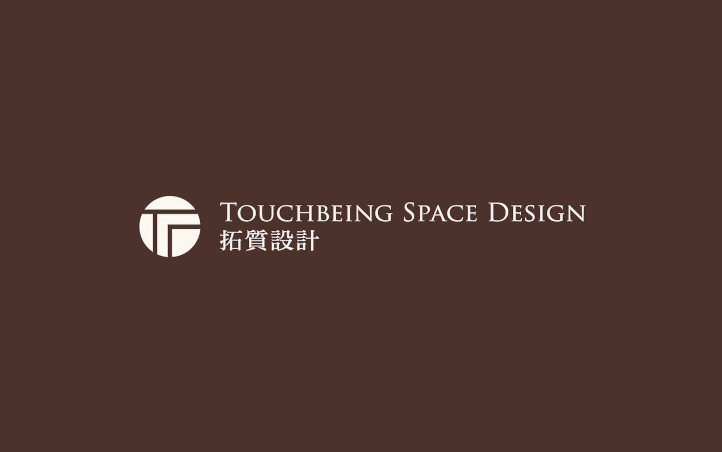
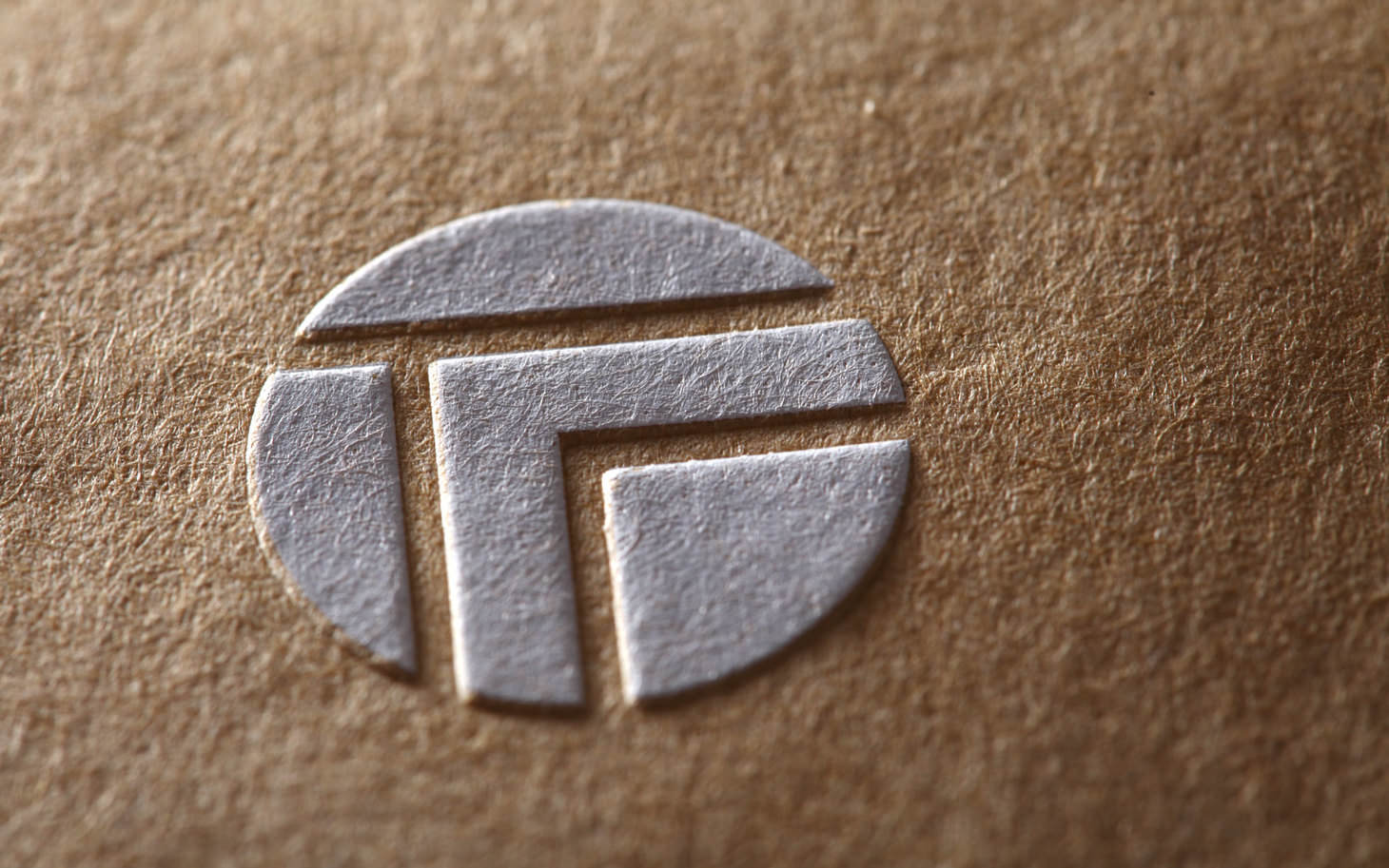
以圓形結構蘊藏 T 與 B 的識別語彙
品牌識別以圓為核心,並在其中以極簡線條隱含字母 T 與 B,象徵品牌內斂、低語、細緻的特質。這種「需近觀才能看見」的設計方式,呼應拓質空間在細節中的專注與對材料本質的深度理解。
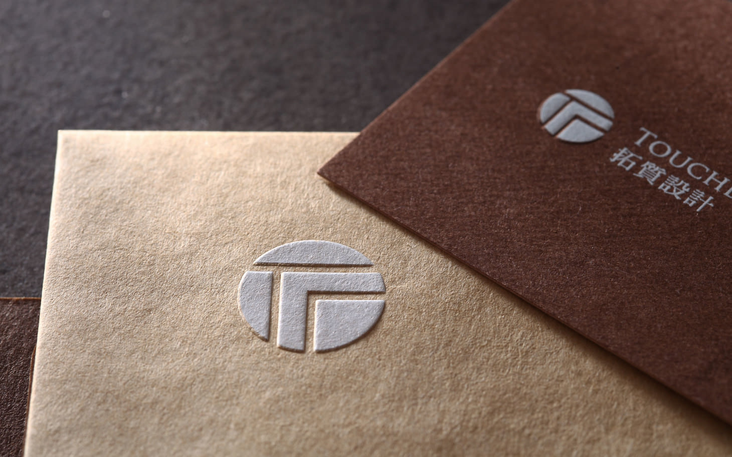
以內斂而安靜的視覺語氣呈現空間哲學
識別延續品牌追求的沈穩調性,以中性色彩、柔和線條與乾淨留白構成視覺風格。整體語彙不張揚、不喧嘩,而是以溫和姿態呈現 Touchbeing 的空間觀點:材料本身即為敘事,安靜之中蘊含力量。
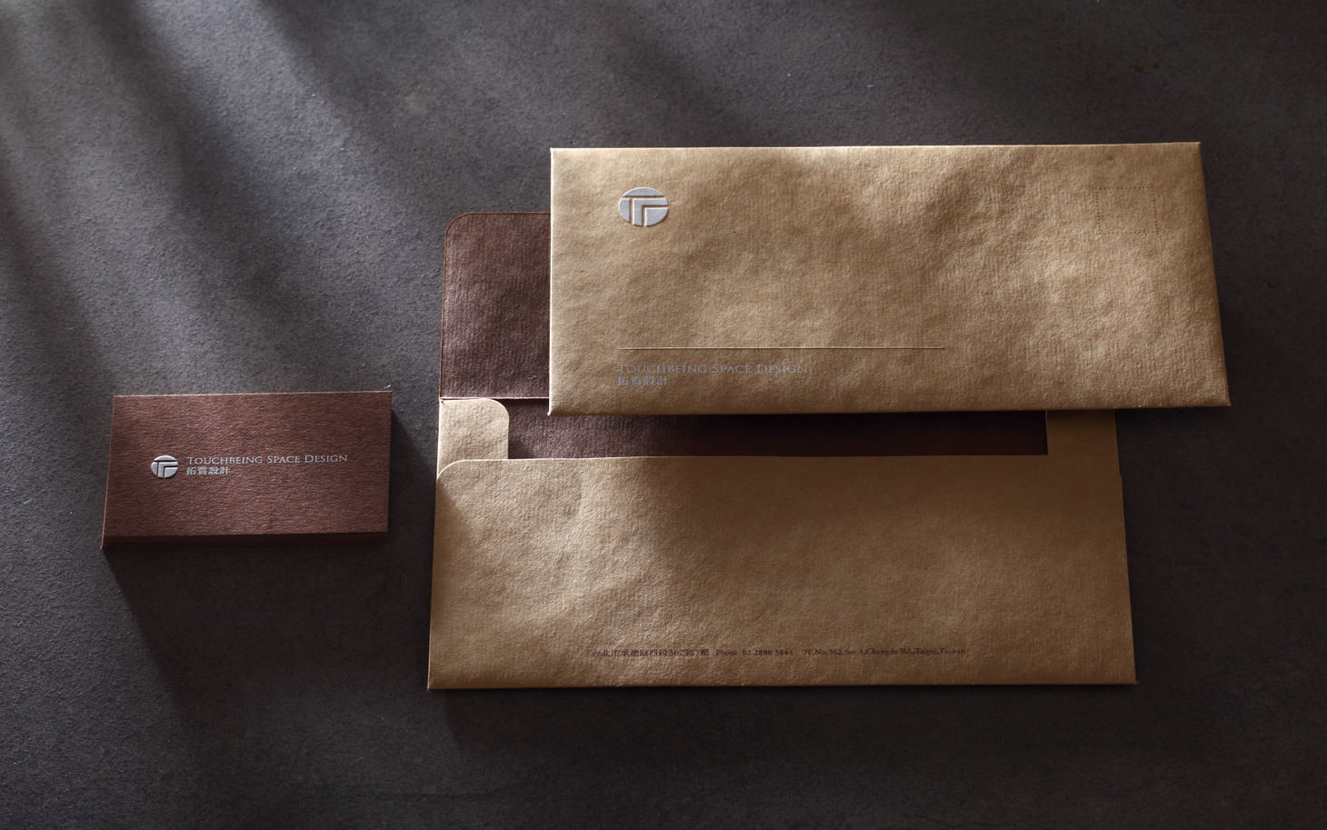
讓識別設計成為空間質地的延伸
從標誌、字體到延伸應用,視覺設計皆以「材質感」與「細節感」為中心,將品牌理念落實到每一項媒介。識別系統成為 Touchbeing 空間哲學的延伸,使品牌在不同接觸點都維持一致、沉穩且具有深度的表現。