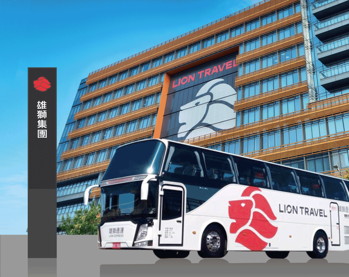
雄獅集團
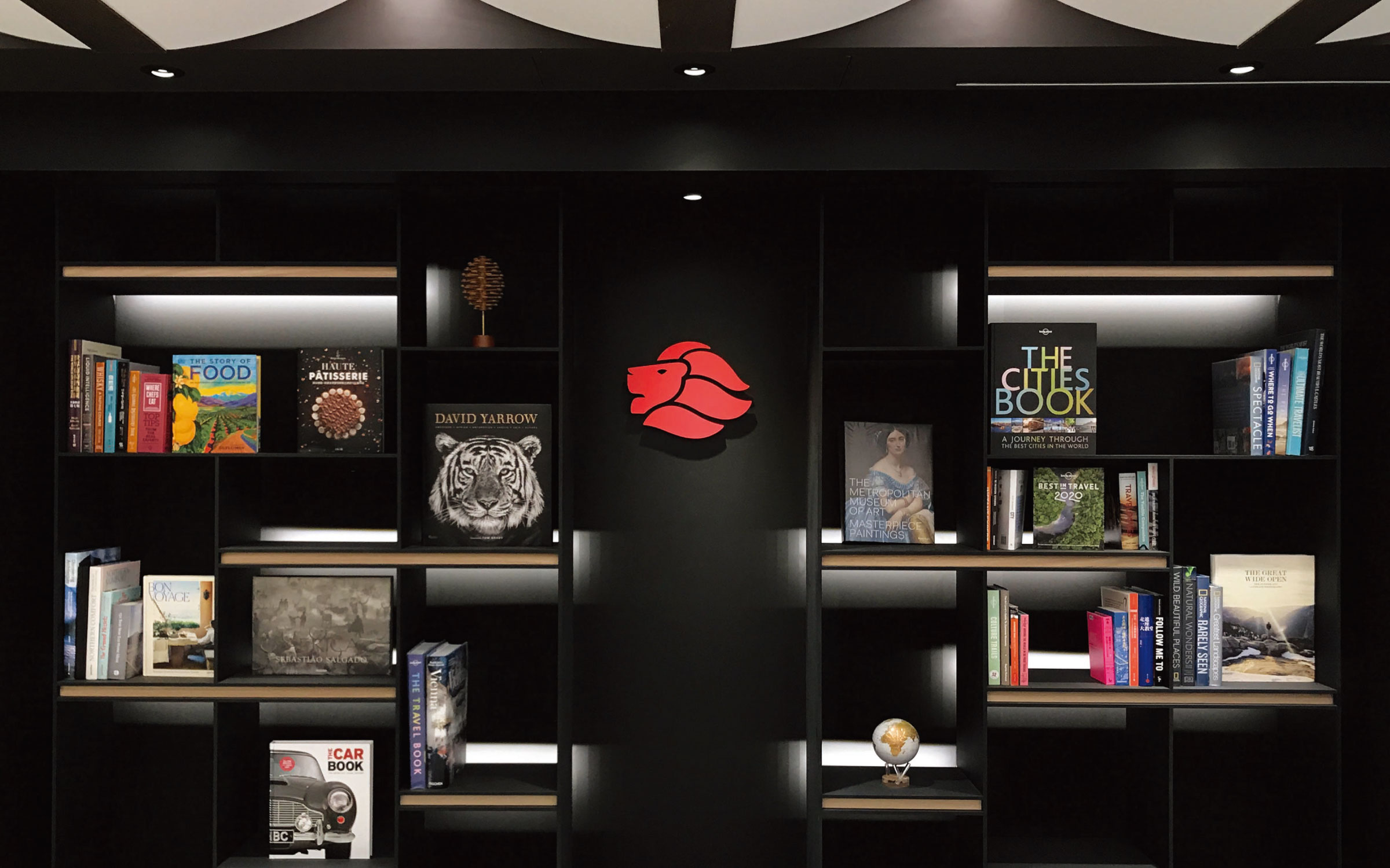
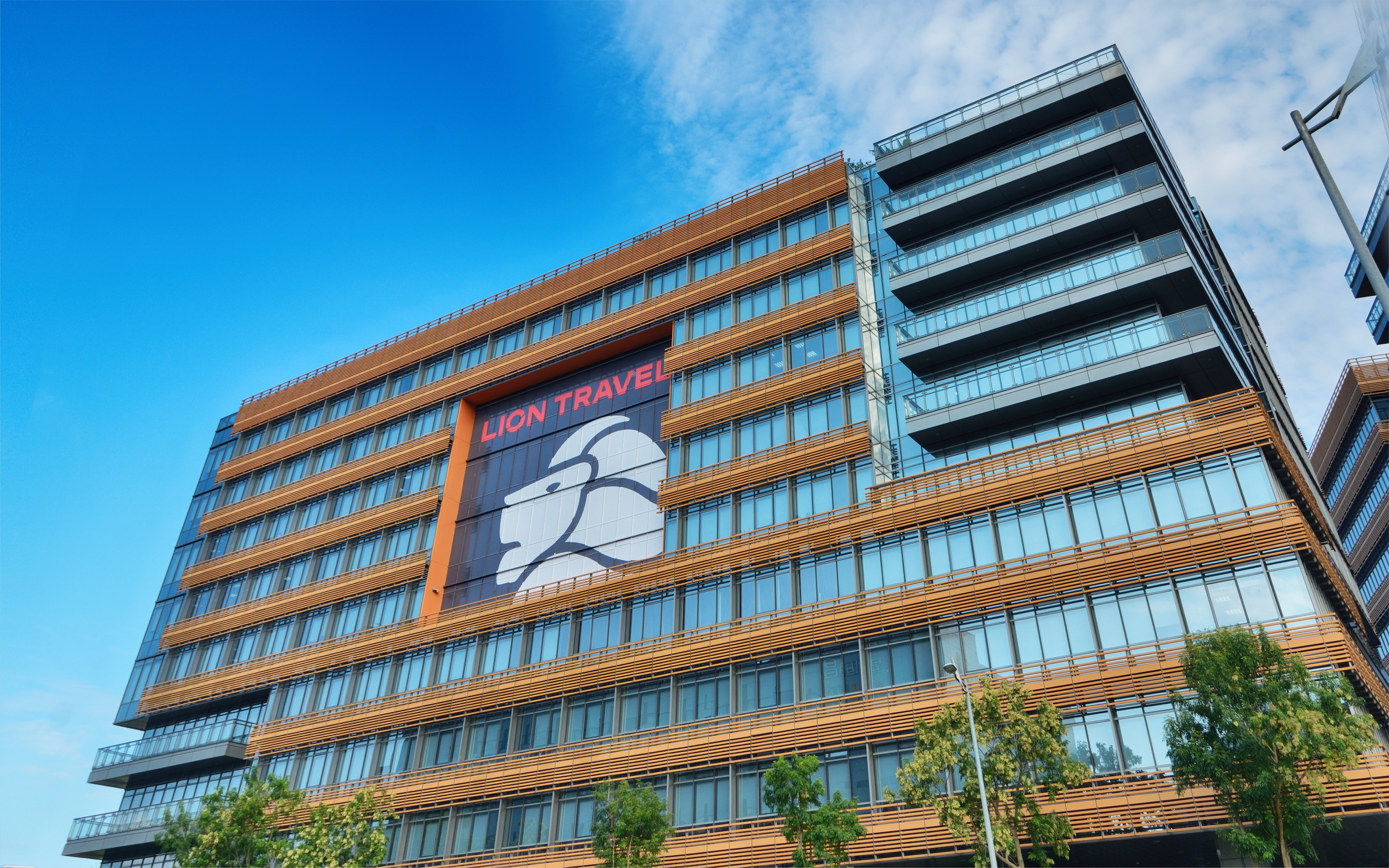
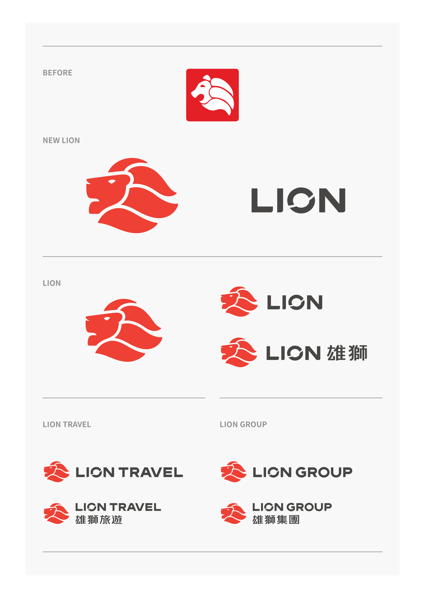
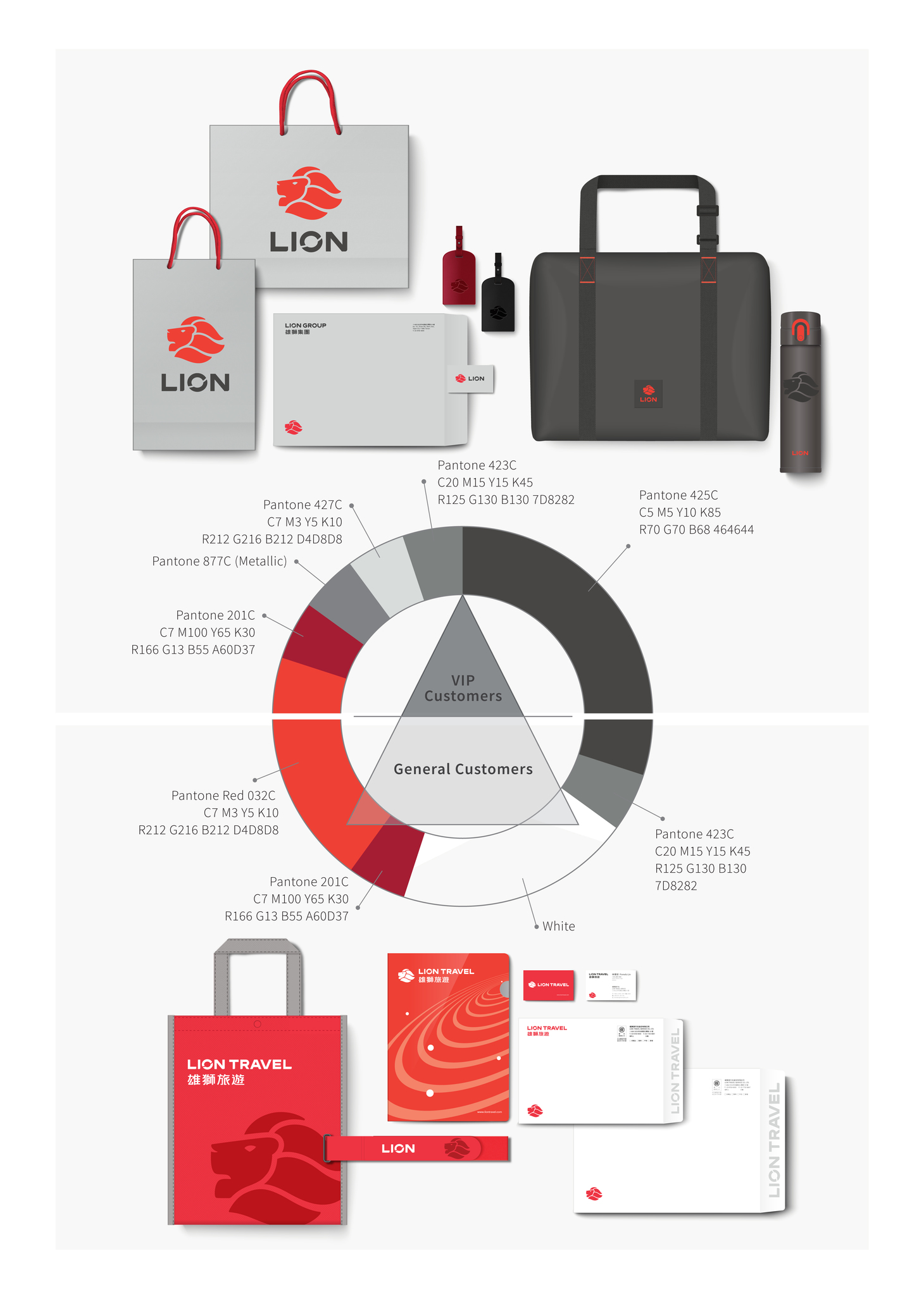
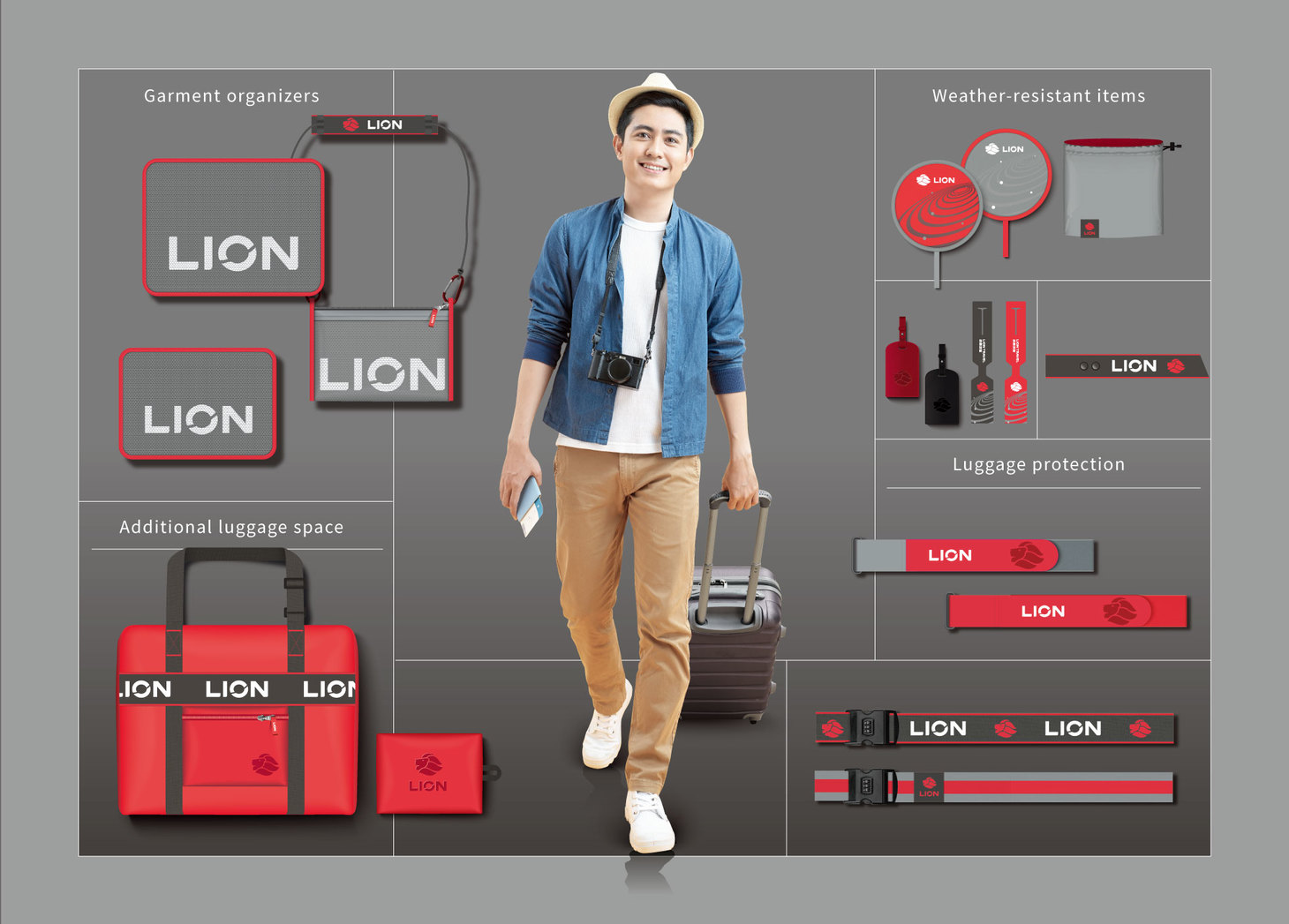
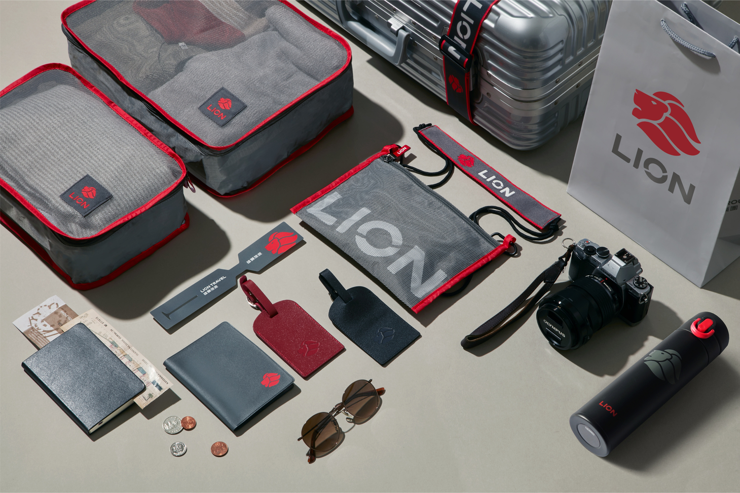
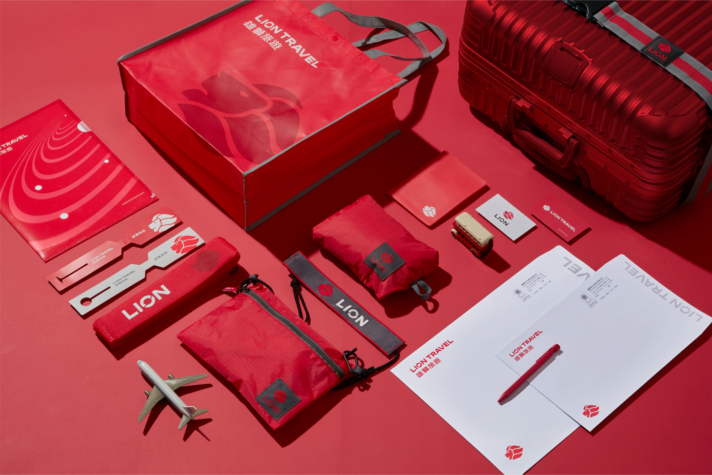
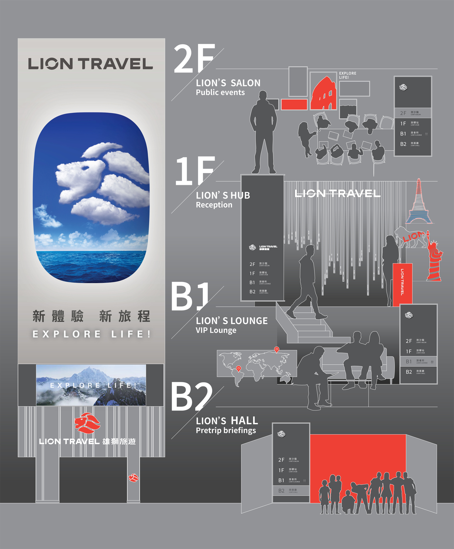
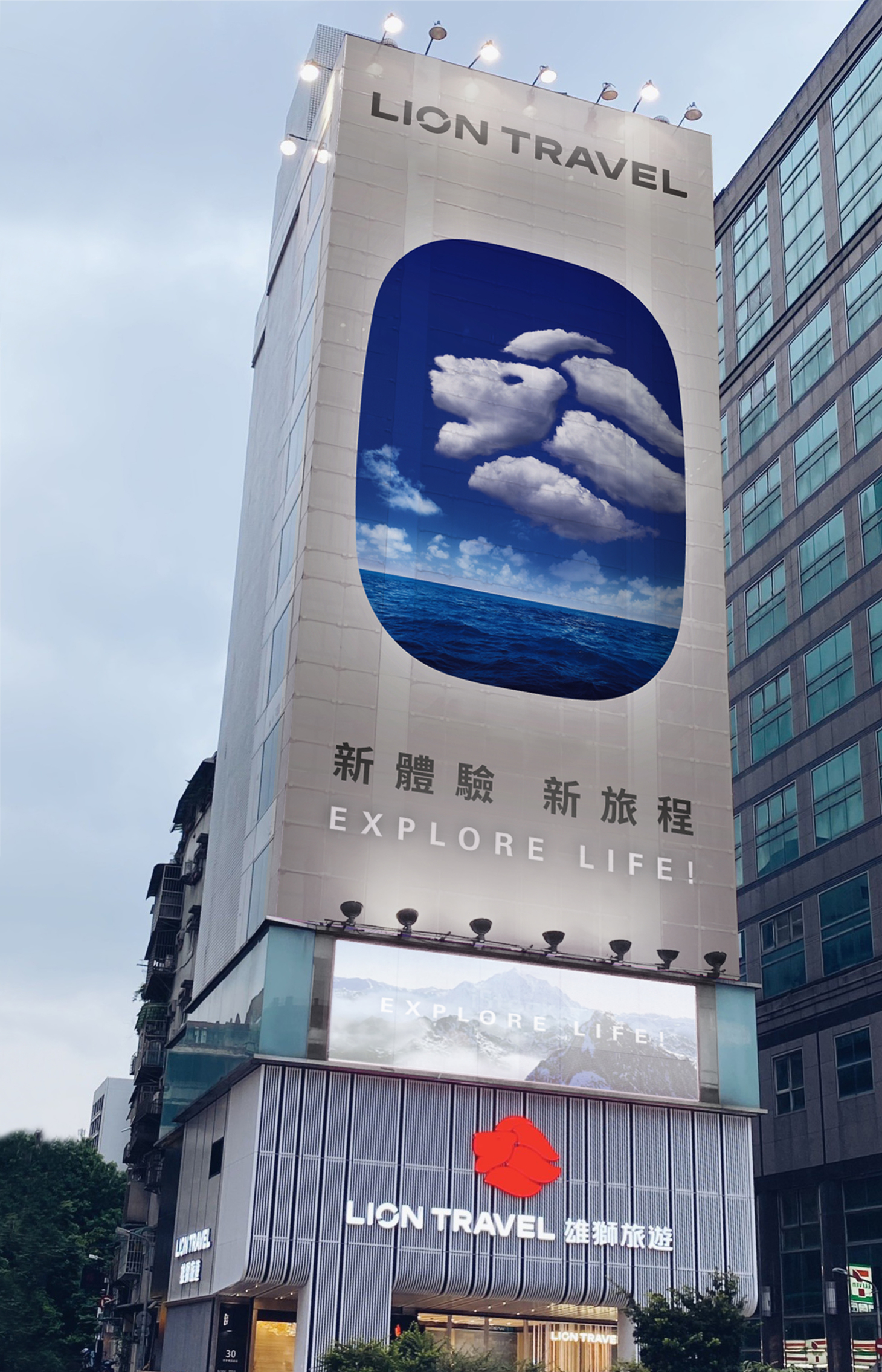
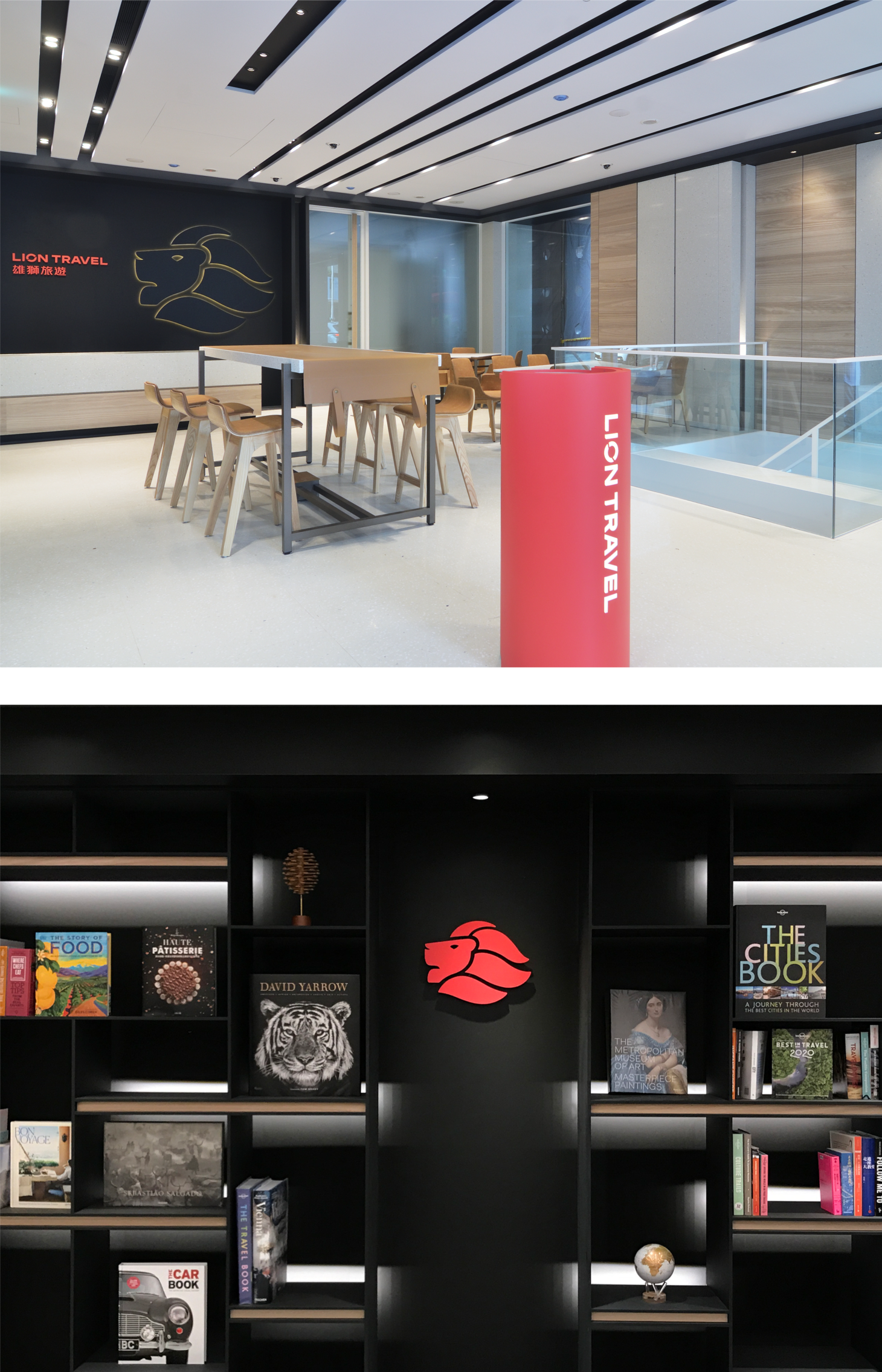
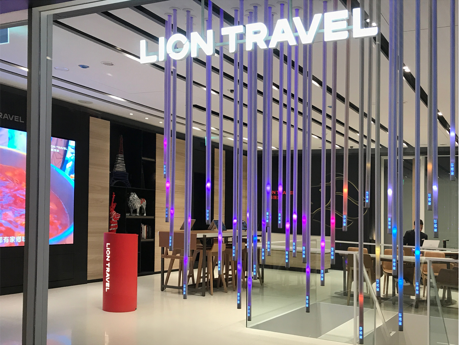
Lion Group has been a leading name in Taiwan’s travel industry for more than 40 years. The rebranding project was launched in 2018. By redesigning brand logo, outlook of the headquarters, travel products, corporate items, visual and spatial experience of the flagship store, we helped Lion Group create exclusive new experiences which encourage consumers to explore life.
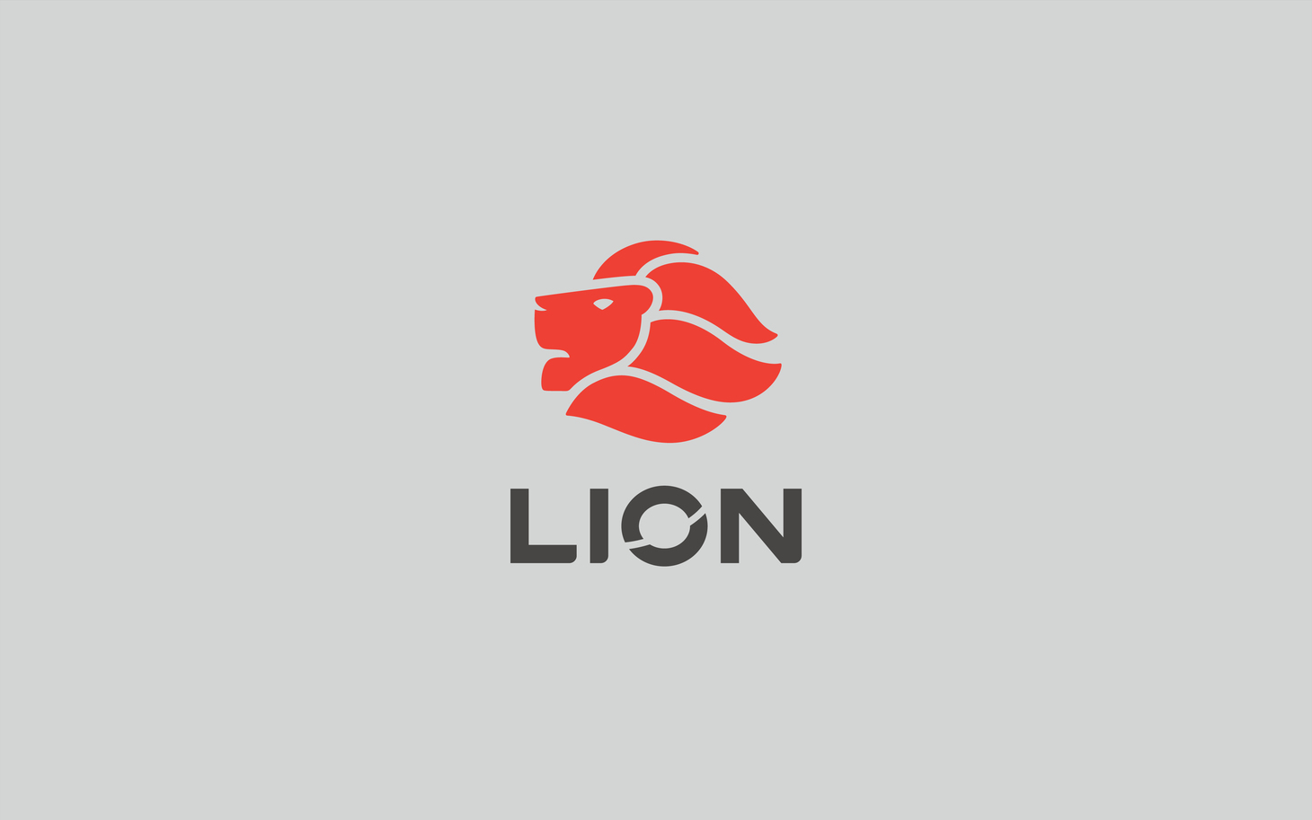
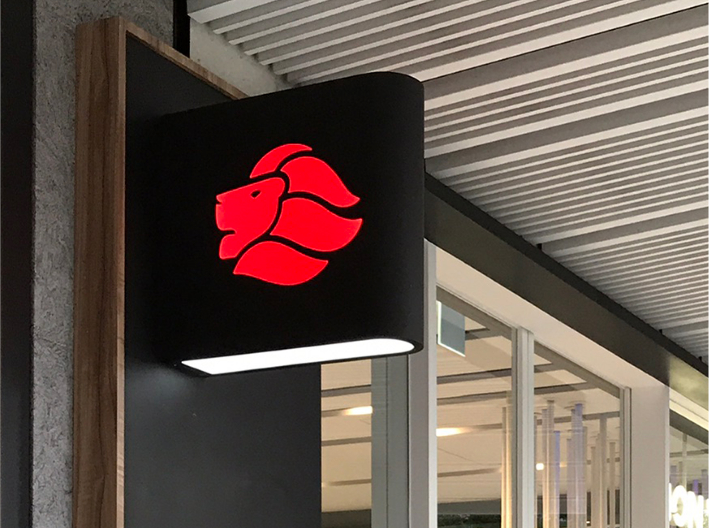
For the new logo, smoother curves are used to illustrate the wavy flying mane of the lion, so it has a smoother, brighter, and more dynamic look. The upward-gazing lion shows Lion Group’s ambition to be the industry leader. The letter “O” symbolizes planet Earth, and the traveler’s route leaves the mark symbolizing Lion Group’s determination to go forward and travel far. For the letters and Chinese characters, a font of well-proportioned structures is used, but we made them look more friendly and playful by adding curves here and there. The new color red contains more vitality and power than the old one. It works well with a good range of complementary colors, which allows more flexibility when the logo is applied to target different markets.
雄獅旅遊深耕40多年,面對全球疫情以聚焦台灣為新策略,建設台灣成為「觀光旅遊生活島」為目標,持續為台灣旅遊業帶來新的可能 !在 2018 年即展開品牌改造計畫,以「Explore Life 」作為新概念,透過全新品牌識別,集團的外觀形象識別、旅遊商品設計、事務用品設計、概念旗艦店空間視覺形象與旗艦店的《光途》裝置,同步全球不同時區的所有光線,體驗與全球時刻同步的光感之旅。多面向的重新形塑品牌整體形象,希望帶給消費者不同的旅遊體驗。 新識別設計以更流暢曲線表現獅子的鬃毛迎風飛揚,使識別更具流線、鮮明和動態感,加上遠觀、昂揚的視角,傳遞雄獅發展的企圖心。字母 ”O” 代表地球,旅行的路徑在地球上畫出一道軌跡,象徵雄獅的跨越與突破。標準字設計以穩重黑體作為骨架,在細節中結合了圓弧線條,讓整體更具親切感。色彩規劃使用不同於以往的正紅色,呈現更有精神、活力的紅色,並搭配不同質感的輔助色,於分眾市場更靈活應用。
- Creative Director
- Chih-Ling Wang
- Chia-Hsiao Shih
- Designer
- Yun-Fang Liu