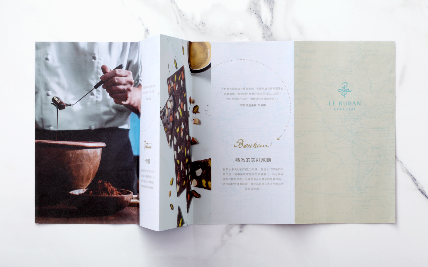
可可法朋
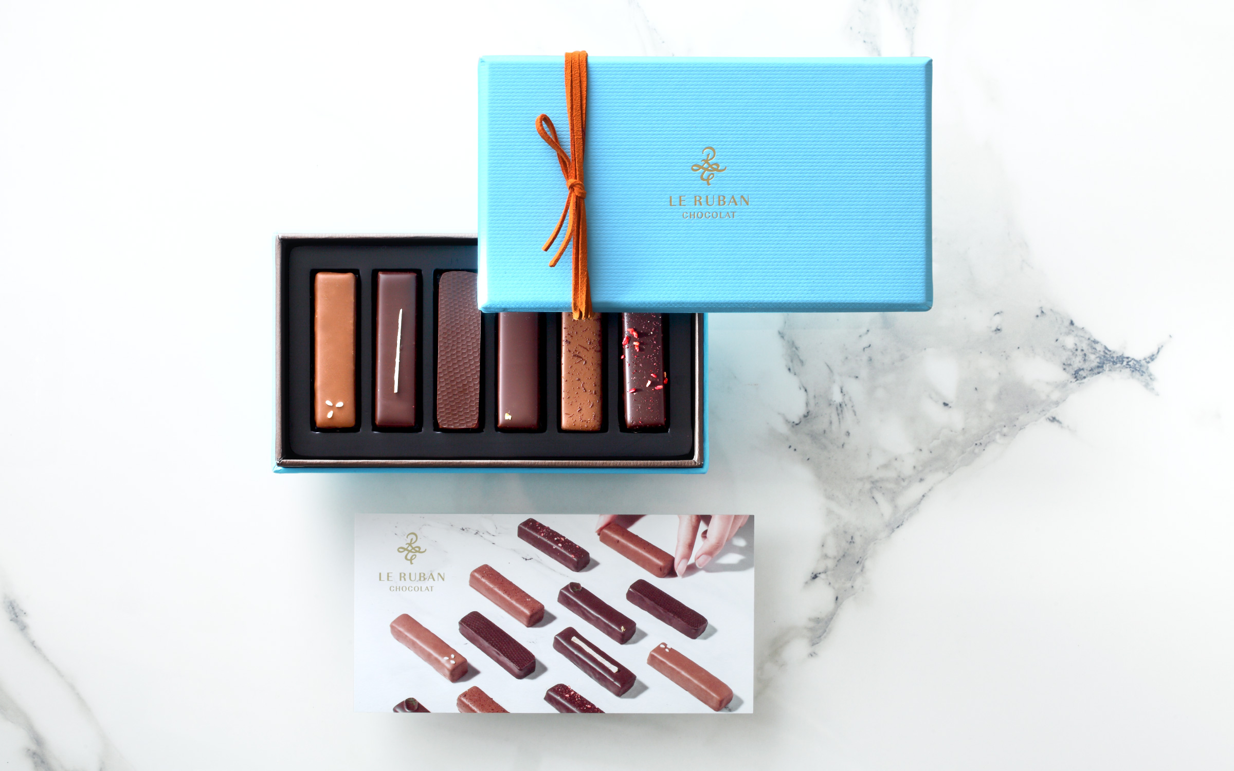
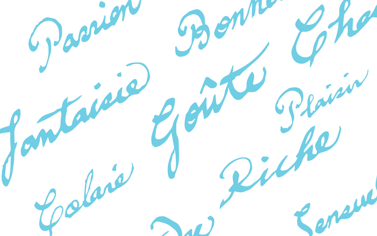
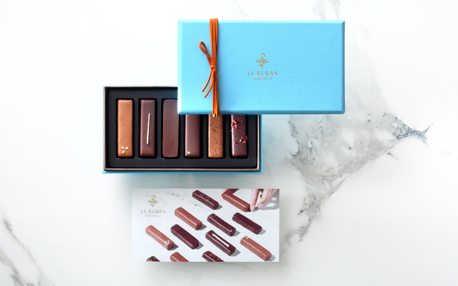
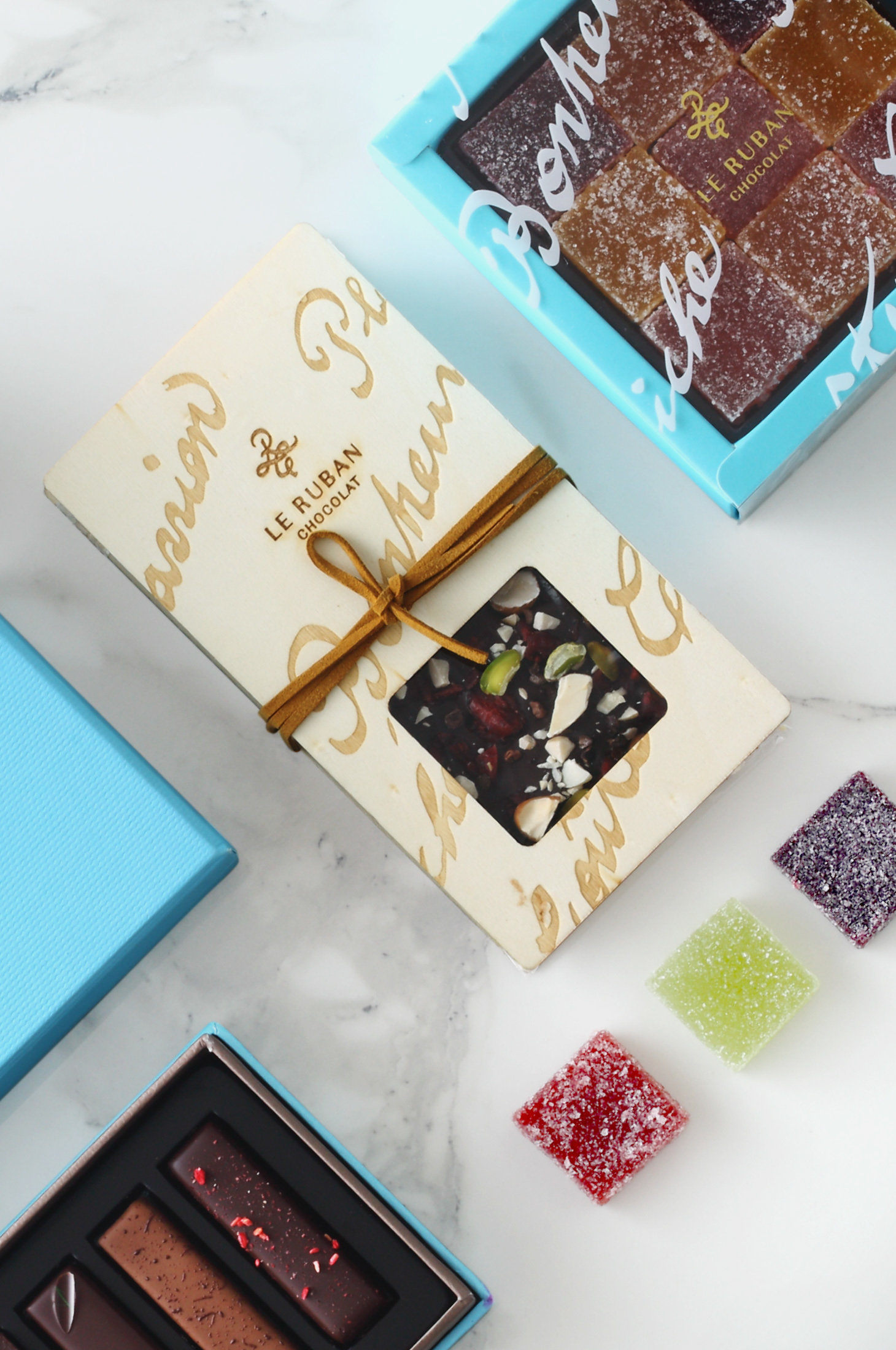
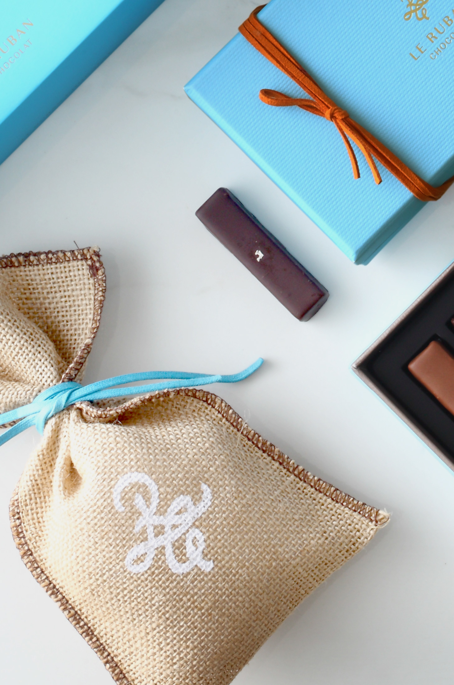
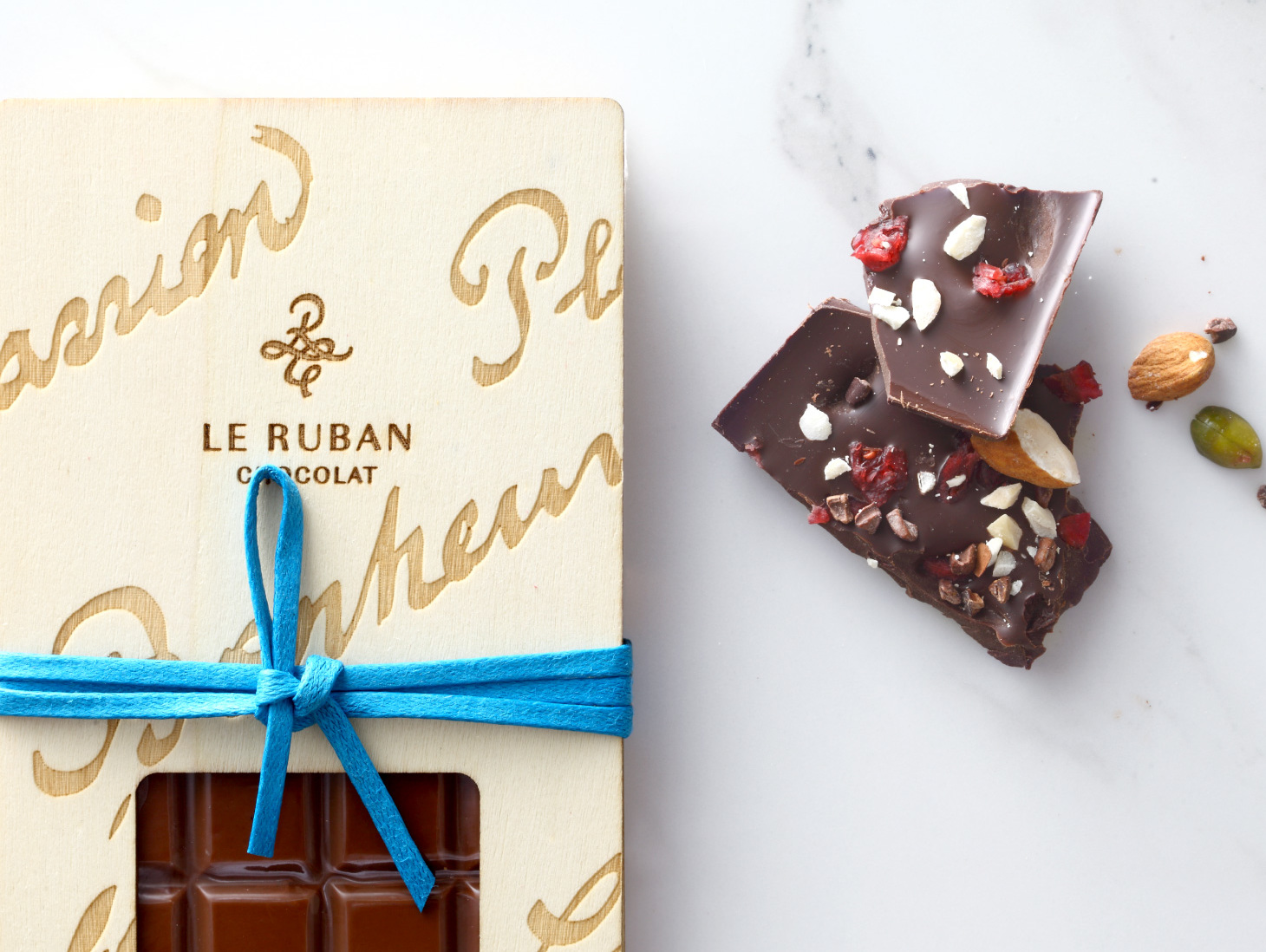
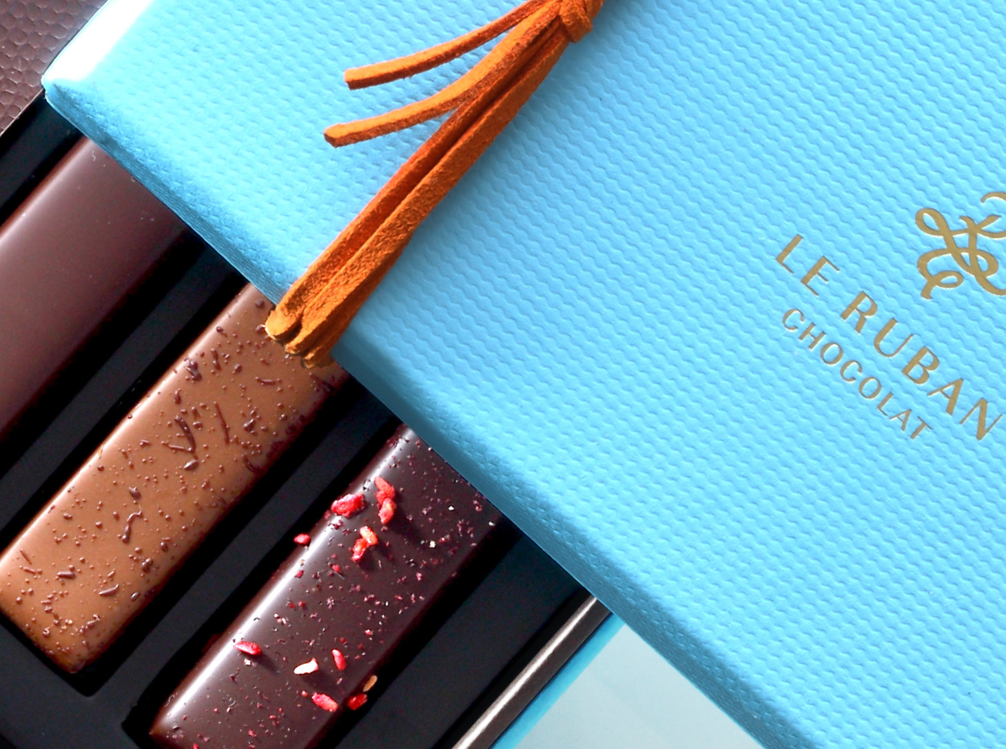
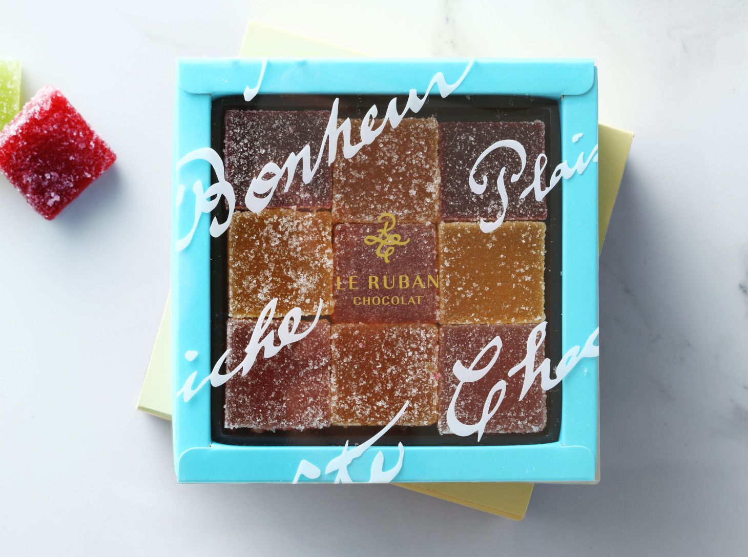
The concept behind Le Ruban Chocolat is happiness of collecting chocolate. The logo is designed with a ribbon to show the chocolate-like silky smoothness of “R&C”, while aqua blue is used to stress how fine and elegant chocolate is. When it comes to exploring good flavors, Le Ruban Chocolat is no less enthusiastic than Le Ruban. It develops a brand new collection of chocolate showcasing Taiwan flavors and continues searching for quality farmers around the island to turn this exploration of delicate flavors into happiness and warmth in life.
Le Ruban Chocolat 可可法朋以收藏巧克力的幸福感為概念 。品牌標誌設計以緞帶詮釋「R&C」如巧克力絲綢般的滑順感,水藍色包裝色調凸顯巧克力的精緻與優雅。可可法朋不亞於法朋對美味的探索,開發全新的台灣特色巧克力及發掘各地優質農友,讓這份細緻的味覺探索,成為生活中的幸福與感動。
- Creative Director
- Chih-Ling Wang
- Designer
- Yu-Tzu Huang