寶璽建設
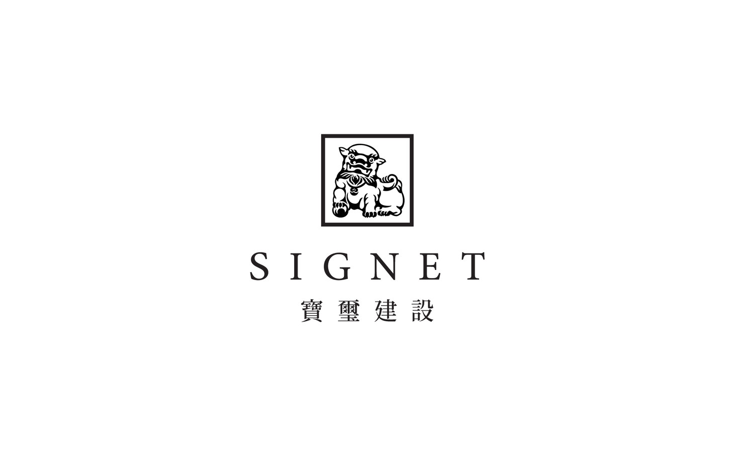
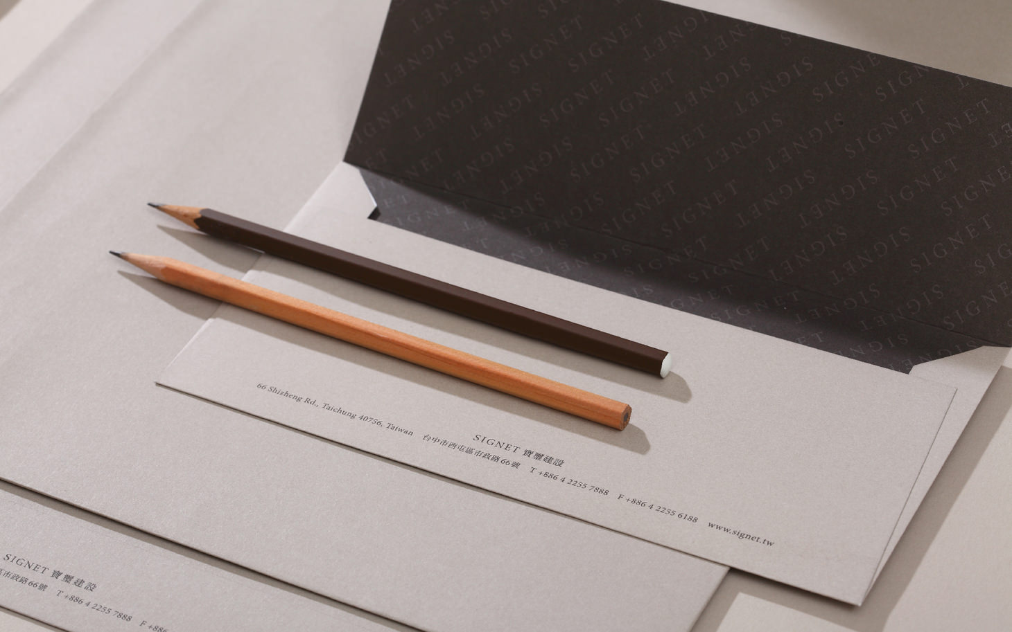
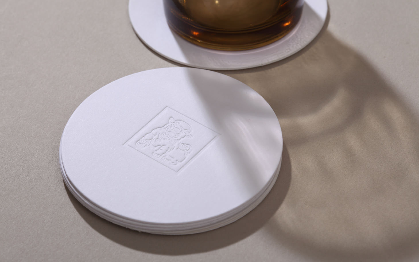
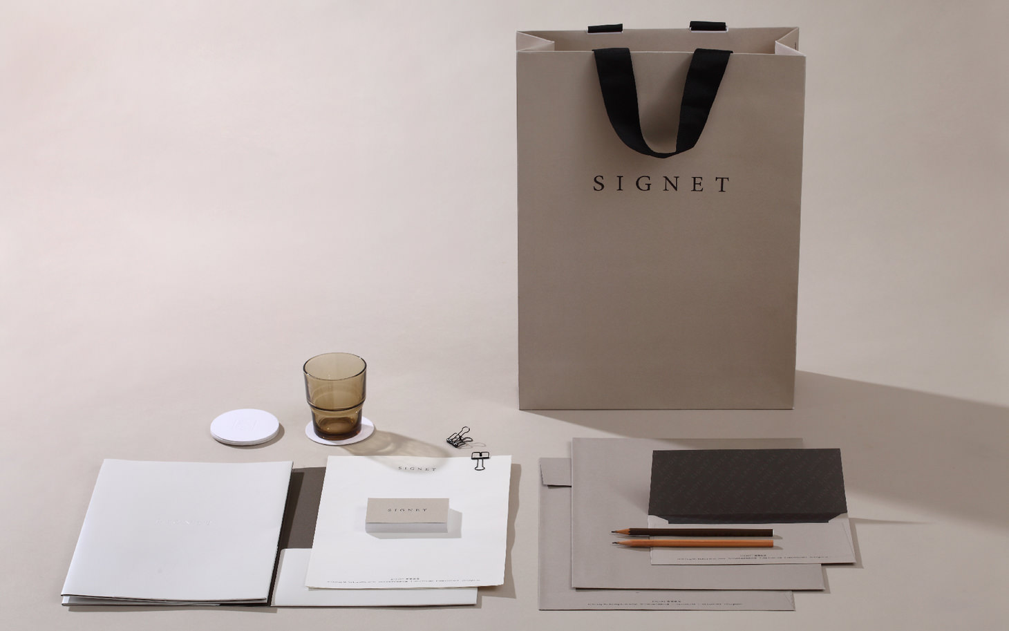
We took Chinese stone lion to be the thirty-year-old company’s visual icon, only that the lion looks more welcoming and its round tail now invokes auspiciousness. The animal’s impressive contour and earth color signify Signet Properties’ epicness.
我們為經營三十餘年的寶璽建設重新規劃企業識別形象,以中國典故進行石獅子的符號改造,突顯出迎賓的笑靨,尾巴則以圓融的線條代表孕育祥瑞之氣,整體以更鮮明的輪廓,搭配大地色系,呈現寶璽為時代允諾的宏大氣度。
- Creative Director
- Chih-Ling Wang
- Designer
- Yu-Tzu Huang
