品牌十事|其一 找回最初的心
真正的前進,有時是回到初心的方向。
有時候,真正的進步,是找回原本的初心,把那座「原本的山」找回來。
關於元本山的品牌回歸故事
有一次,我們接到元本山的品牌重塑案。對方的需求很清楚:更新Logo。
但在我們的觀察與調查之後,發現問題的根本,不只是Logo。
元本山當時是海苔市場的領頭品牌,每年編列固定廣告預算,由廣告公司規劃行銷,同時也順帶更新包裝。然而,這樣的操作反而陷入了一個無限循環:
推出新包裝 → 同業快速模仿 → 自家再推新版 → 各種包裝成為市場雜訊。
最終的結果,就是架上的元本山不再像一座穩定的山,而和大家混雜在千變萬化的迷宮中。
我們也注意到,一旁的對手高崗屋,儘管品牌因為銷售模式不同,也沒有投入資金改變包裝,卻反而因為視覺穩定、單一樣貌,在貨架上非常醒目。這個對比,提醒了我們一件事:
與其創造更多新的「辨識點」,不如先讓自己「被認出」。
我們的提案不是推翻原來的設計,而是找回原來的「那一座山」。
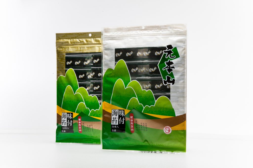
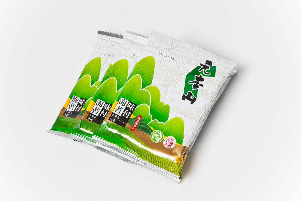
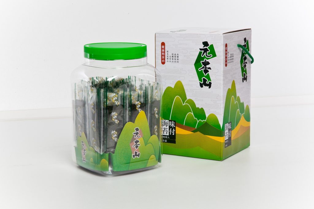
Logo中加入一片現代感的海苔形狀,簡單但鮮明,讓品牌有了新語彙,也不失原有記憶。
進一步,我們為系列包裝設計了統一的山形架構,每一座山都可辨識,並透過色彩與紋理進行品項區隔。這讓視覺不再是無限「創新」,而是有規律、有系統地延續品牌的語言,找回原本在大家心中的那一座山。
最後我們發現,我們做的不是設計Logo,而是替品牌找回它自己。
True progress sometimes begins by returning to where we started.
Sometimes, true progress is about going back—
back to where it all began.
Back to the mountain that was always there.
The Brand Comeback of Yuan Ben Shan
One day, we were approached with a clear request:
“Can you redesign the logo for Yuan Ben Shan?”
But after our research and observation, we realized—
the issue wasn’t just the logo.
Yuan Ben Shan had long been a leading brand in Taiwan’s seaweed market,
with consistent advertising budgets and a steady rhythm of marketing campaigns.
Each campaign came with a packaging refresh.
But the cycle turned into a trap:
New look → Competitors quickly mimic → Another new look → Endless visual noise.
On the shelf, the brand no longer stood tall like a mountain.
It got lost in a maze of constant change, blending in with everything else.
Right next to it was its competitor, Takakanya.
Unlike Yuan Ben Shan, it didn’t invest in packaging makeovers or visual strategies.
Yet its single, consistent look made it unmistakably recognizable.
That contrast taught us something important:
Instead of trying to create new visual hooks,
maybe the brand just needed to be seen again.
So, our proposal wasn’t to reinvent the brand.
It was to return to the original mountain.
We preserved the core identity,
but added a simple, modern touch—a seaweed-shaped form within the logo.
Something fresh, yet familiar.
Next, we created a unified visual system for the product line:
each package featured a mountain silhouette—unique yet related.
Color and texture became the method of product distinction,
while the structure brought back visual harmony.
We weren’t chasing innovation for the sake of novelty.
We were reintroducing rhythm, clarity, and recognizability.
And in the end,
we realized this wasn’t just a logo redesign.
We helped the brand find its way back to itself.