阿里山林鐵
Since its establishment, the Alishan Forest Railway and Cultural Heritage Office has been committed to promoting preservation and maintenance of forest railways, their cultural heritage and forest ecology. The new brand identity shows its determination to achieve sustainable business and to create a new travel brand for Taiwan’s cultural heritage.
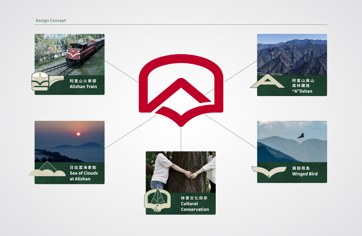
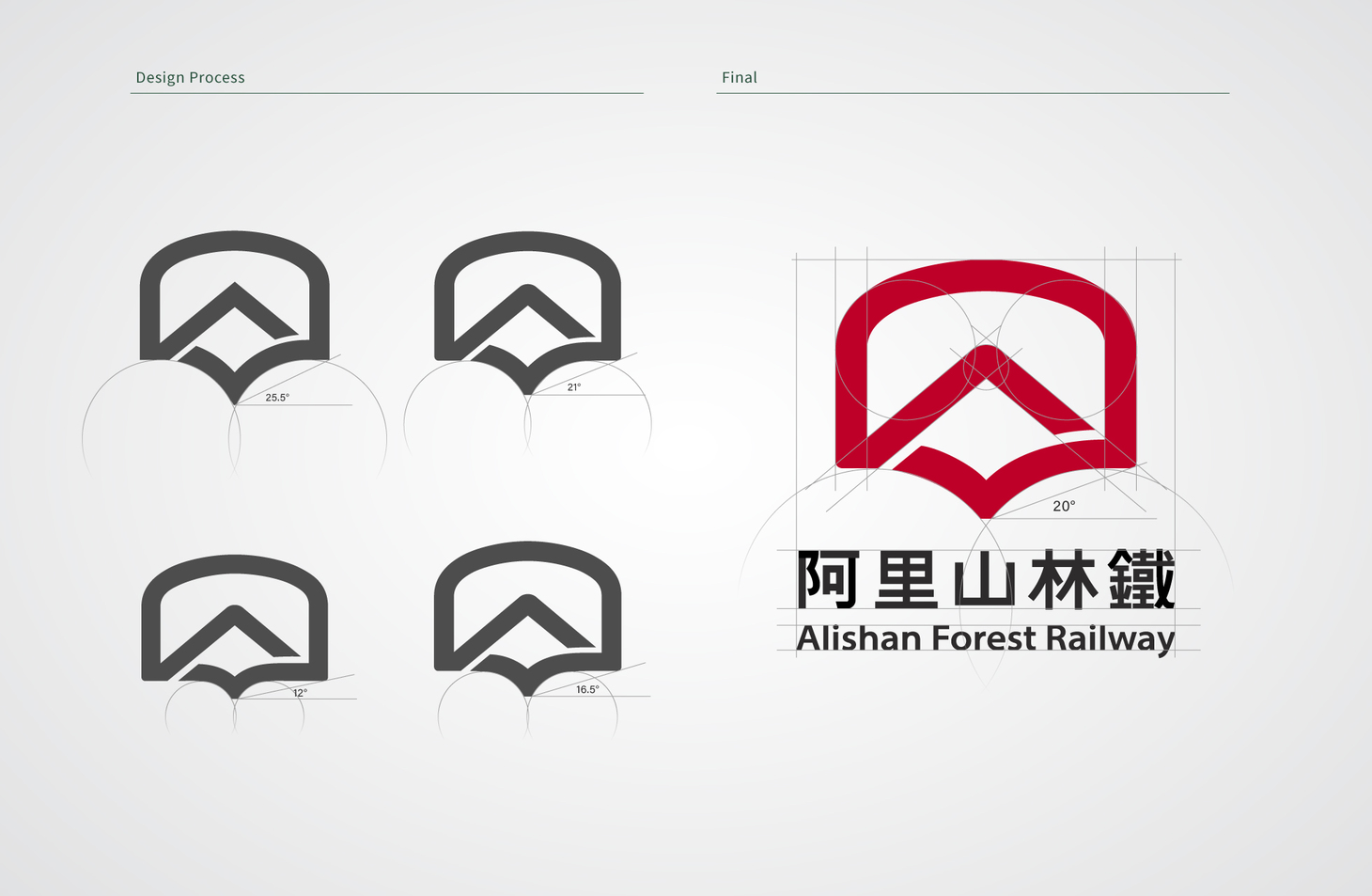
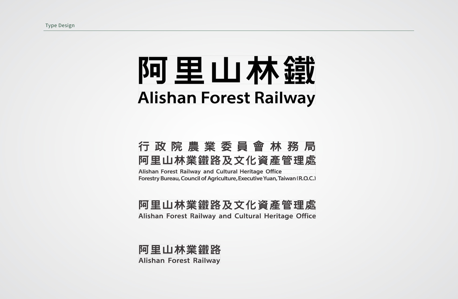
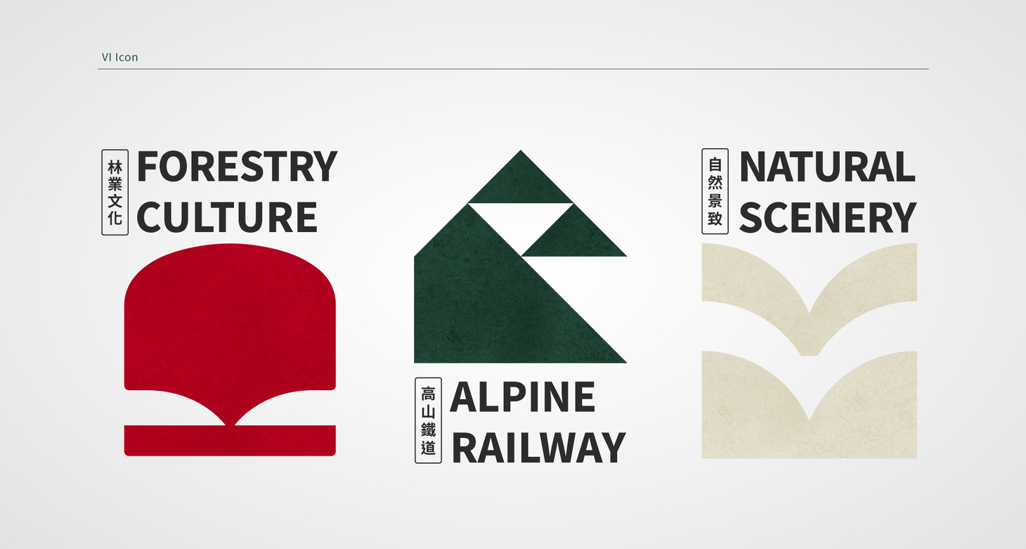
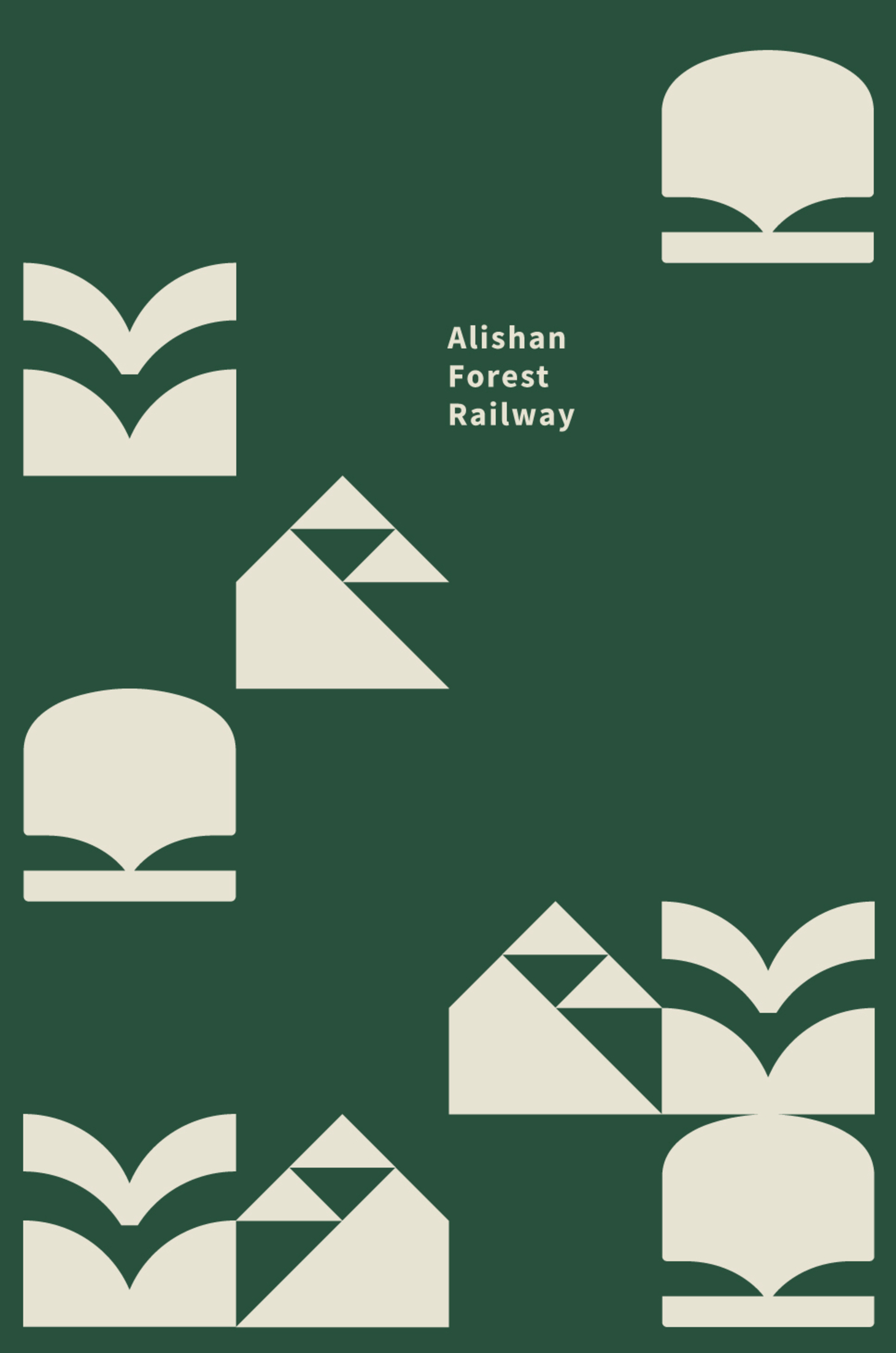
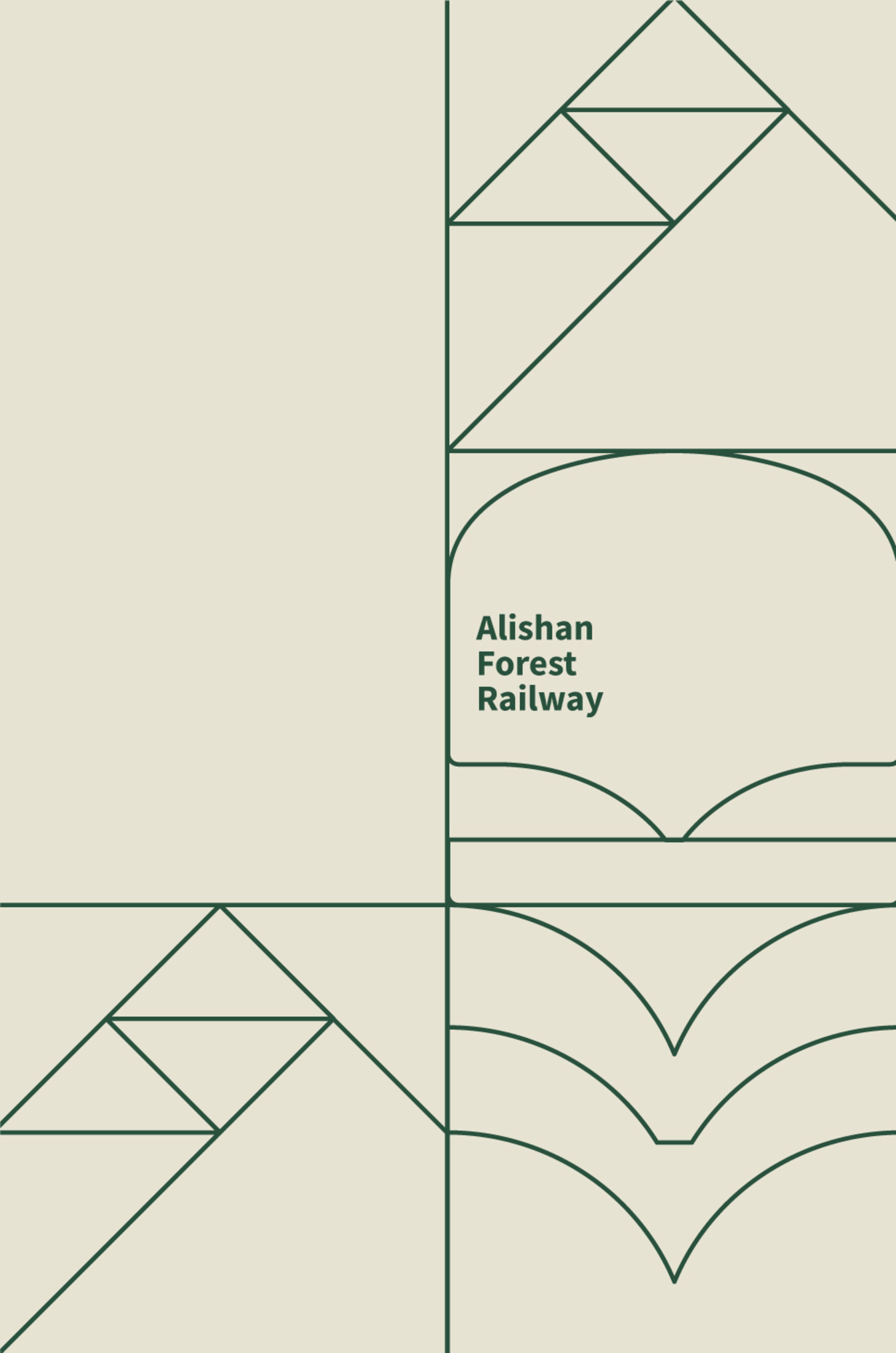
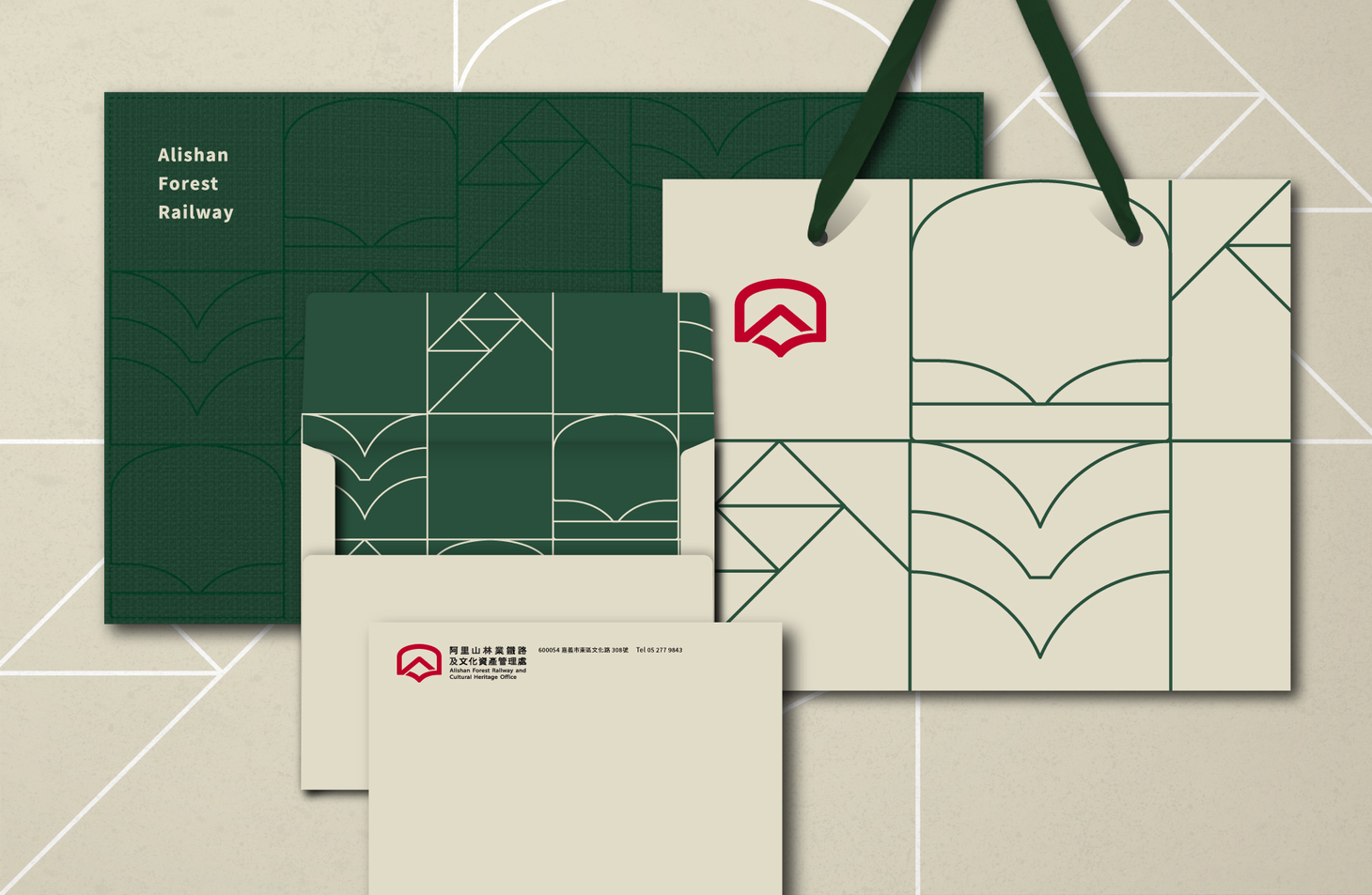
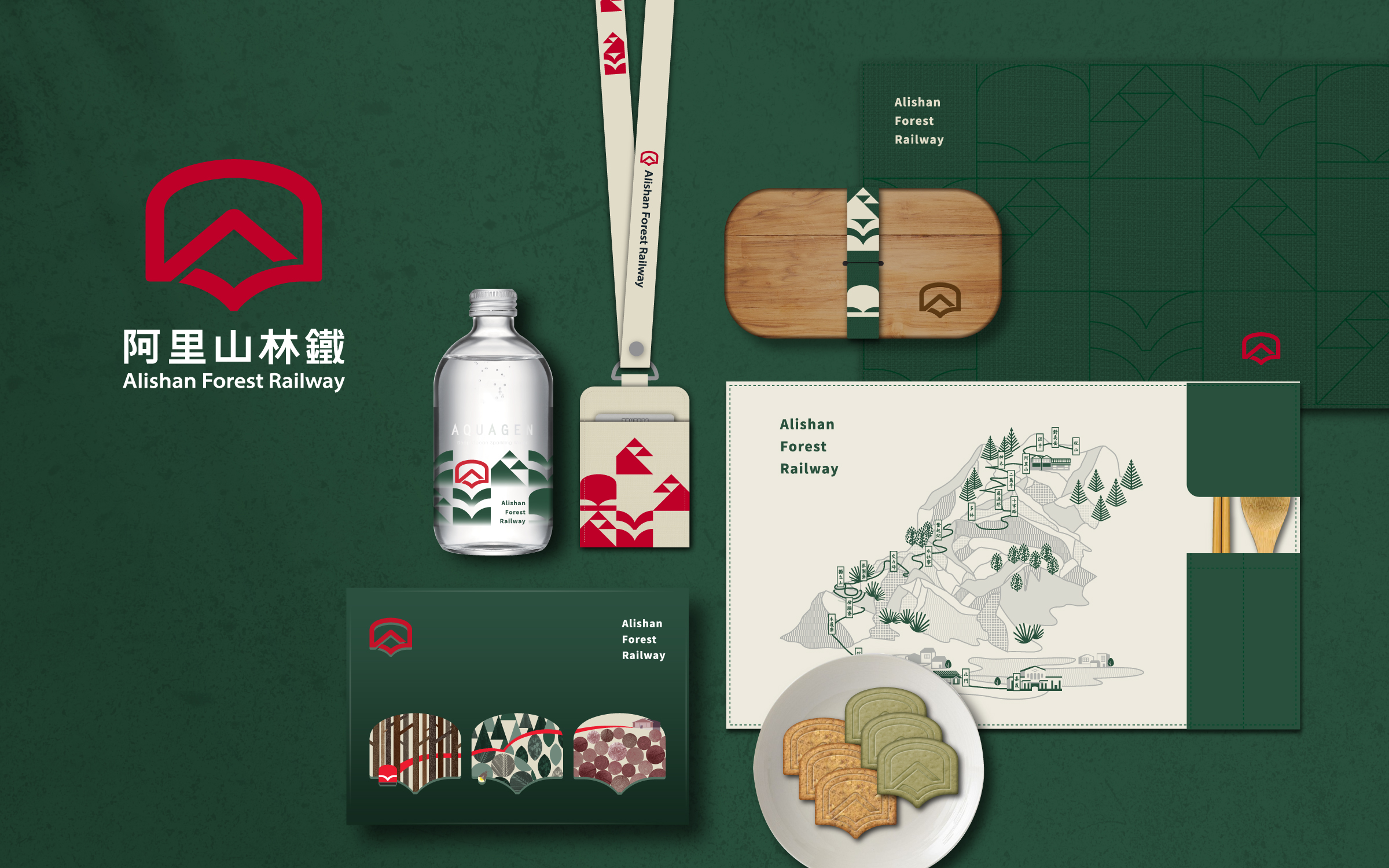
"Enjoy the window view while traveling through the history of the forests" summarizes the design concept of the project. The logo is a combination of the signature sceneries of Alishan: locomotive, sunrise above sea of clouds, and flying birds with open wings. It implies the office’s hope for a great future and its determination to protect Alishan’s forest railways and cultural heritage. The curvy V-sign hidden in the logo creates a soothing and reassuring visual effect, just like transportation safety, which is always the office’s priority. The bold font is inspired by the font used on the railroad cars. It carries the weight of the railway industry while allowing more diversity in application and easier identification.
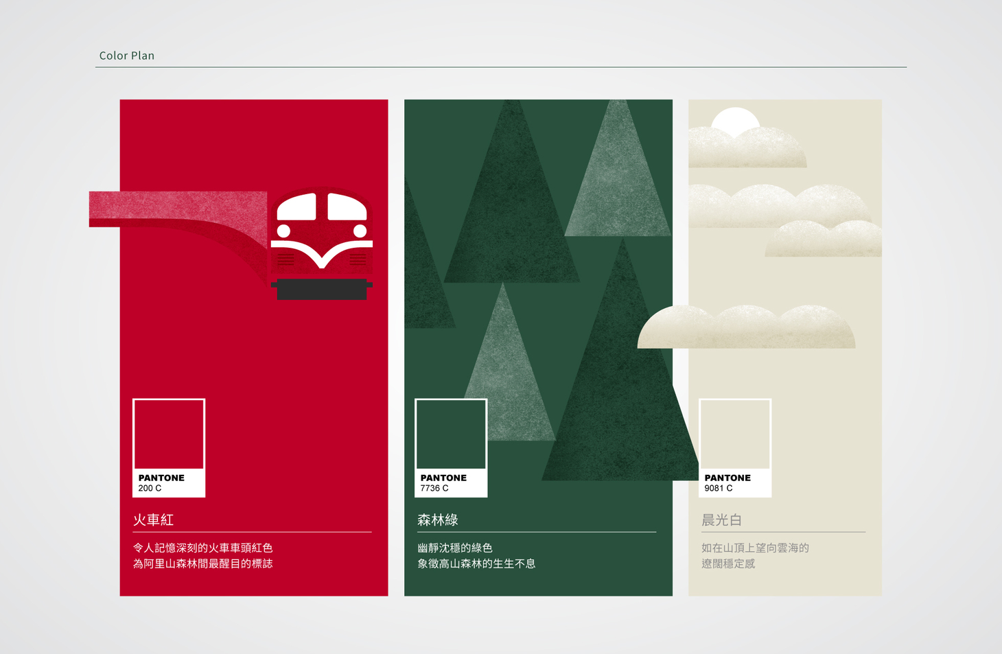
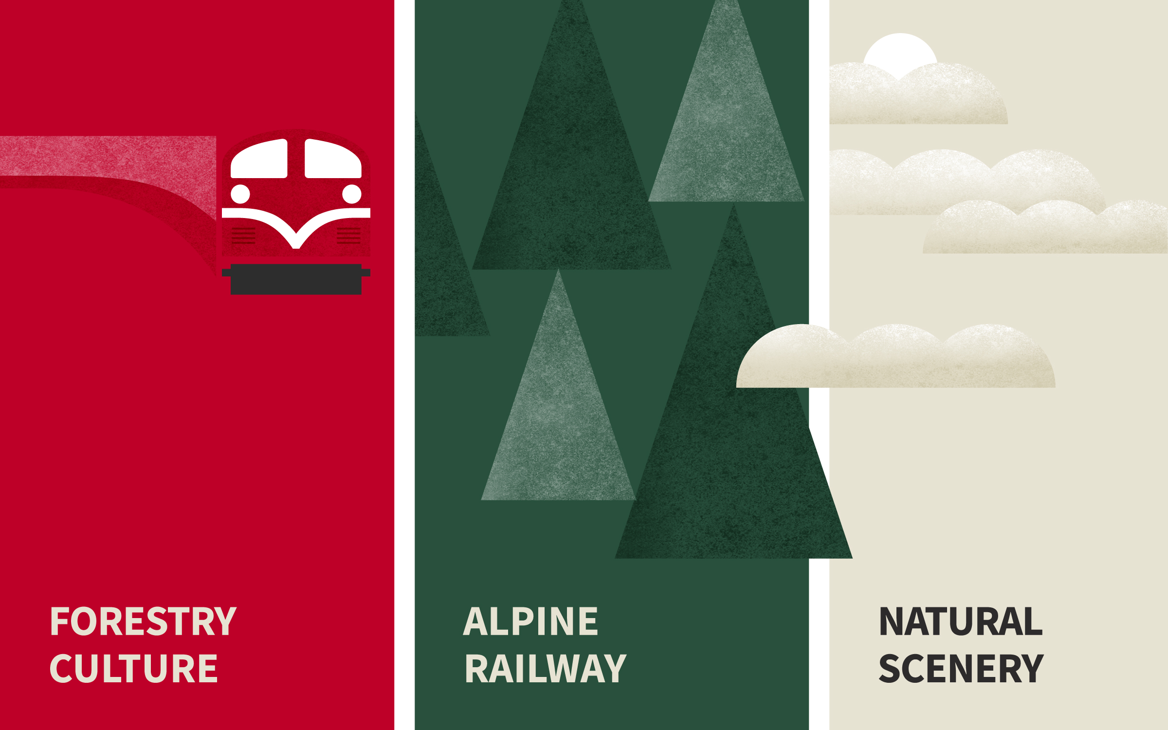
The brand's main color red comes from the color of locomotives – a classic of Alishan. It sets the tone for the new era of Alishan’s railway tourism. Two auxiliary colors are included in the palette: forest green represents the tranquility and vitality of Alishan’s forest, while morning white is a reminder of the spectacular sea of clouds viewed from the mountain top. The brand identity is a combination of robustness and vitality, capsulating the spirit of forestry and railway cultures while bringing more diversity and energy to the brand. The supporting patterns are full of dynamic visuals, reminding people of the flowing window views of train rides.
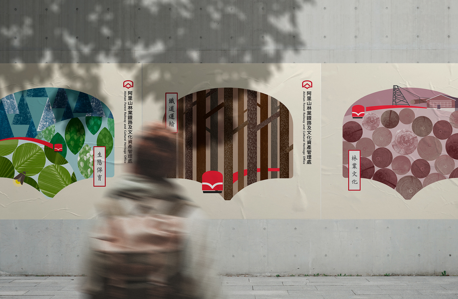
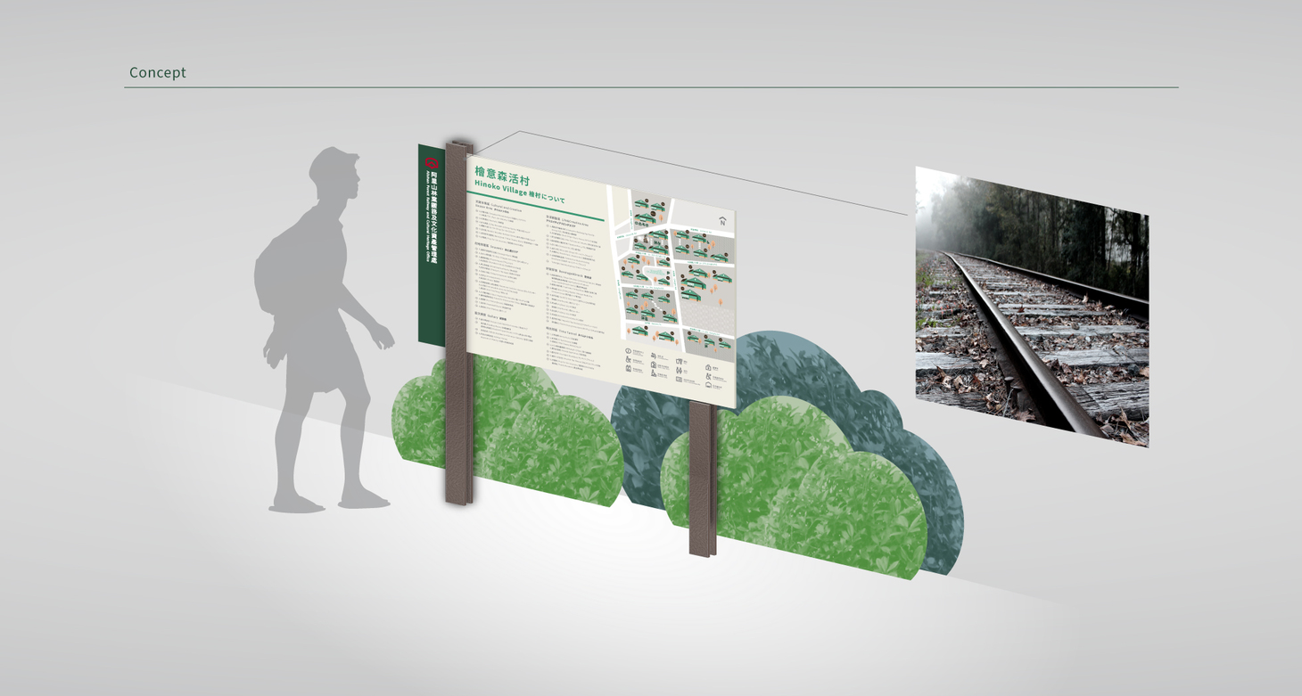
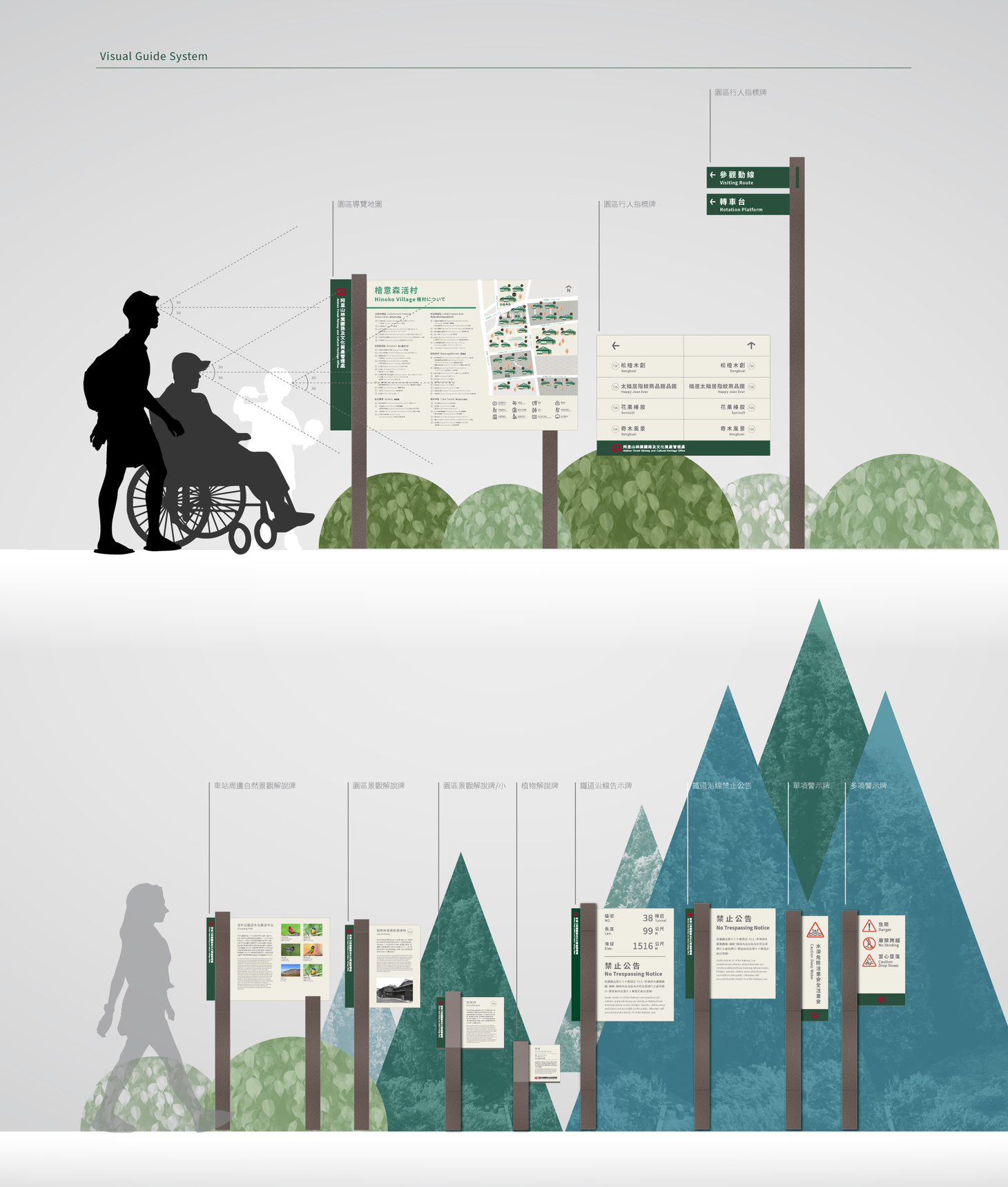
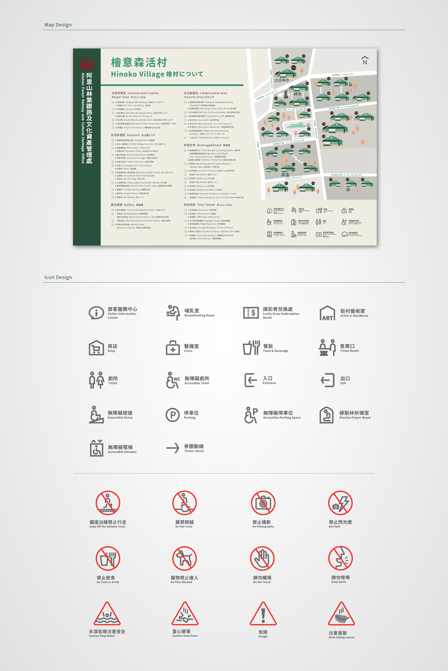
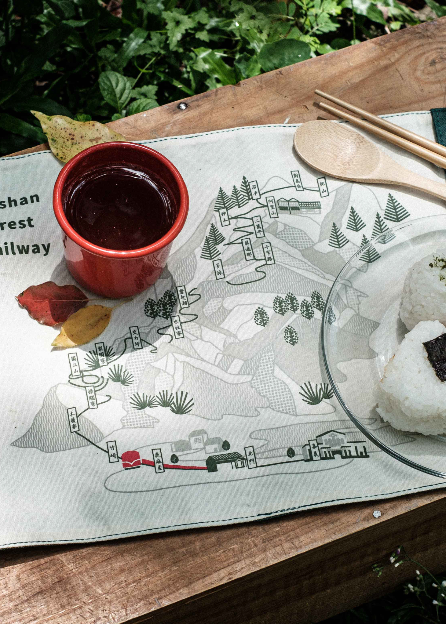
On-site inspections and in-depth analyses allowed Cizoo to re-plan and design the tourist information sign board system, which consists of guide maps, wayfinding systems, pure-text tourist information sign boards, warning signs and public announcements along the railway. H-beams covered with bark-textured enamel paint are adopted in the design to make the information boards blend better into the forest environment. The information boards will be updated through various stages and provide visitors with a more efficient wayfinding experience.
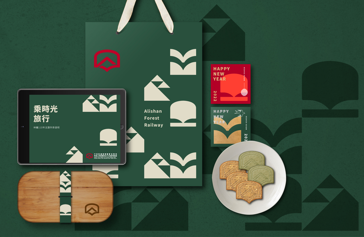
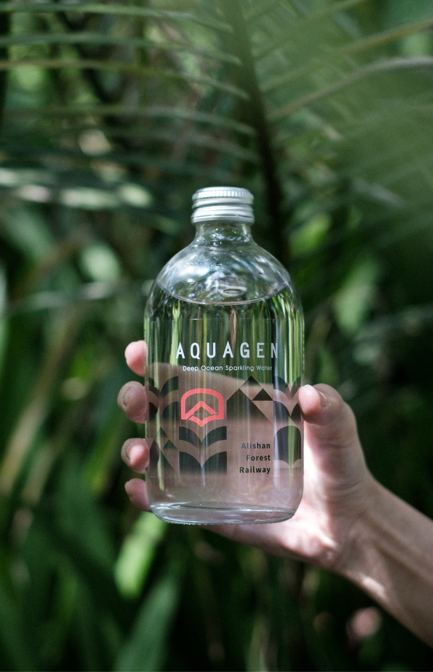
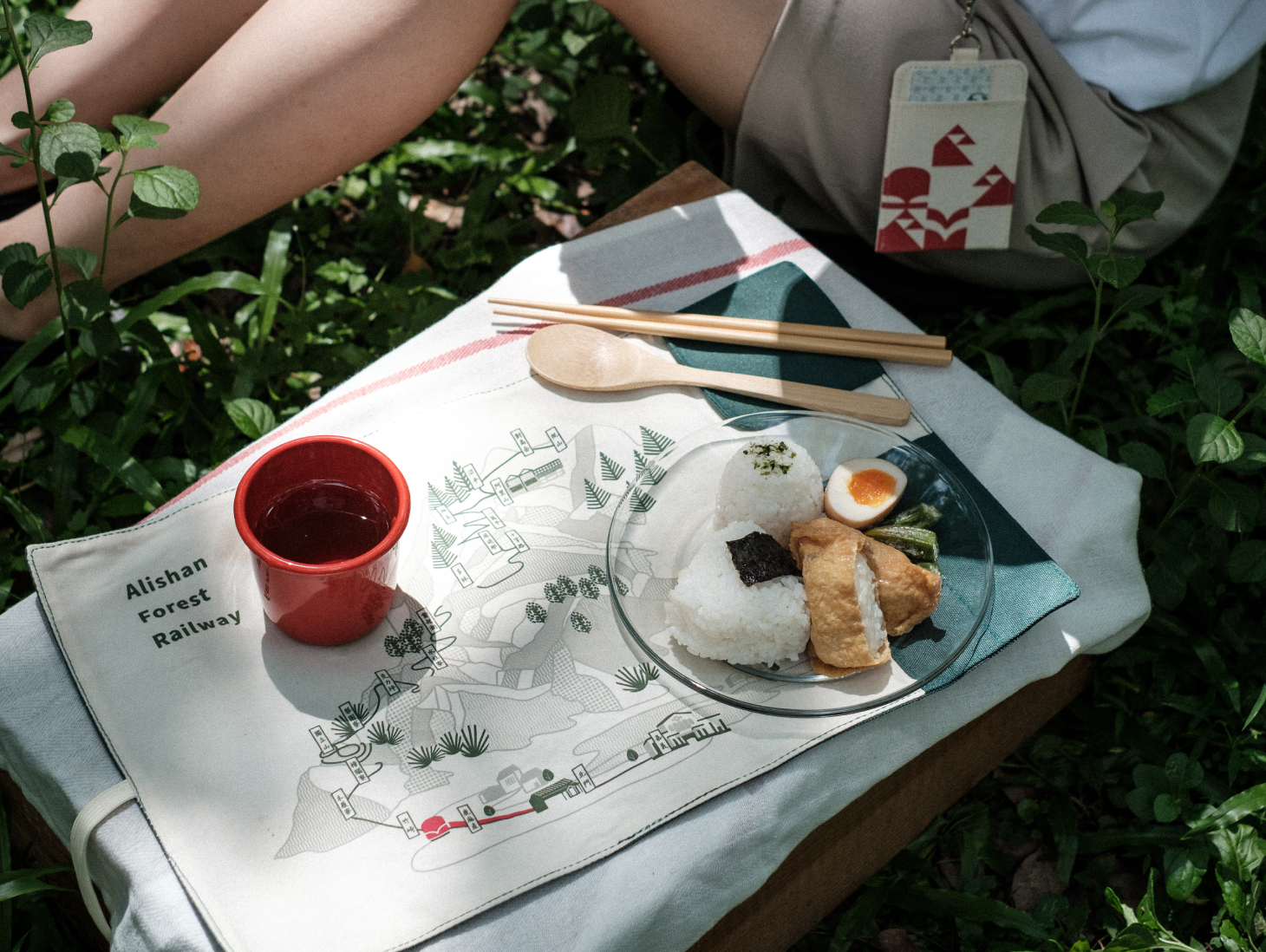
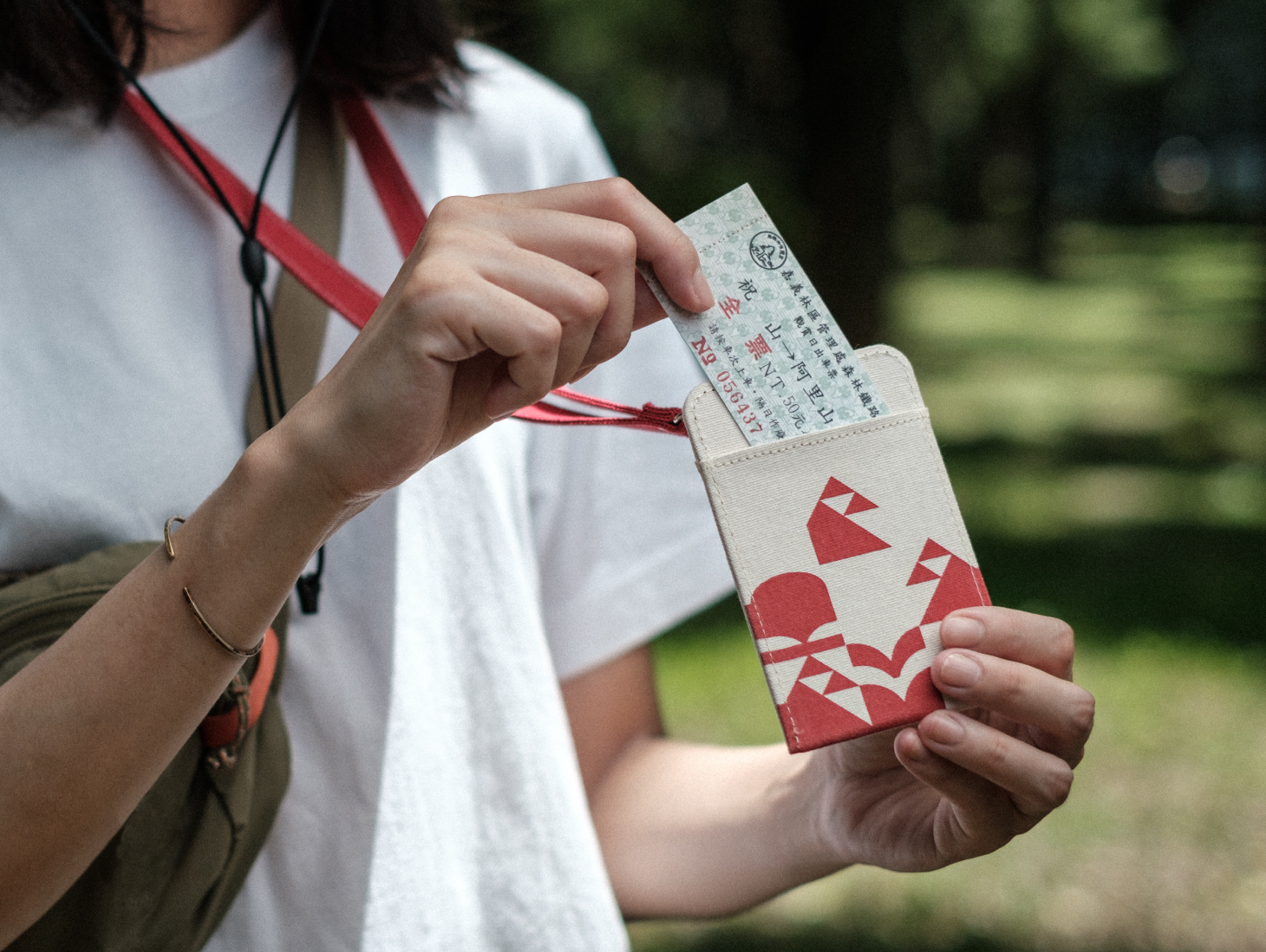
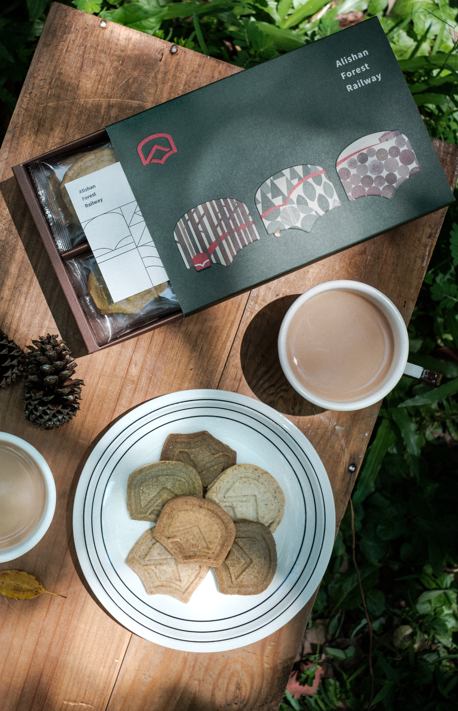
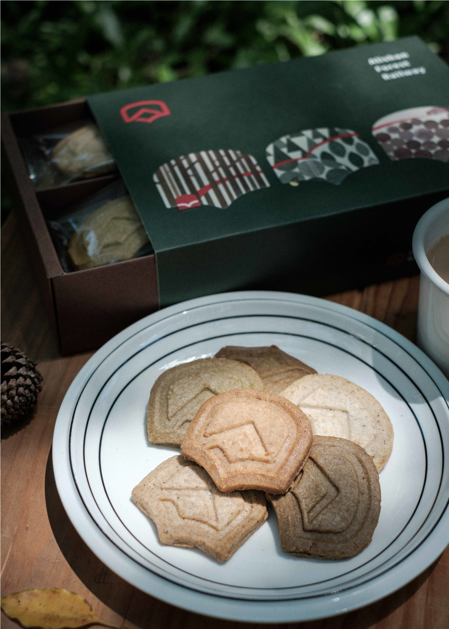
To strengthen the new positioning of the travel brand, Cizoo proposed, developed, and designed products including card holders, placemats, flavored biscuits and sparkling water. It is expected that after the full commissioning in 2023, they will facilitate global visitors to see Alishan in a new light.
阿里山林業鐵路與文化資產管理局成立以來致力於推廣林道鐵路與文化資產、林業生態的保存與維護;以永續經營為目標,以全新品牌識別出發,為臺灣文化資產打造旅運品牌的新定位。
囍樹團隊以「穿梭山林歷史,細賞窗中景致風光」為設計概念,標誌識別結合火車的窗景,融入阿里山的火車頭、日出雲海景致、展翅飛向未來的飛鳥以及隱喻守護阿里山林鐵與文化資產的決心;識別中的V形弧度如同林鐵對於安全運輸的重視,呈現舒適、穩定的視覺效果;字面大且肚圍寬的黑體標準字設計靈感取自火車車身字體,帶有鐵道工業的穩重,在應用上更多元也更易於辨識。
品牌主色調紅色代表著令人印象深刻的火車頭紅,也是阿里山鐵路開啟觀光時代的里程碑。輔助色彩中的森林綠代表阿里山森林幽靜沈穩、生態多元的生機;以及如同在山頂望向雲海般遼闊又穩定的晨光白,使識別在呈現林業文化與鐵道精神的同時,兼具穩健和活潑的生命力,為品牌注入更多元發展的力量。 輔助圖紋富有動感的視覺效果,彷佛靠在風景流動的窗邊,細賞自然風貌。
通過實地盤點現況、分析統整,重新規劃設計解說牌誌系統,包括導覽地圖類、導視系統、純文字解說牌、警告警示牌及鐵道沿線公告,設計上以帶有樹皮肌理烤漆的H鋼金屬板和堅固的鐵軌造型來融入森林的環境;未來逐步更新解說牌誌後,為遊走山中的旅客提供更快速清晰的導讀體驗。
為強化旅運全新品牌定位,提出概念商品的企劃與設計包括:卡夾、餐墊、風味餅乾及氣泡水 ... 等期望在2023年全面通車後讓世界以不同角度重新認識阿里山。
- Creative Director
- Chih-Ling Wang
- Chia-Hsiao Shih
- Visual Guide System Collaboration
- 4CUS Creative
- Art Director
- Yun-Fang Liu
- Designer
- Chen-Wei Lin
- Zi-Yin Lin
- Guan-Ru Lung
- Yen-Jen Chen
- Project Manager
- Dodo Liu
- Penny Yang
- Photographer
- Kat Leung
- Image Provider
- Alishan Forest Railway
- Zoopaper
- 阿里山林鐵