山頂鳥

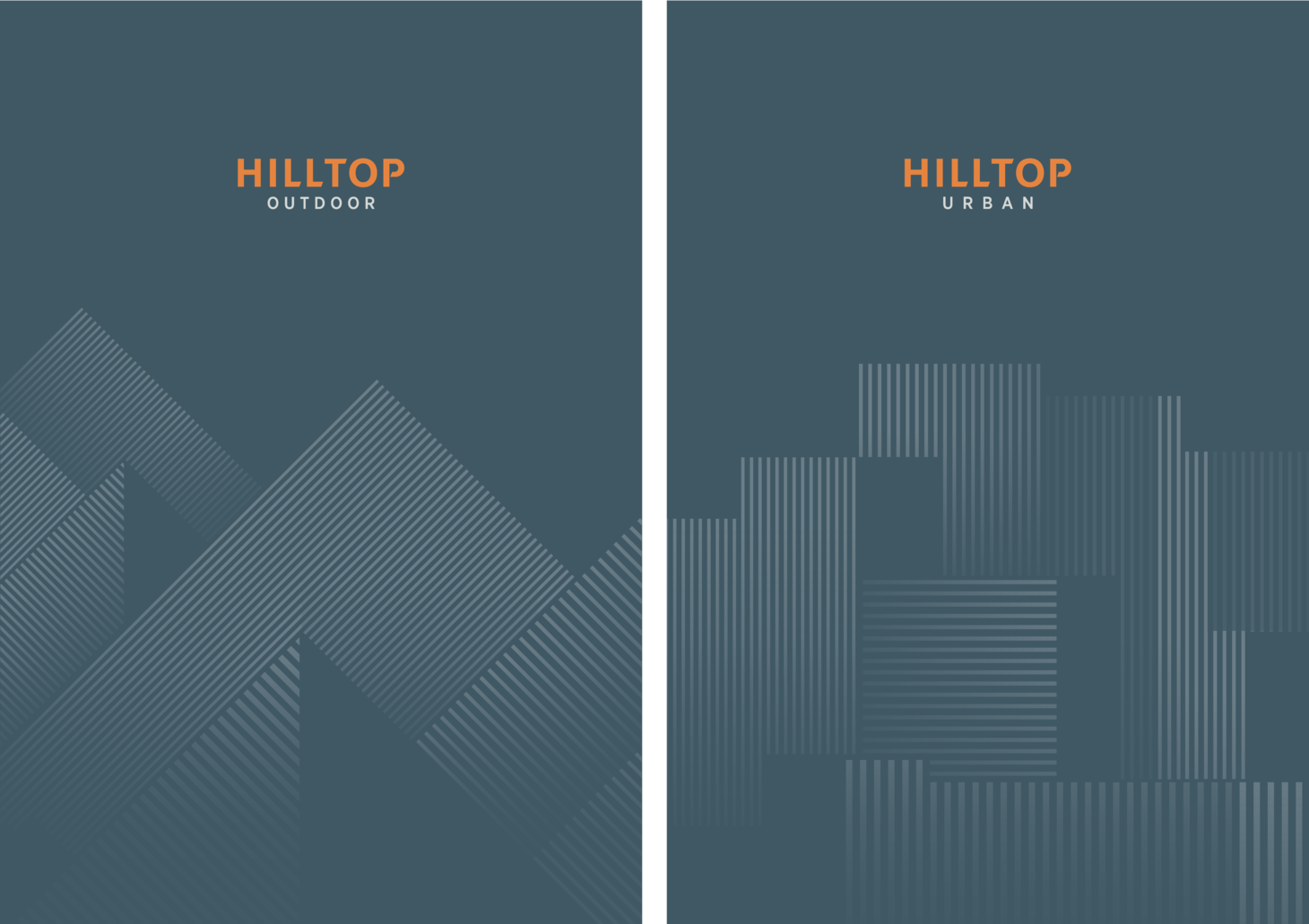
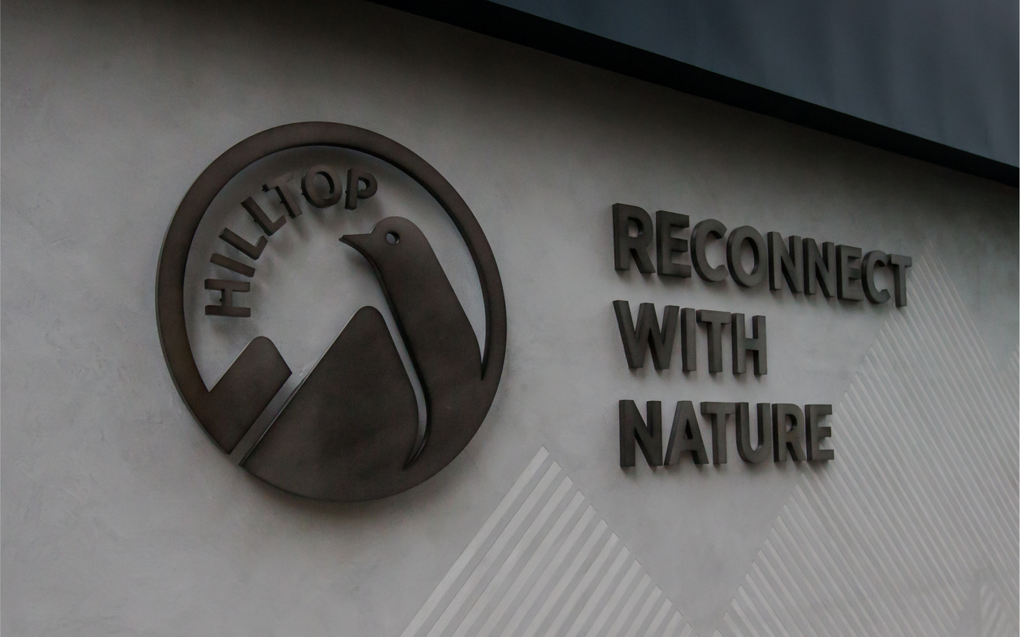
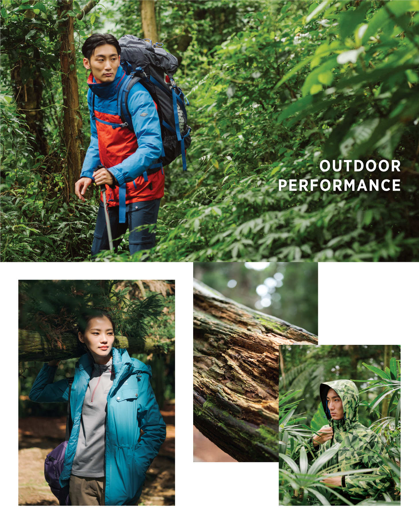
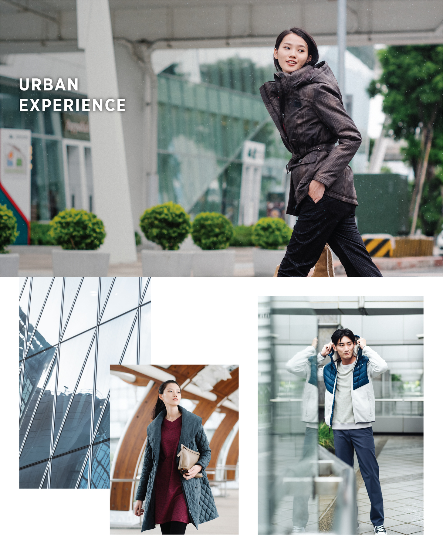
HILLTOP has been the leading brand of functional clothing in Taiwan for more than 30 years and is dedicated to creating functional wear that meets consumer needs and suits different weather conditions. During the rebranding process, it reviewed the needs of the younger generation who values outdoor sports and urban leisure activities equally. It seeks to move closer to the urban population while continuing to focus on developing high quality outdoor functional wear and products, hoping to help consumers "RECONNECT WITH NATURE" and enjoy a balanced lifestyle between city and nature.
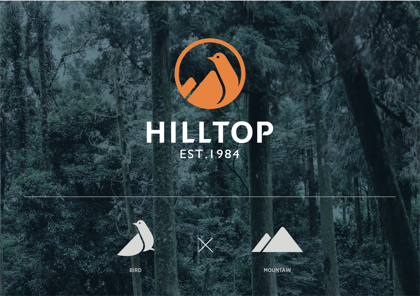
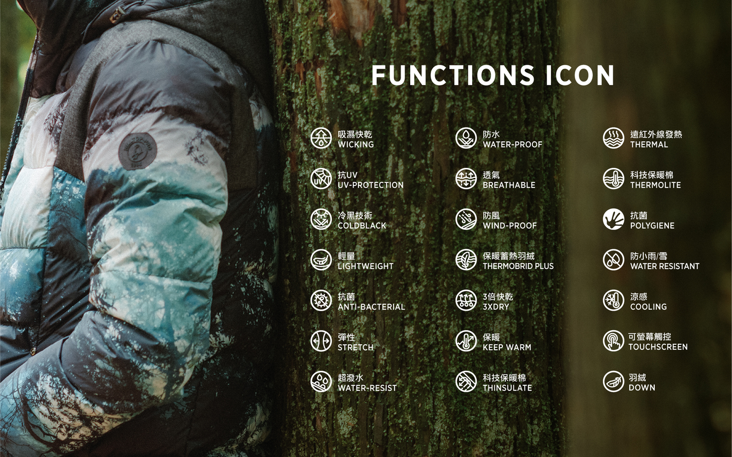
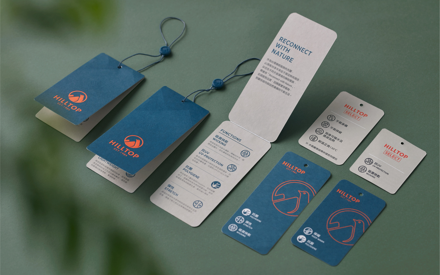
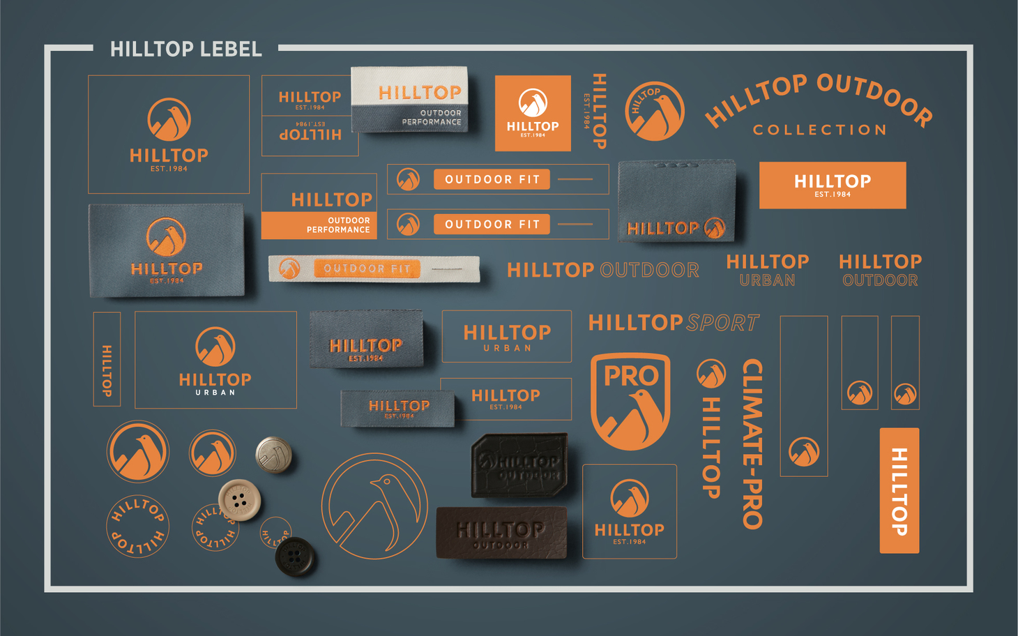
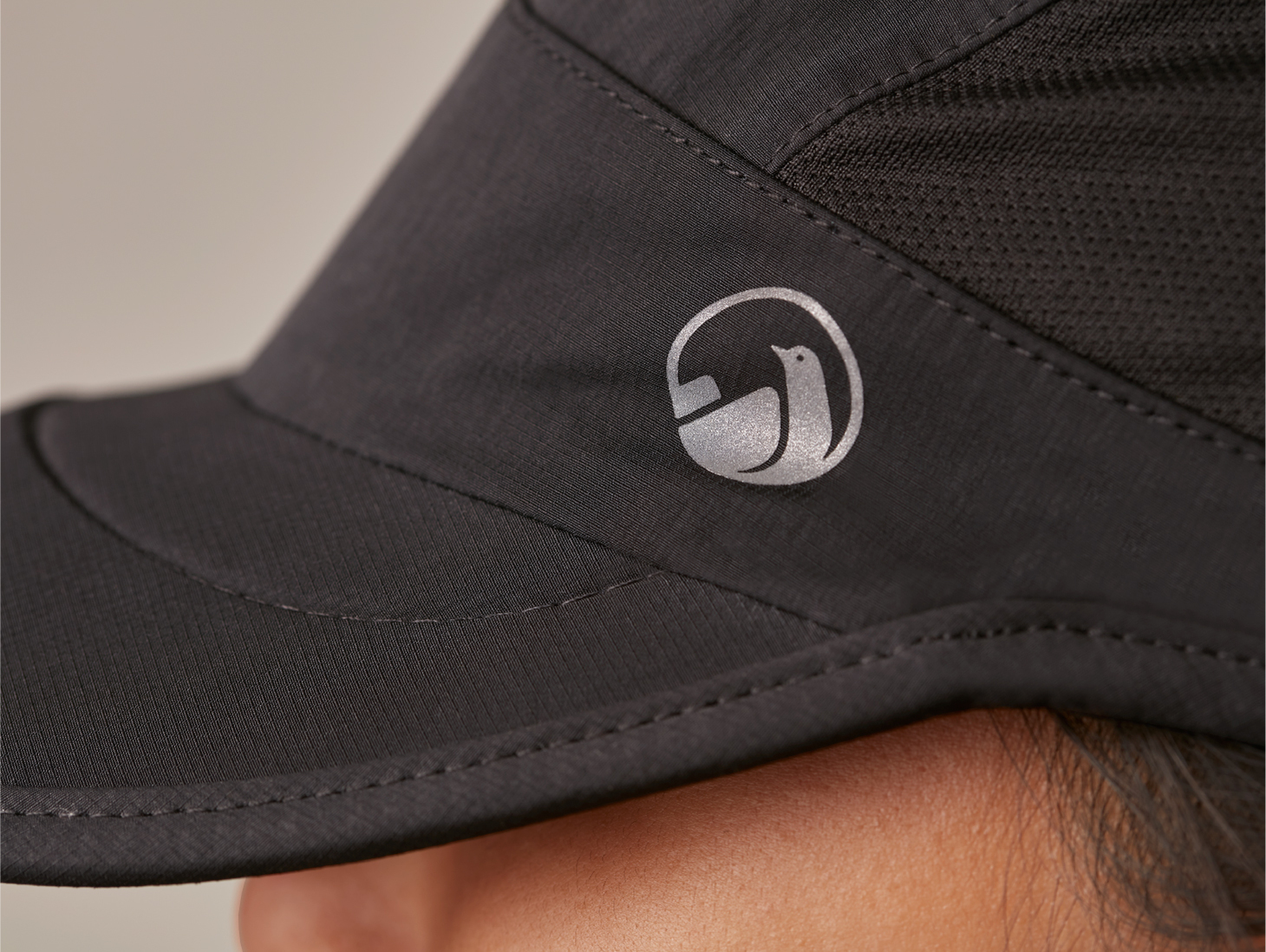
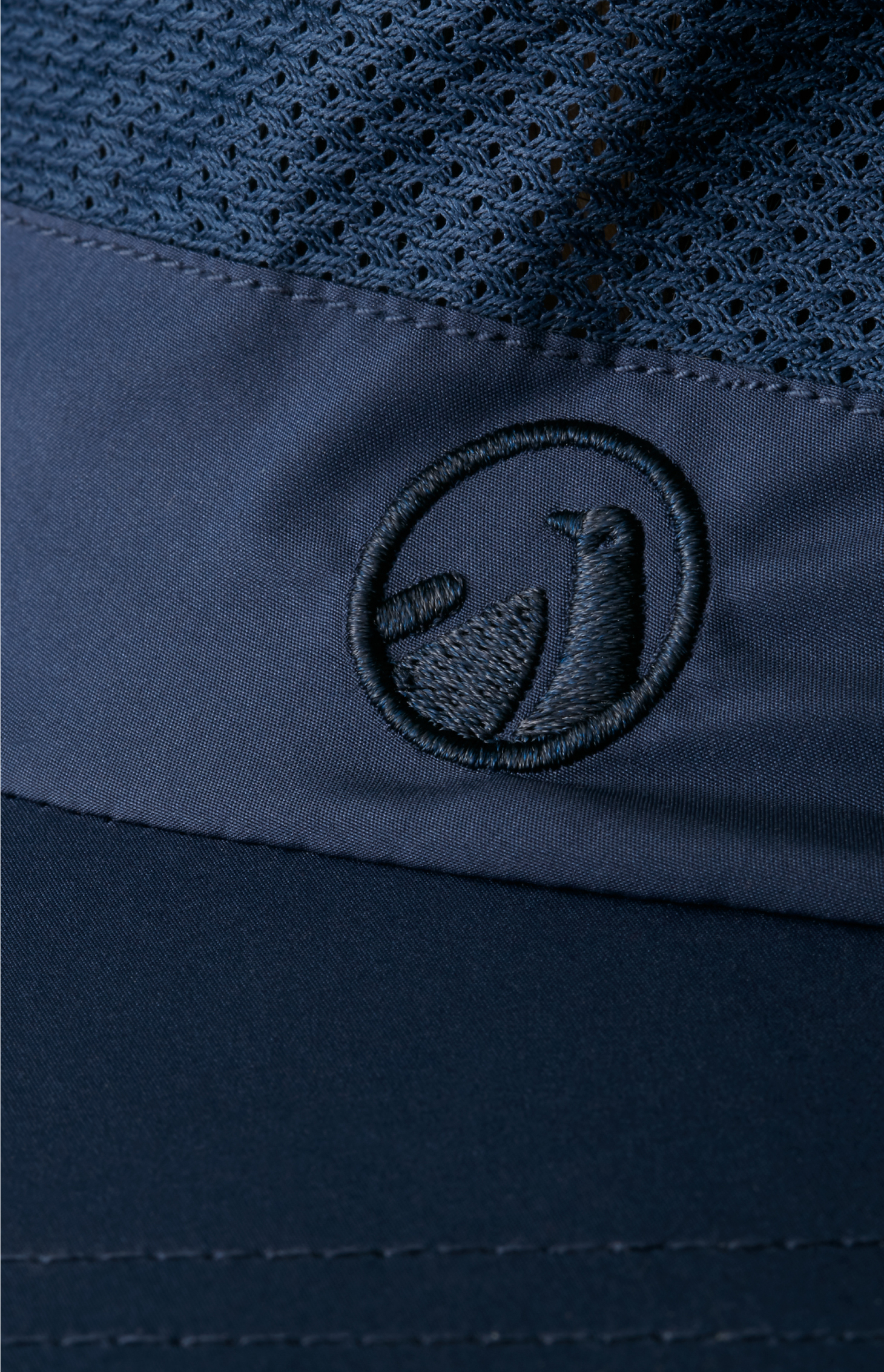
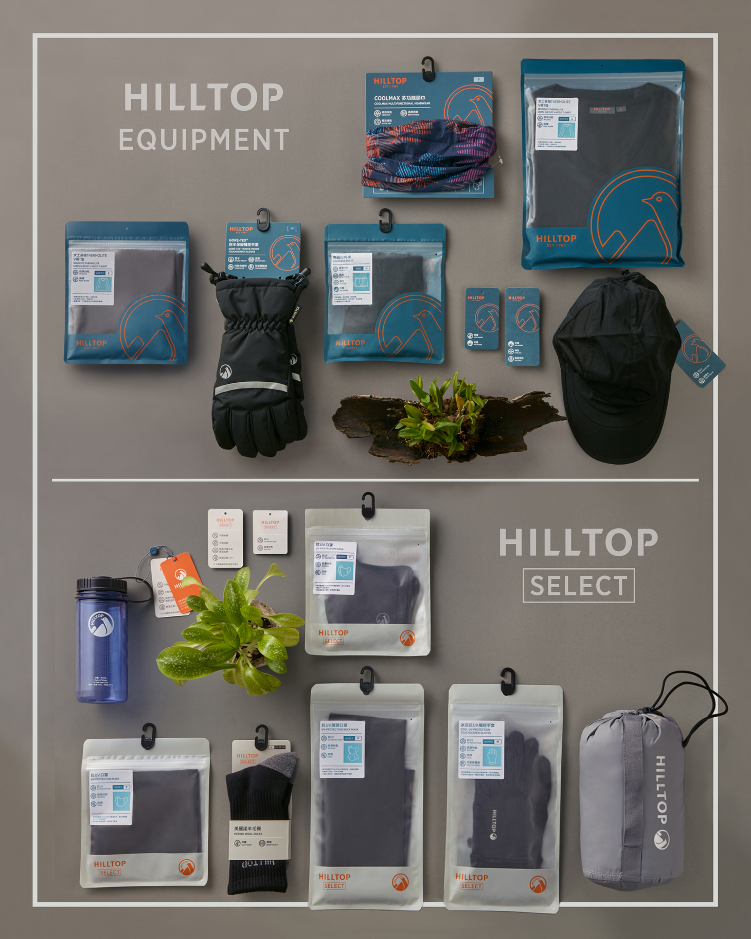
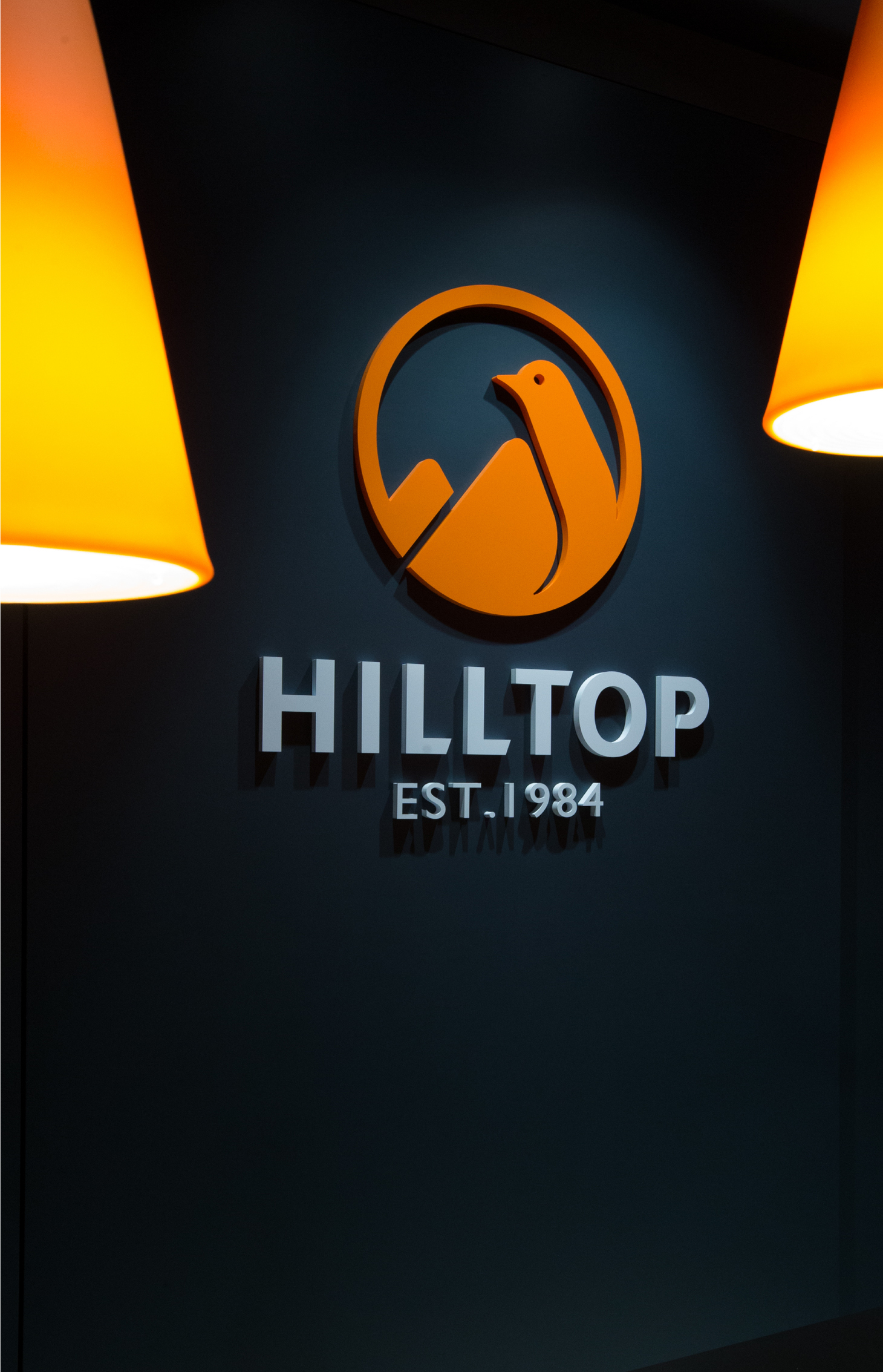
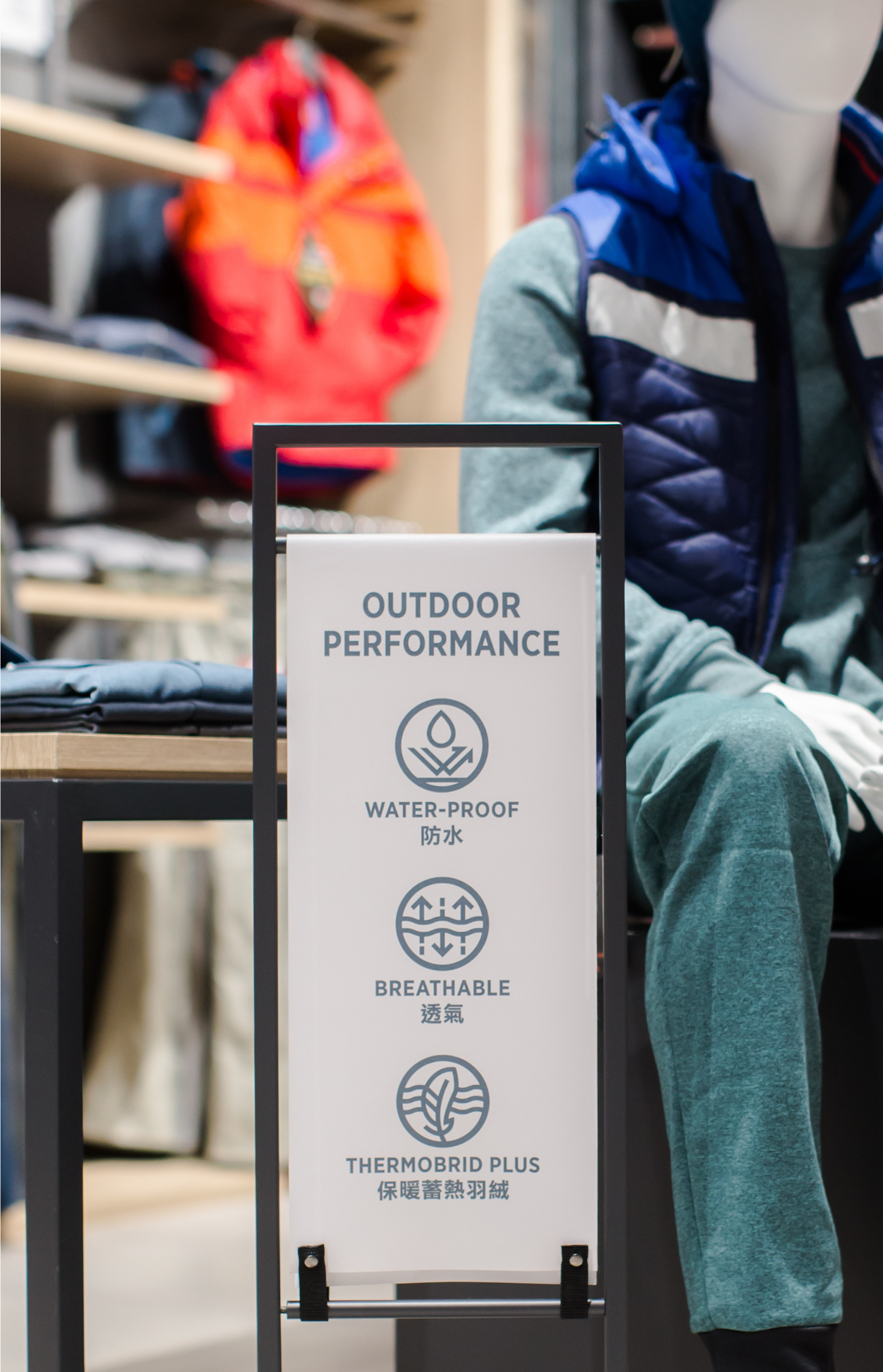
With a more refined symbol, the new brand identity embodies the concept of "a bird fearlessly bracing for winds and rain on the hilltop." It aims to achieve brand rejuvenation while solving the problem of poor recognizability in product design, store image and digital carrier caused by the complicated old design. Introducing the dirty blue color has allowed the orange color to pop and has brought depth to the new design. A complete set of infographics has been developed to illustrate and communicate the advanced functions of the brand’s outdoor lineup.
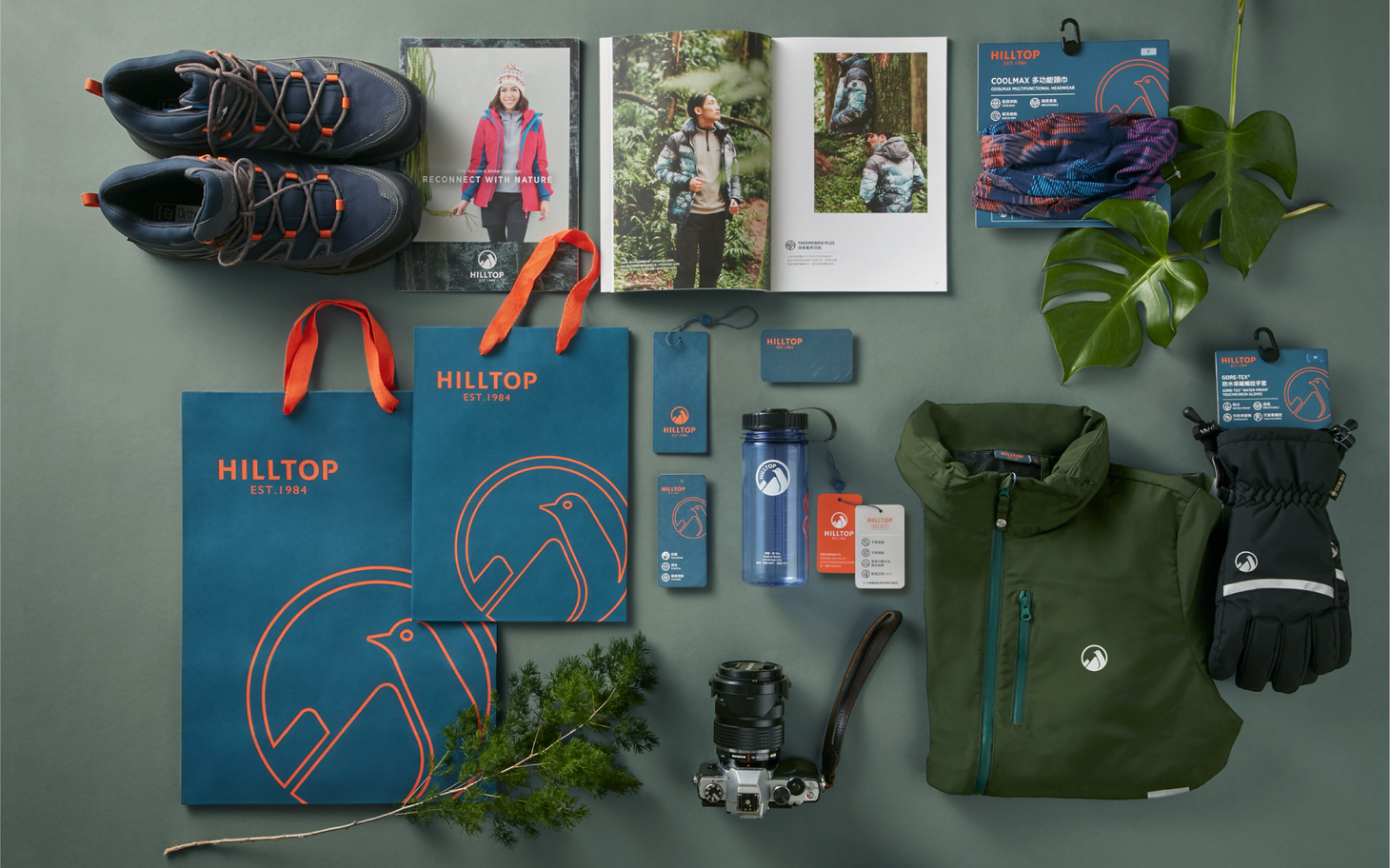
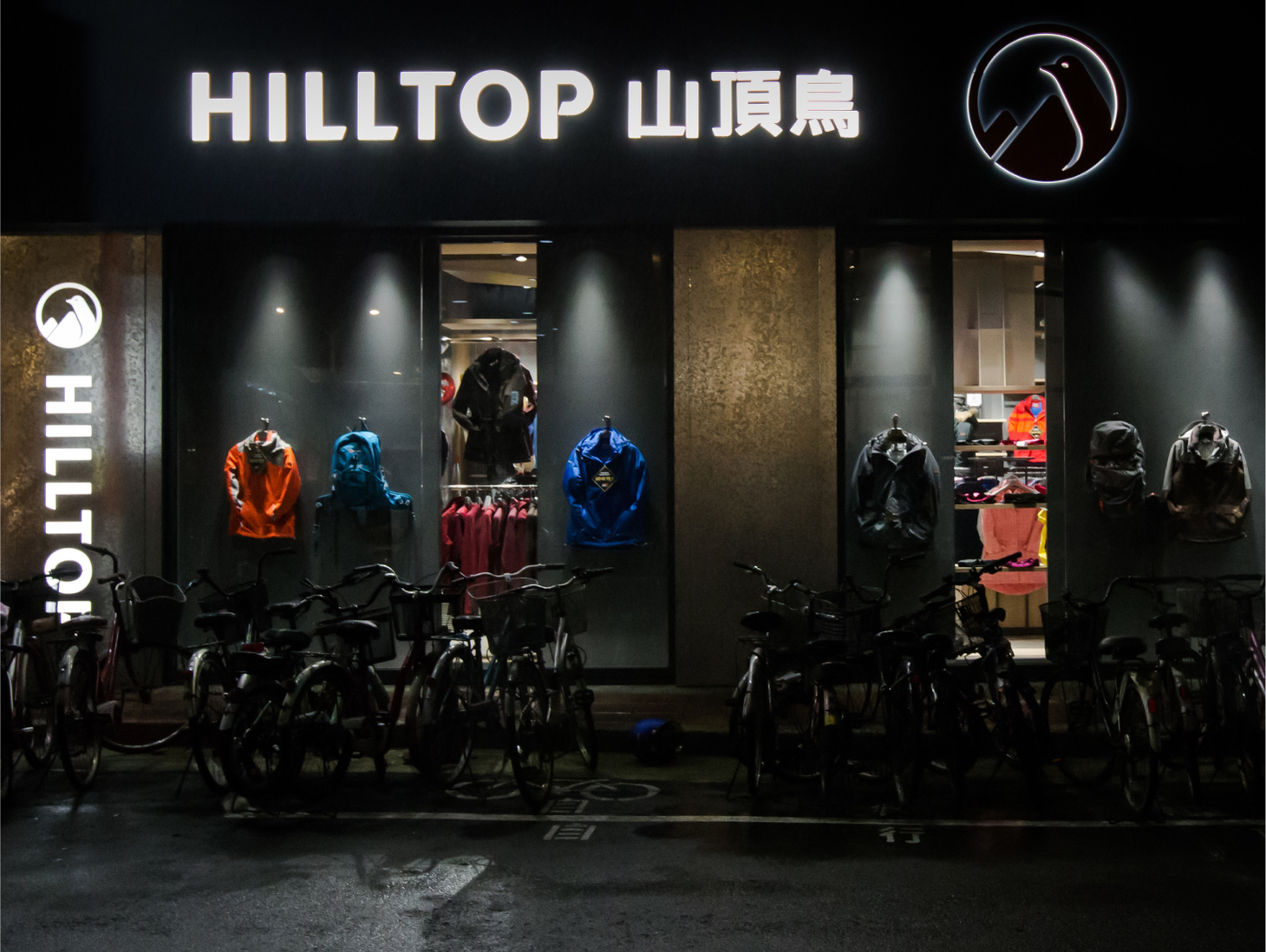
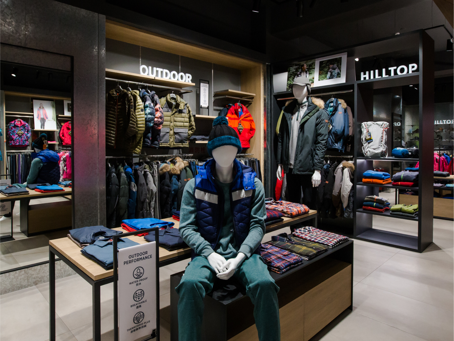
Cizoo guided the client to rebrand in two stages. The aim of stage one was to transform the image of the new Xinyi store with new interior design and identity. This has been achieved by analyzing and integrating the store’s circulation planning, merchandise display system, marketing communication points and props, and the image of its seasonal catalogs. Stage two focused on developing new product accessories and packaging design system. With the new product accessory design, we have successfully answered to the application needs of combining various materials and sizes together. The redefined strategy allowed us to come up with a new packaging design plan to accommodate the brand’s “original products" and "curated products.”
作為台灣機能服飾的先驅,山頂鳥30多年來致力於開發符合消費者需求並切合不同天氣環境的機能服飾,在品牌重塑的過程中重新思考戶外運動與都會休閒⽣活兩者同樣受重視的新世代,山頂鳥期許持續以⾼品質的⼾外機能產品為核心,同時更貼近都會生活,在尋找都市與⾃然兼備的平衡⽣活中,重回自然的感動「RECONNECT WITH NATURE 」。
全新的品牌識別將「山頂上無懼風雨的鳥」以更精練的符號呈現,希望品牌年輕化同時改善原先識別過於繁複,導致產品設計、 門市形象、 數位載具的辨識度不佳。品牌色彩計畫加入鐵灰藍為第二輔助色,在凸顯橘色的前提下也形塑生活風格的質感。輔助圖文則發展全系列專業功能圖說,溝通⾼品質的⼾外機能訴求。
囍樹協助進行階段性的品牌改造,第一階段改造信義新門市形象,從空間設計與空間識別打造實體通路新形象,重新梳理及整合消費者的遊逛動線、 商品陳列系統、行銷溝通點位和道具及季節目錄形象。第二階段發展全新產品配件設計和包裝設計系統,產品配件設計重點在於跨材質、多樣尺寸的應用需求,產品包裝則是重新設定「開發商品」與「選品商品」兩條軸線的包裝設計策略,設計出定位清晰的整體包裝。
- Creative Director
- Chih-Ling Wang
- Designer
- Yun-Fang Liu