楹春紀事 以茶生活
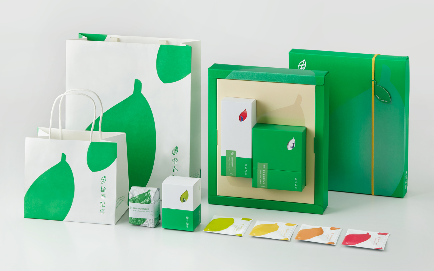
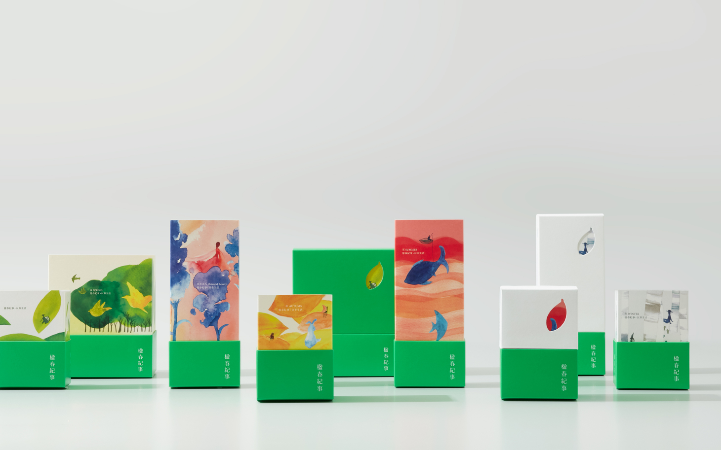
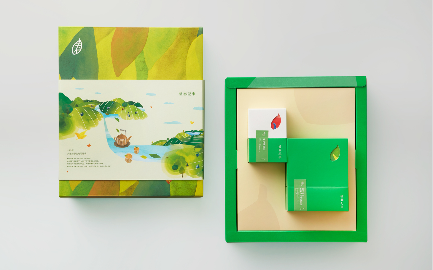
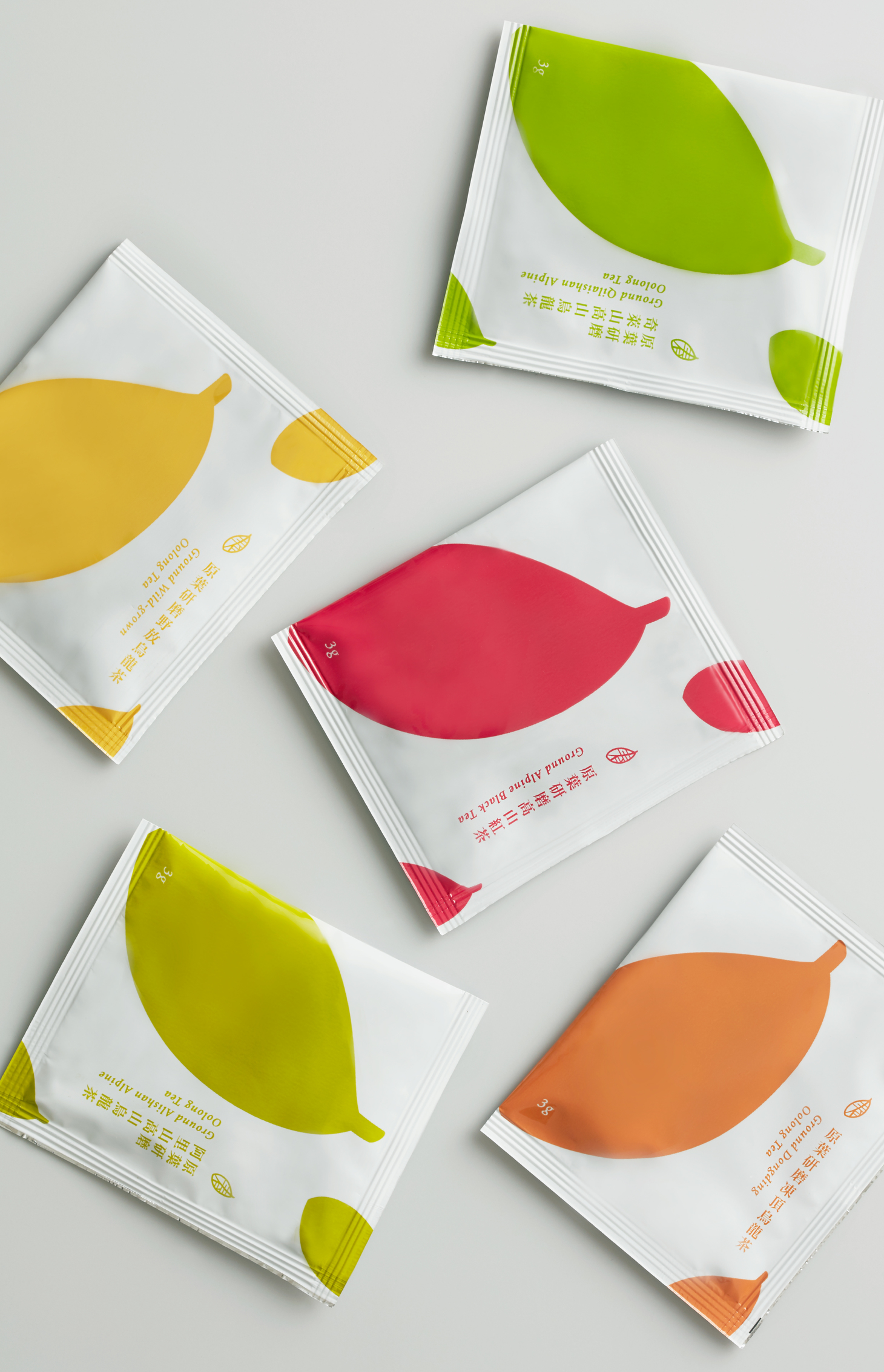
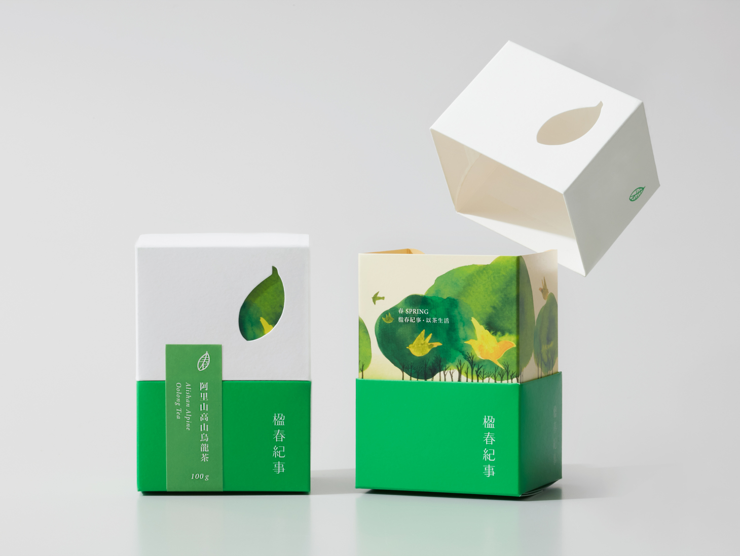
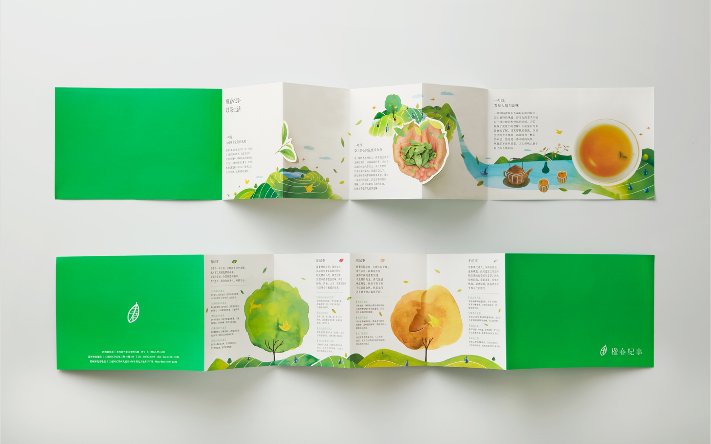
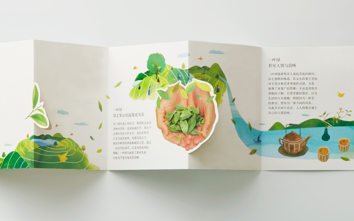
The four seasons begin with spring, when green sprouts unfold like new lives. It’s the perfect time to drink Idun’s Gift’s tea and enjoy the endless possibilities of life it brings. For brand identity, we chose tea sprout to symbolize the beginning of all seasons, introducing the idea of a life centered on tea. The packaging is designed for everyday teas, so we decided it keep it succinct. We came up with a foldable structure which can store the tea bags and change form according to the four seasons. The packaging reflects the variety of solar terms in a life centered of tea, creating a unique scenery every day. The bright green color is a symbol of plants and vitality; it represents spring, the beginning of all lives.
春為四季之始,嫩芽如生命般開展,飲這杯楹春茶,引出生活的萬千趣味。品牌識別以一片嫩芽葉片為概念帶出季節之始,展開以茶生活的核心精神。包裝整體規劃以生活茶品為主軸,捨去過度包裝,重新思考可折疊收納與系列視覺可依四季變化的包裝結構,呈現茶生活中豐富的節氣變化,日日都有不同的景色。鮮明的綠色則是植物與生命力的象徵,代表了萬物之始的春天。
- Creative Director
- Chih Ling Wang
- Designer
- Elica Tzeng
- Karin Liu
- Raku Li
- Yo Hsin Lin
- Illustrator
- Guan Ru Lung
- Animator
- Yen Jen Chen

