朵頤排餐館
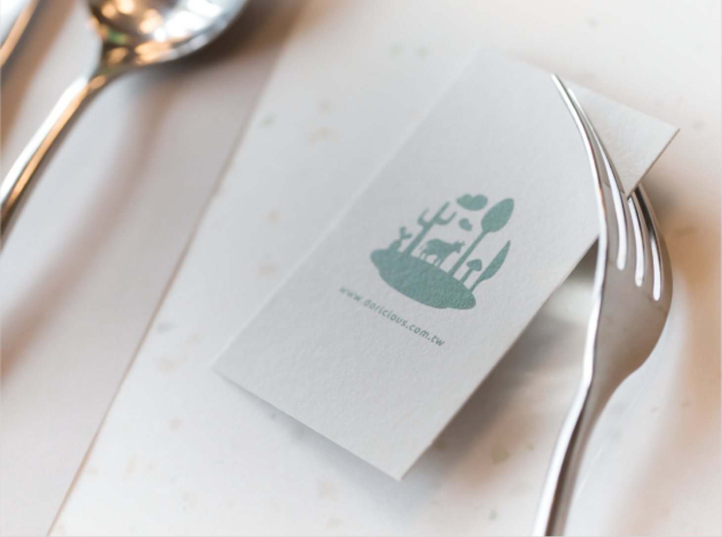
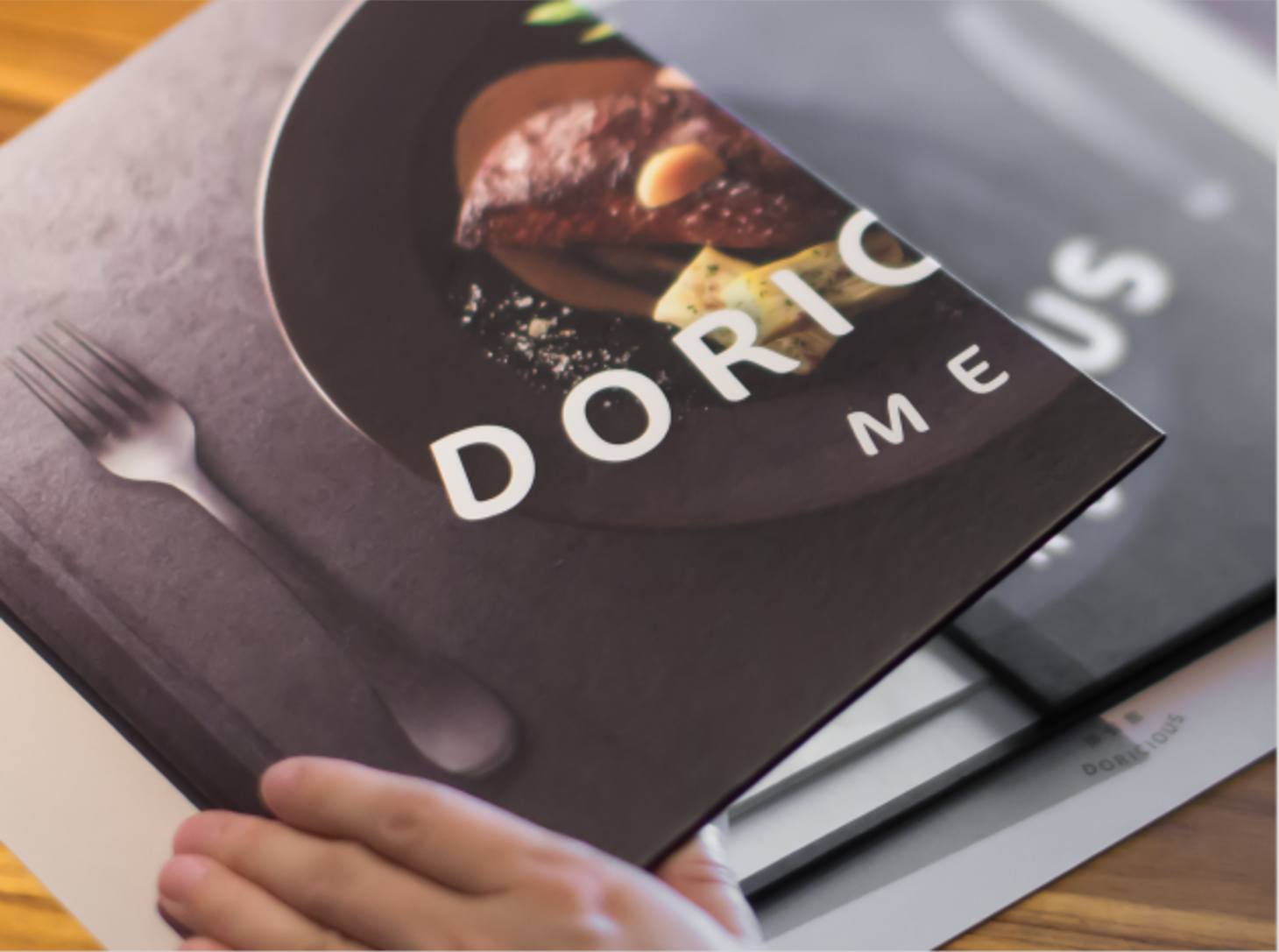
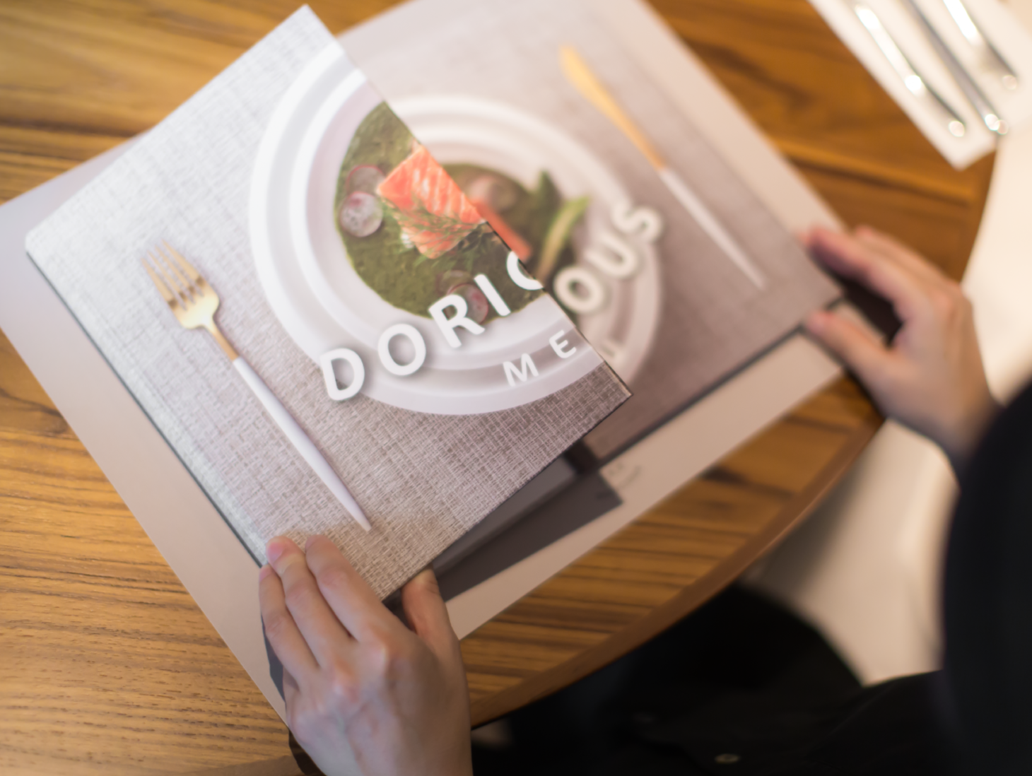
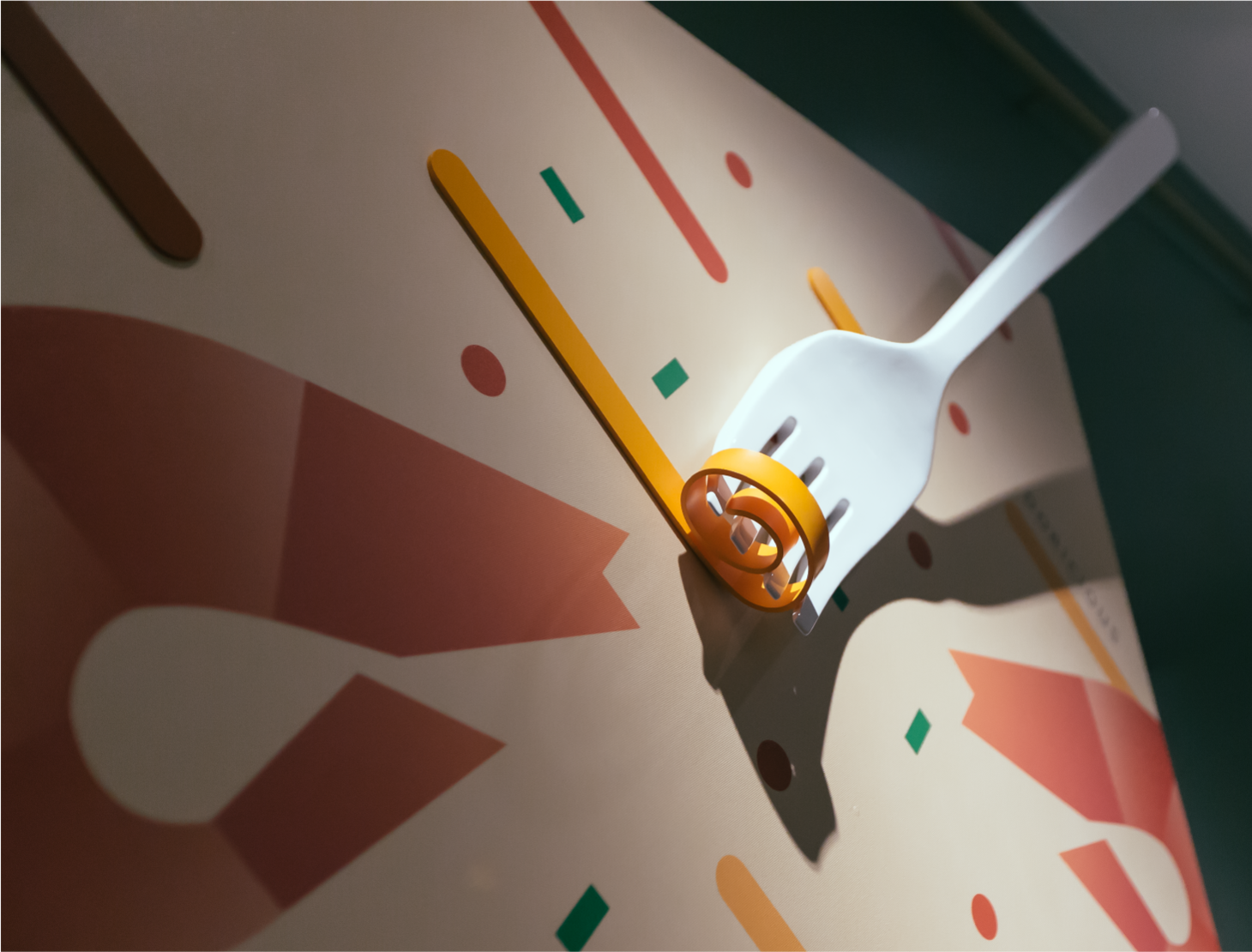
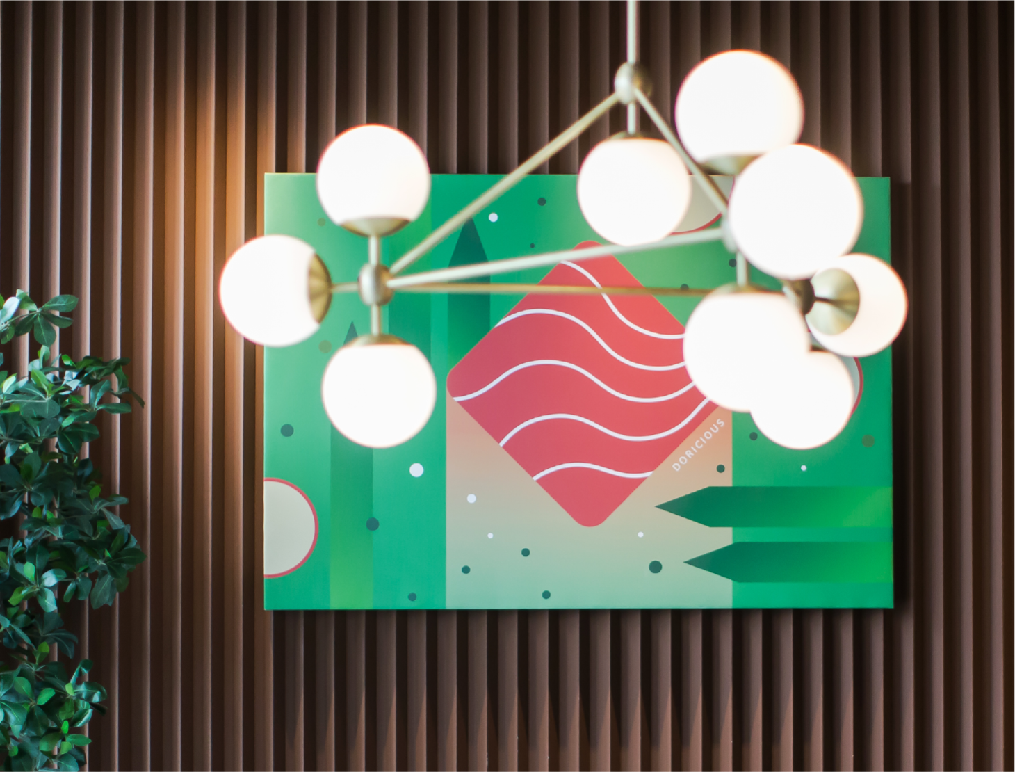
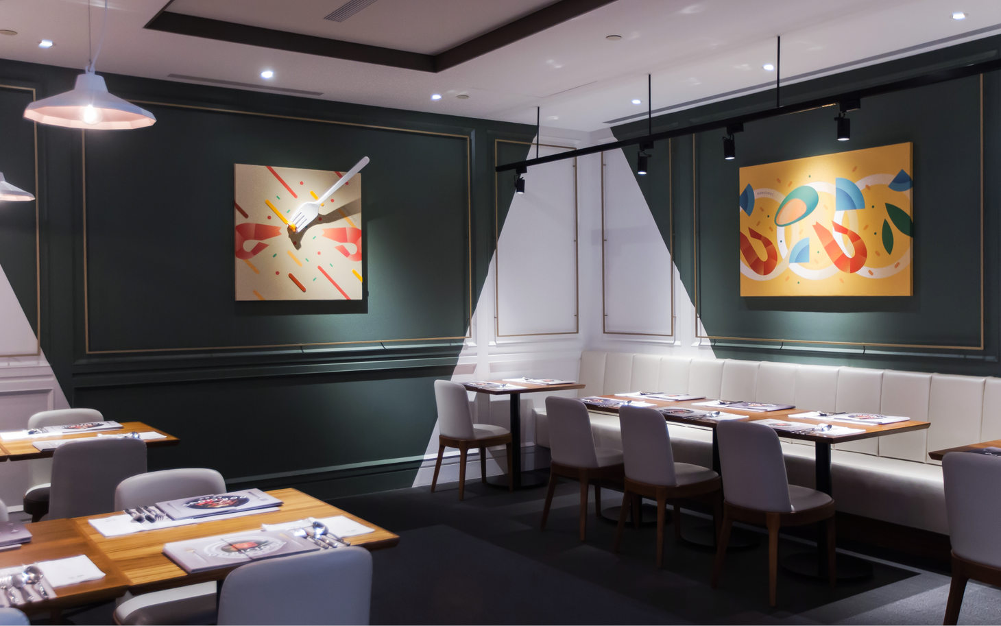
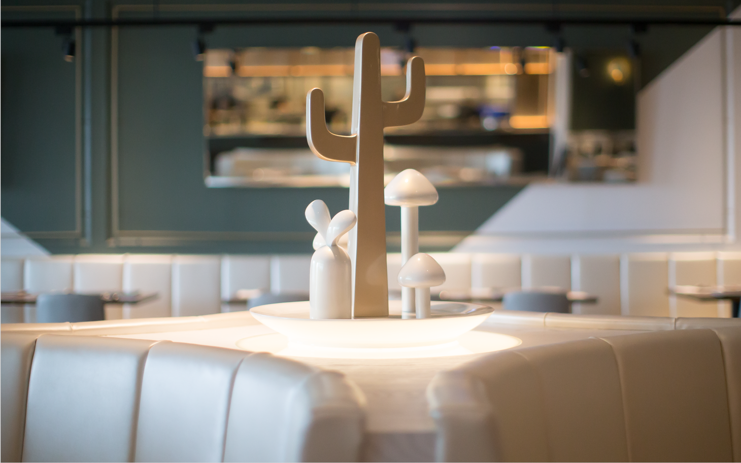
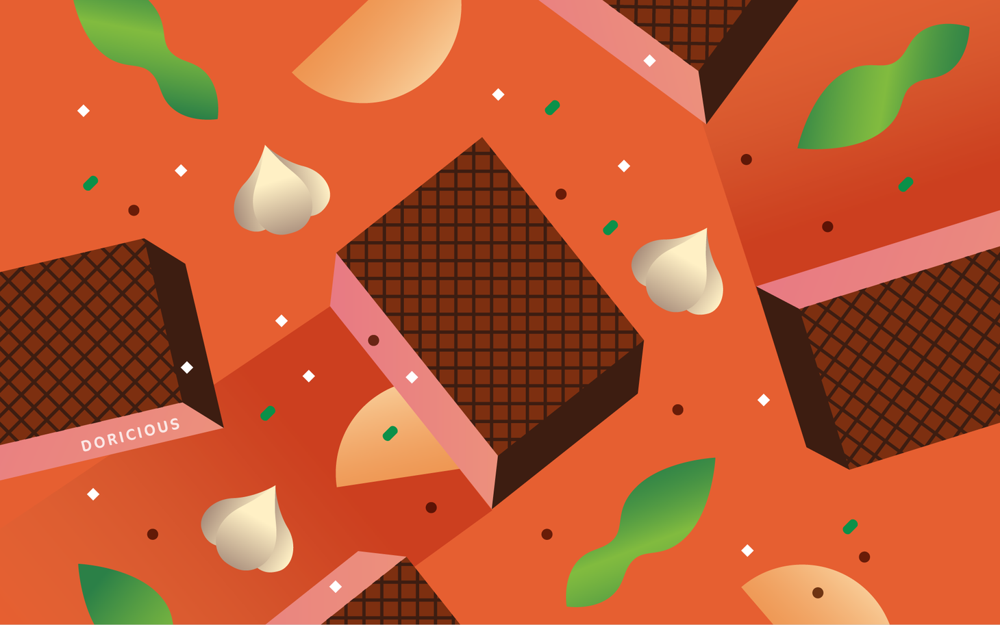
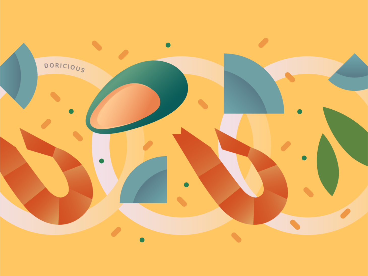
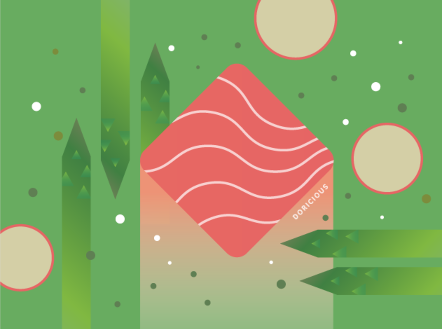
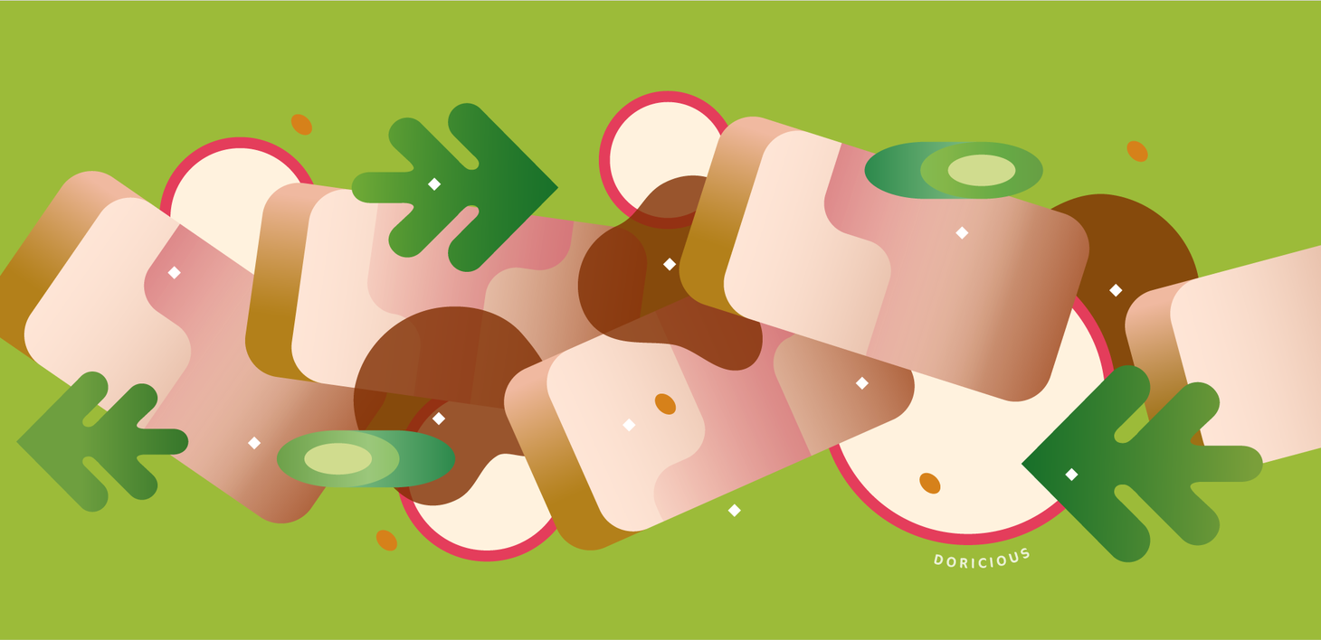
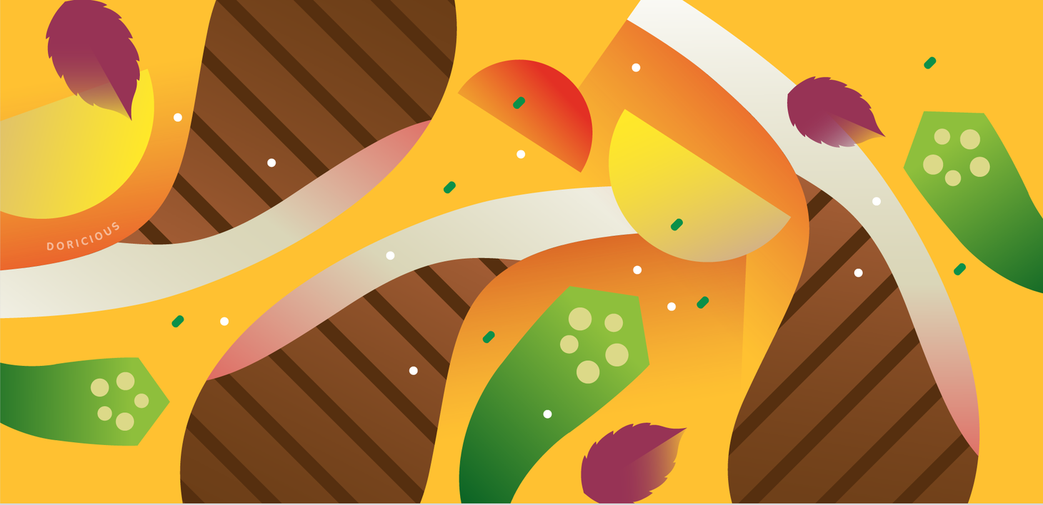
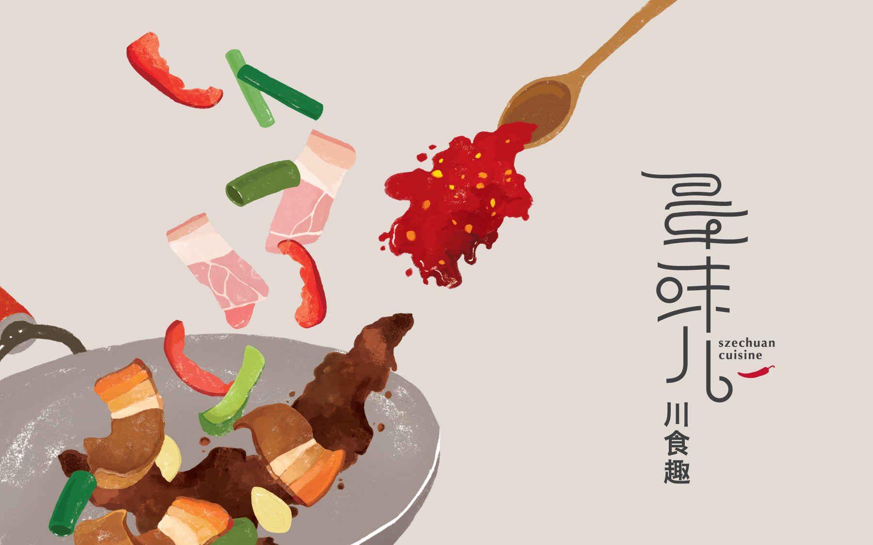
“Doricious” is a combination of the sound of the brand’s Chinese name (Dori, which means to eat one’s fill) and the meaning of “delicious.” This new word corresponds to the brand’s idea to invite customers to eat their fill. Based on the design concept “scenery on the plate,” we developed the brand identity, plating of copious amounts of food, abstract illustration of food elements and three-dimensional sculptures in the space. We transform scenery in the eyes and enjoyment on the taste bud into greatest satisfaction in the heart.
將朵頤的音譯 Dori 與 Delicious 一同造出新字 Doricious,呼應大快朵頤的品牌精神。以「餐盤上的風景」為設計概念,從品牌識別,餐點的豐盛擺盤設定、食物元素的抽象風景插畫,與空間裡的立體雕塑,將眼中的風景、舌間上的味覺享受,化為心裡最滿足的滋味。
- Creative Director
- Chih-Ling Wang
- Art Director
- Elica Tzeng
- Designer
- You Wen Cao