阿里山林鐵
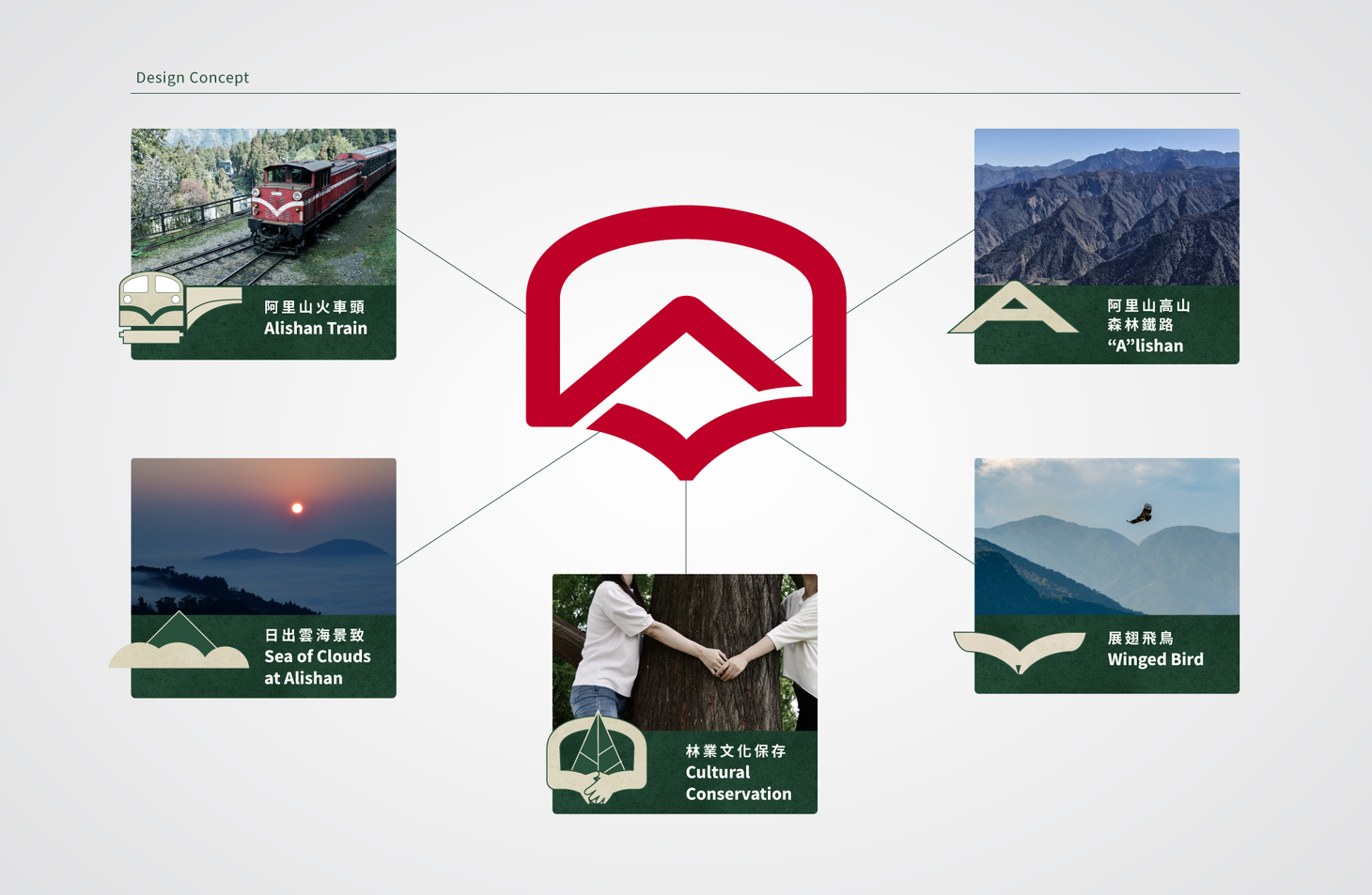
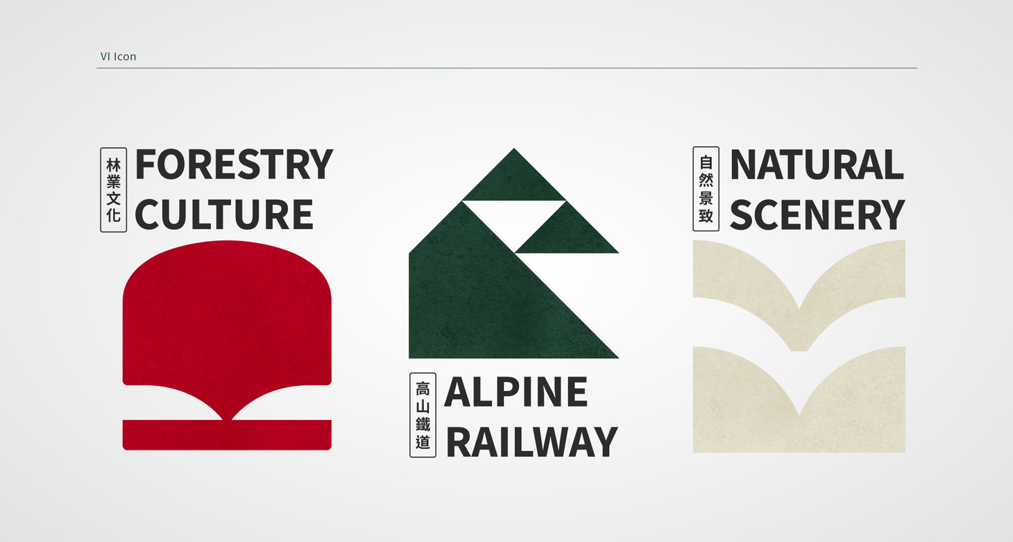
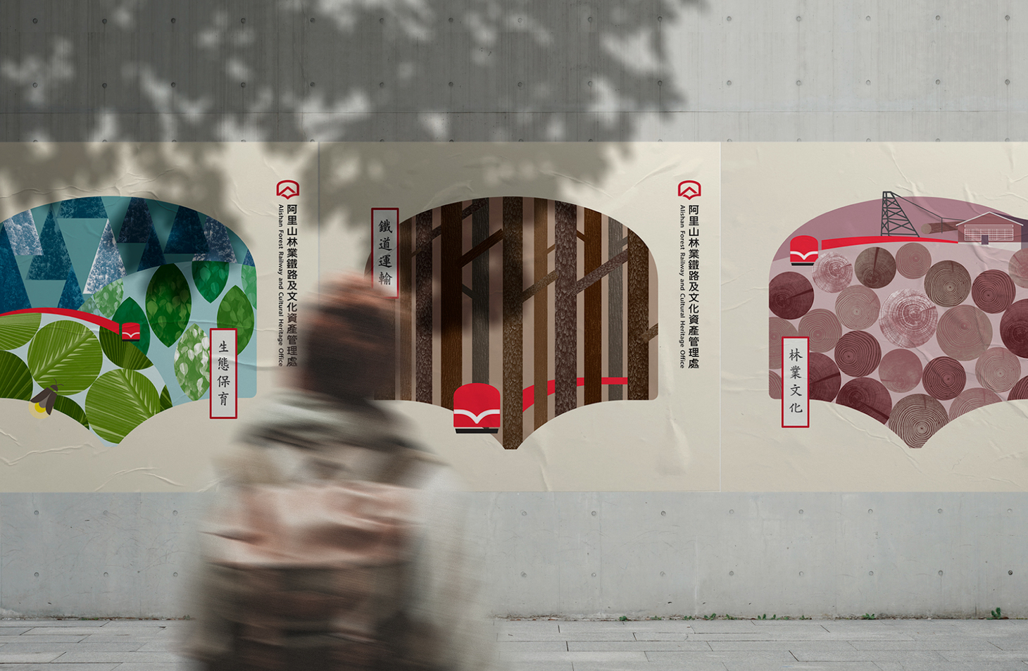
Alishan Forest Railway Brand Revamp|Cizoo&Co Unveils a New Travel Identity for Cultural Heritage Sustainability Since its establishment, the Alishan Forest Railway and Cultural Heritage Office has been dedicated to preserving Taiwan’s forest railways, cultural heritage, and ecological forestry. With a vision of sustainable operation, the organization has launched a new travel brand identity, reshaping the image of Taiwan’s cultural assets for the modern traveler. Cizoo&Co developed the concept “Travel through forest history, appreciate the scenic beauty beyond the train window,” merging the essence of forest railways with the visual poetry of nature. The logo design integrates the iconic train window, the red locomotive, sunrises and sea of clouds, and a bird in flight—symbolizing both a forward-looking spirit and the commitment to safeguarding Alishan’s railway and heritage.
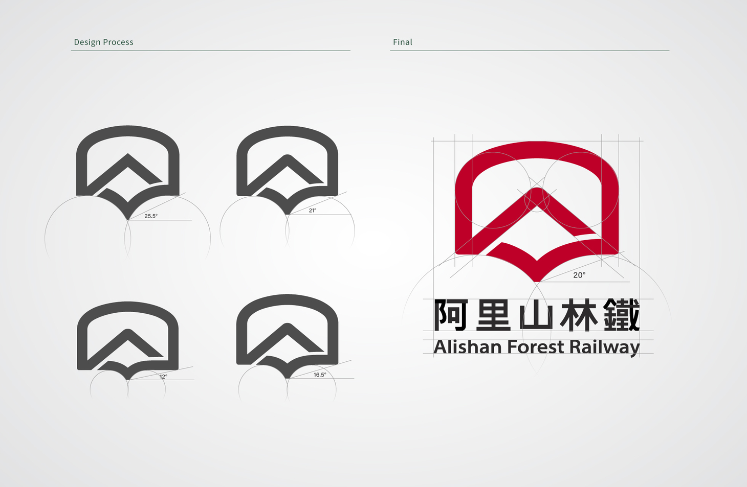
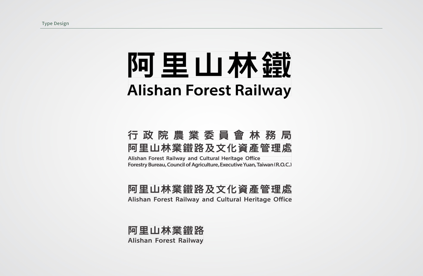
The V-shaped arc within the symbol reflects both rail tracks and the railway’s focus on safe, stable transportation. The logotype features wide, bold strokes inspired by traditional train car lettering, expressing the stability of railway industry aesthetics while ensuring high readability and versatility across applications.
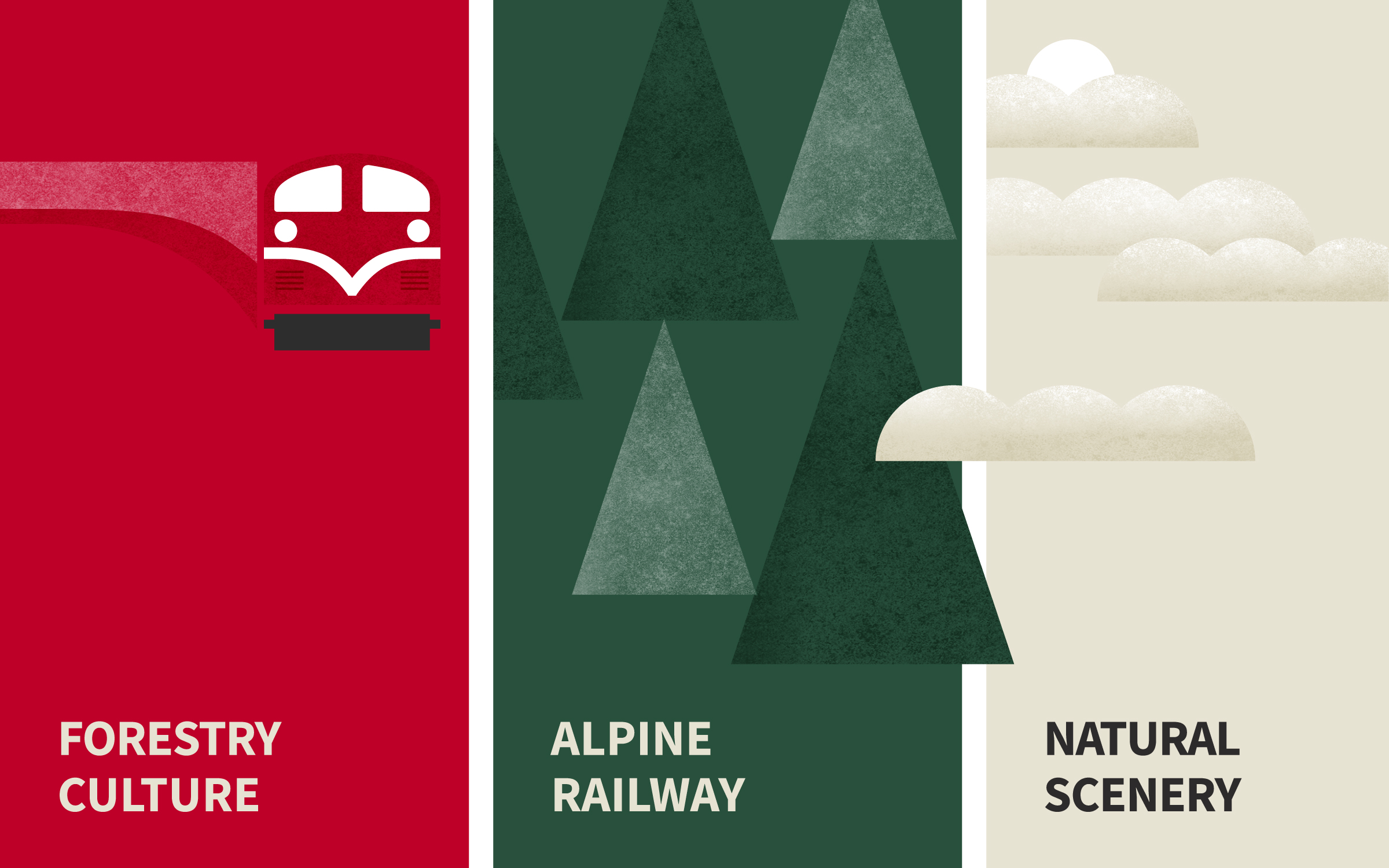
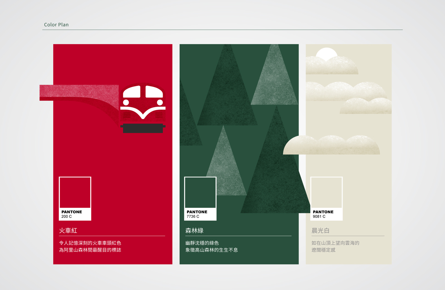
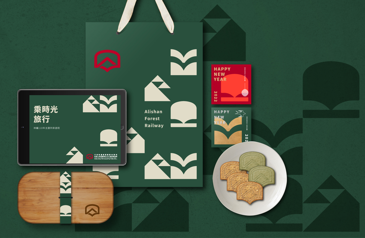
The brand’s primary color, Locomotive Red, recalls the iconic image of Alishan’s early tourism boom. Supporting colors include Forest Green, evoking the region’s lush, biodiverse landscape, and Morning White, reminiscent of the vast sea of clouds atop the mountain. This palette conveys both the natural richness and the dynamic, enduring vitality of the railway’s cultural spirit.
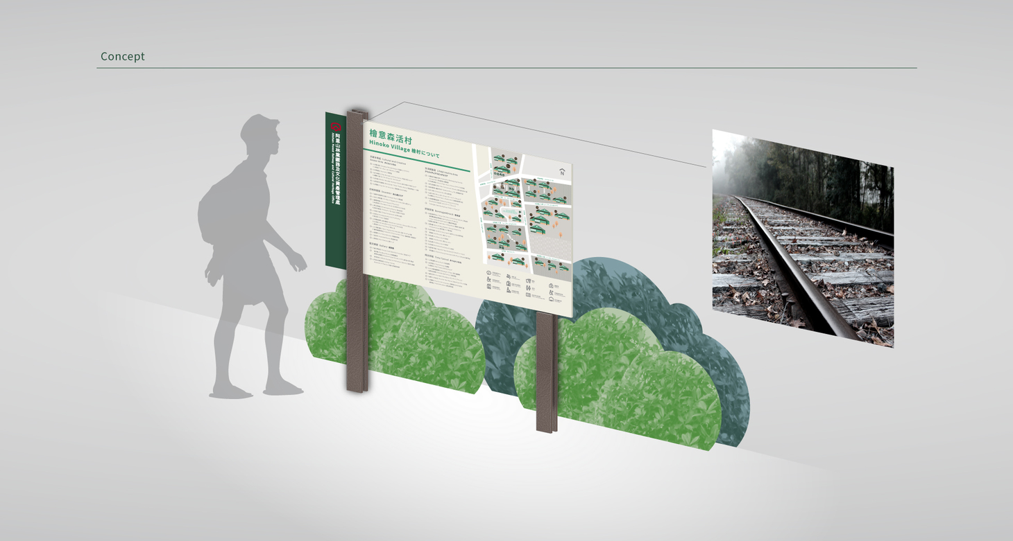
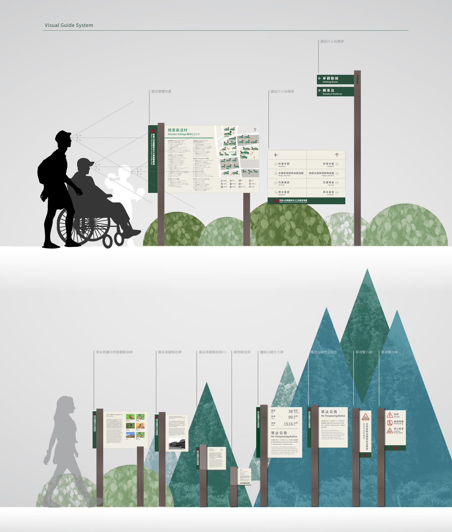
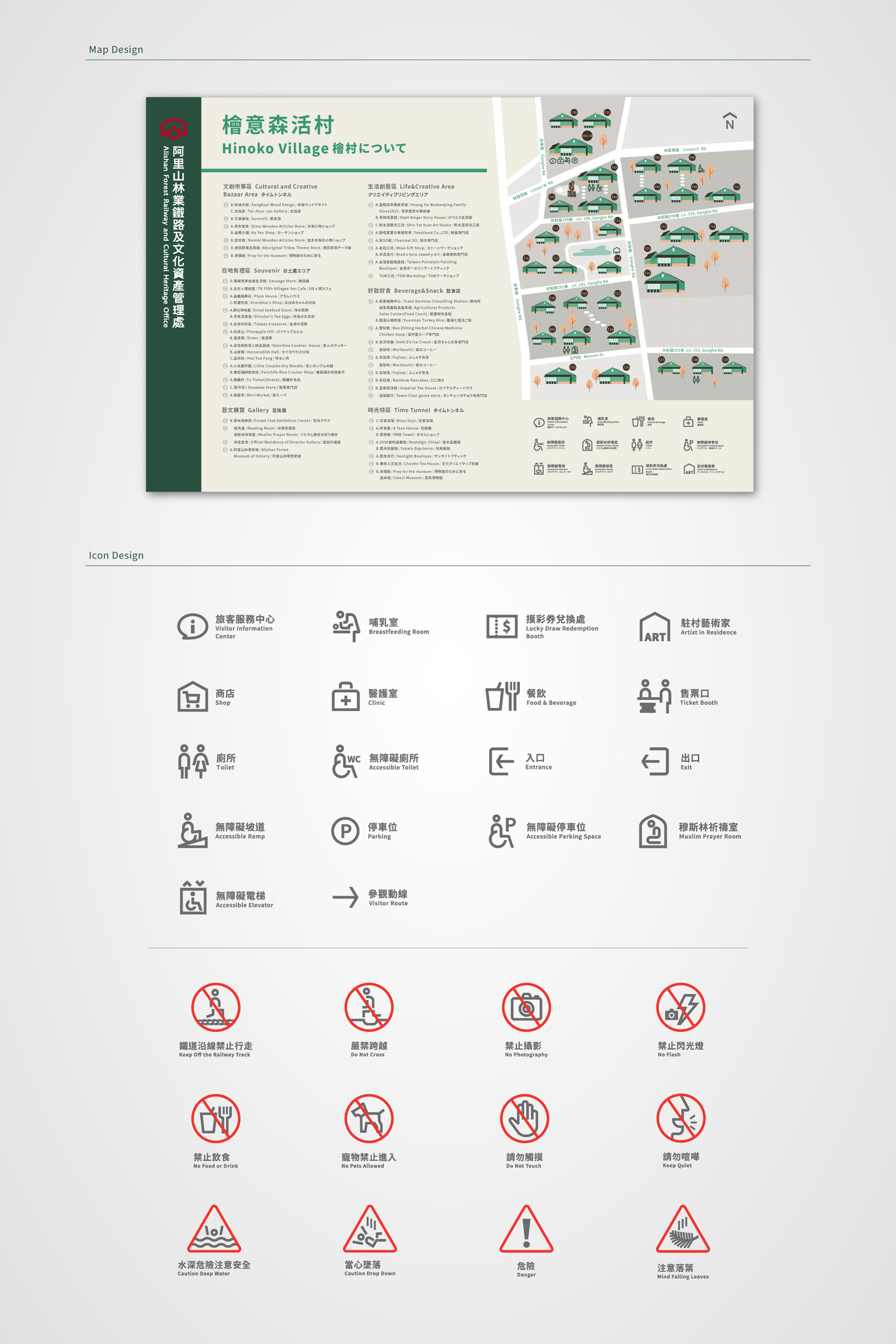
To enhance the physical brand experience, Cizoo&Co also redesigned the interpretive signage system, including visitor maps, directional guides, informative panels, warning signs, and railway notices. The signs feature H-beam steel structures with bark-textured powder coating and rail-inspired bases, blending industrial materials into the forest landscape. This ensures clearer, more intuitive guidance for travelers exploring Alishan.
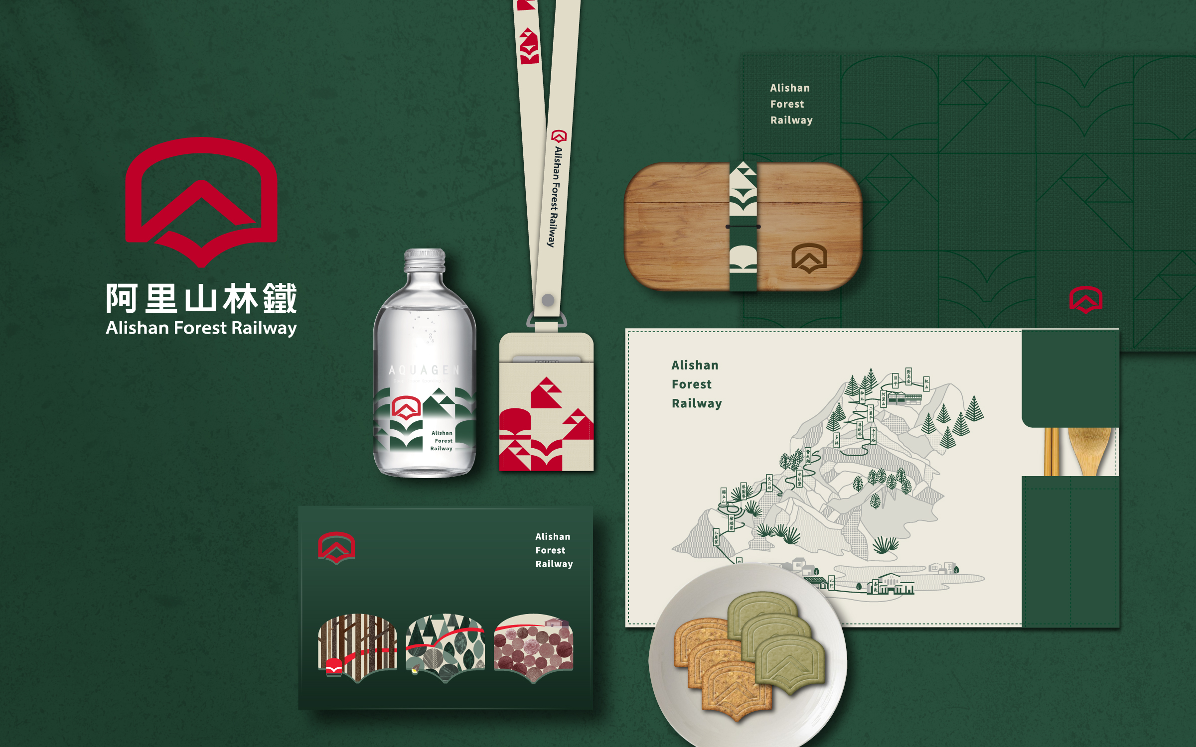
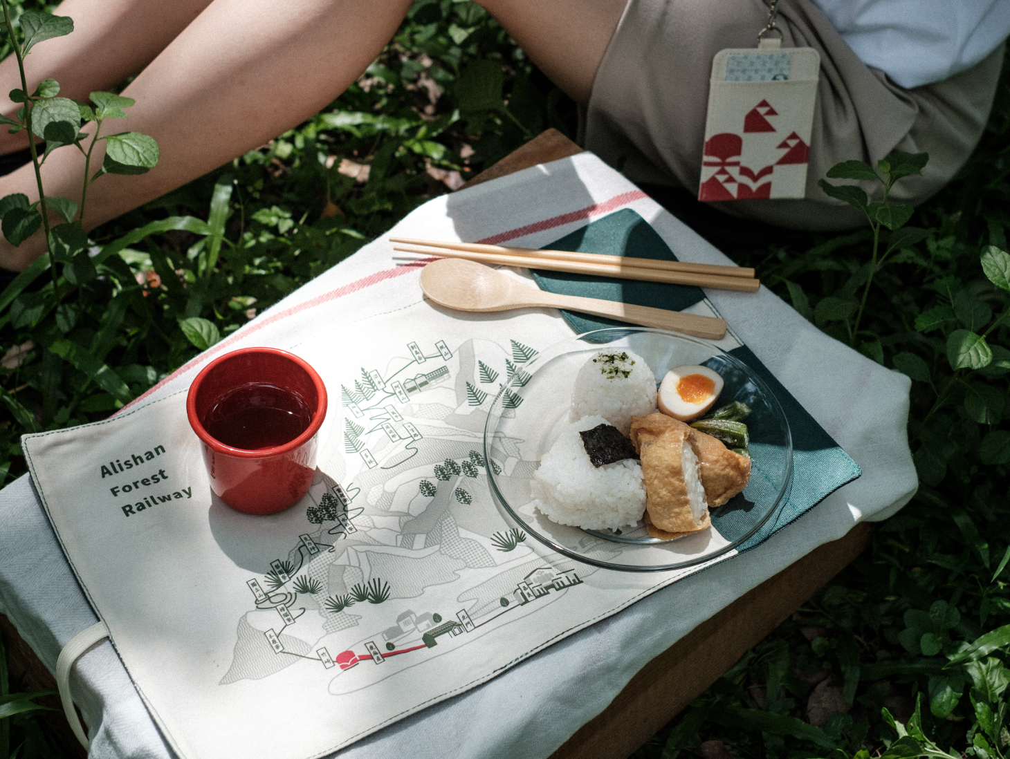
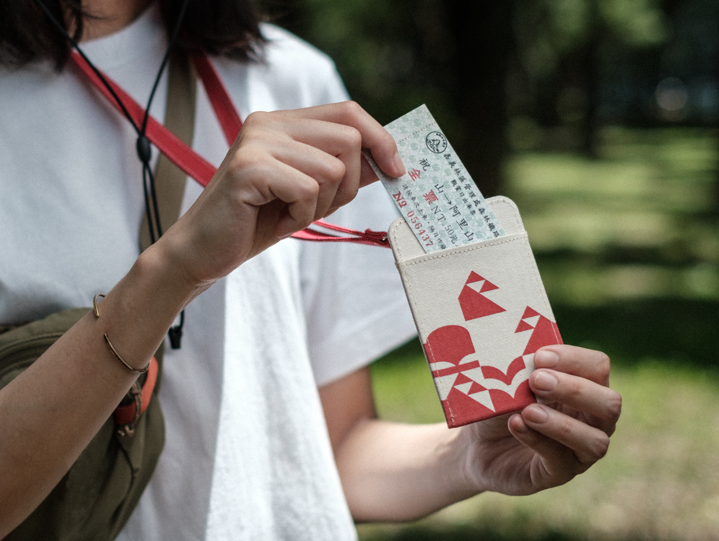
To further strengthen the travel brand’s new identity, Cizoo&Co proposed a range of concept merchandise—including card holders, placemats, Alishan-flavored cookies, and sparkling water—transforming brand touchpoints into everyday cultural connections.
As the Alishan Forest Railway prepares for full service resumption, we hope this renewed brand system will invite the world to rediscover Alishan—from a cultural route to a journey of memory, landscape, and heritage.
阿里山林業鐵路品牌再造|囍樹設計打造嶄新旅運識別,開啟文化資產永續新篇章
自阿里山林業鐵路與文化資產管理處成立以來,即肩負起推廣林道鐵路文化、守護林業生態與歷史資產的使命。此次以永續經營為核心,進行品牌形象重塑,導入全新旅運品牌識別系統,為臺灣文化資產注入嶄新能量。 囍樹設計團隊以「穿梭山林歷史,細賞窗中景致風光」為視覺主軸,融合林鐵精神與森林意象,設計出全新 阿里山林鐵品牌標誌。識別結構以火車窗景為概念基底,納入多重象徵:紅色火車頭的經典記憶、日出雲海的自然壯闊、飛鳥振翅象徵開創未來,同時暗喻守護阿里山文化資產的堅定意志。
標誌中的 V 形弧度象徵行進中的軌道,也寓意林鐵對安全運輸與平穩旅程的承諾。標準字設計以車身字體為靈感,採黑體寬肚結構,傳遞出鐵道工業的穩重與可靠,並兼具高度識別性與應用彈性。
品牌主色採用火車頭紅,呼應阿里山觀光鐵道的起點記憶;輔助色包含代表森林生態的綠,與象徵晨曦雲海的白,整體色彩策略結合山林文化與鐵道精神,展現出穩健、活潑並具生命力的品牌性格。
為強化品牌識別的場域體驗,囍樹同步進行導覽解說系統再設計,涵蓋導覽地圖、指引導視、警示告示等,並導入帶有樹皮肌理的金屬烤漆H鋼結構與鐵軌造型基座,呼應森林中的工業美學,提升旅客在林間步道與鐵道路線上的導讀效率與體驗。
此外,我們更提出整體文創商品規劃設計,包含卡夾、餐墊、阿里山風味餅乾與氣泡水等旅運概念商品,讓品牌識別不只停留在視覺,更能融入日常,形成旅客與文化資產之間的連結。
當阿里山林鐵全面通車的日子來臨,囍樹期盼透過全新品牌語彙與系統性設計,讓世界以不同視角重新認識阿里山這條通往歷史與自然的文化路徑。
- Creative Director
- Chih-Ling Wang
- Chia-Hsiao Shih
- Visual Guide System Collaboration
- 4CUS Creative
- Art Director
- Yun-Fang Liu
- Designer
- Chen-Wei Lin
- Zi-Yin Lin
- Guan-Ru Lung
- Yen-Jen Chen
- Project Manager
- Dodo Liu
- Penny Yang
- Photographer
- Kat Leung
- Image Provider
- Alishan Forest Railway
- Zoopaper
- 阿里山林鐵
