開飯川食堂
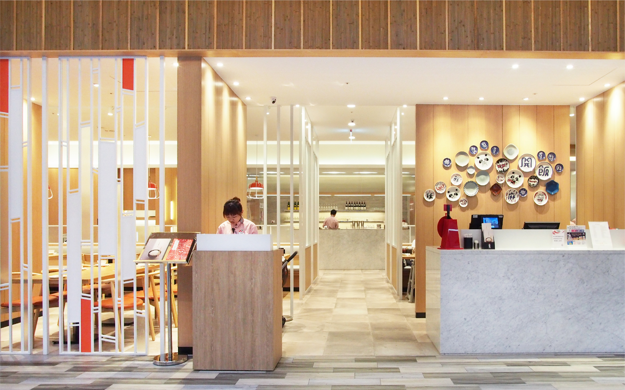
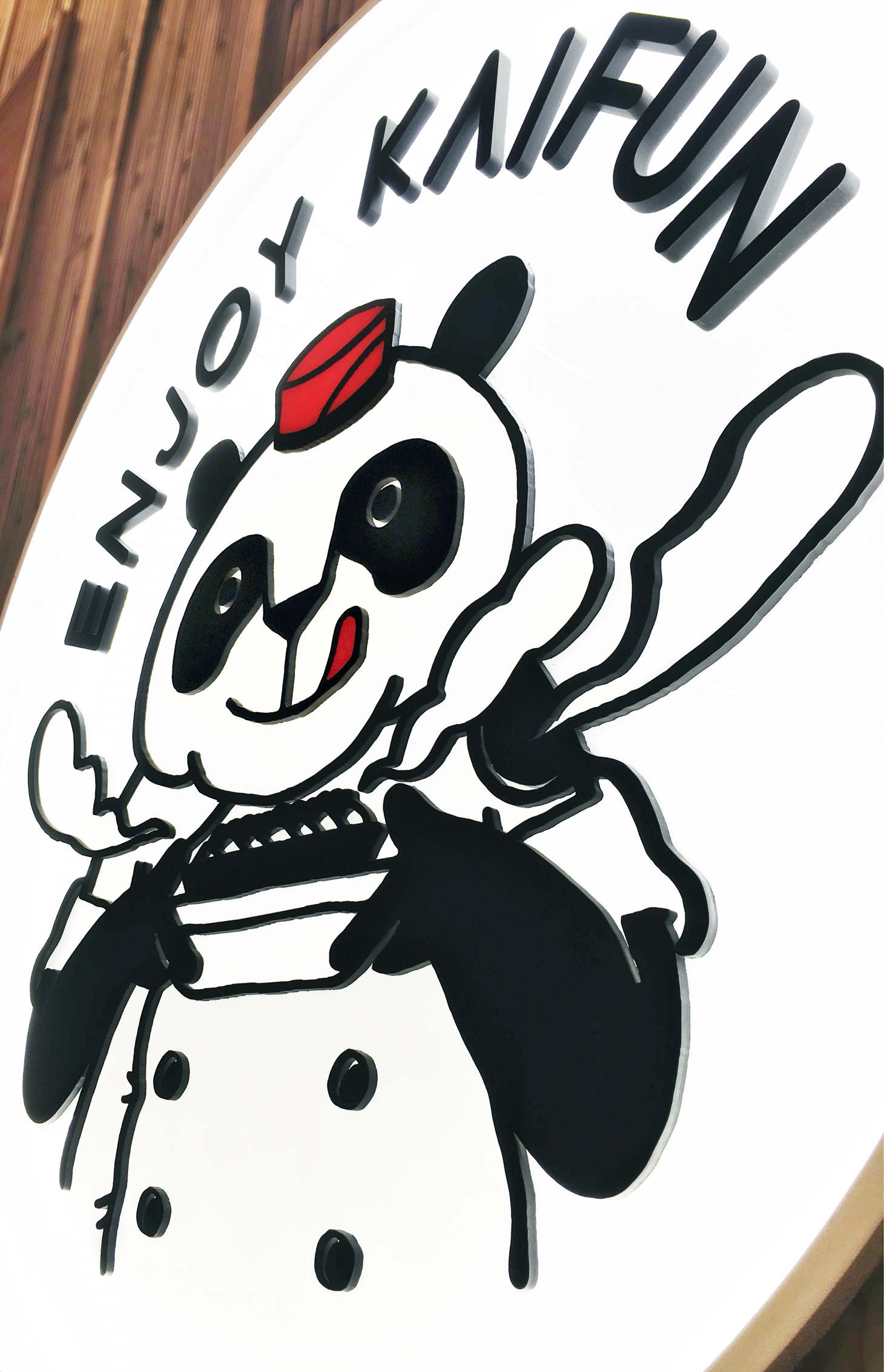
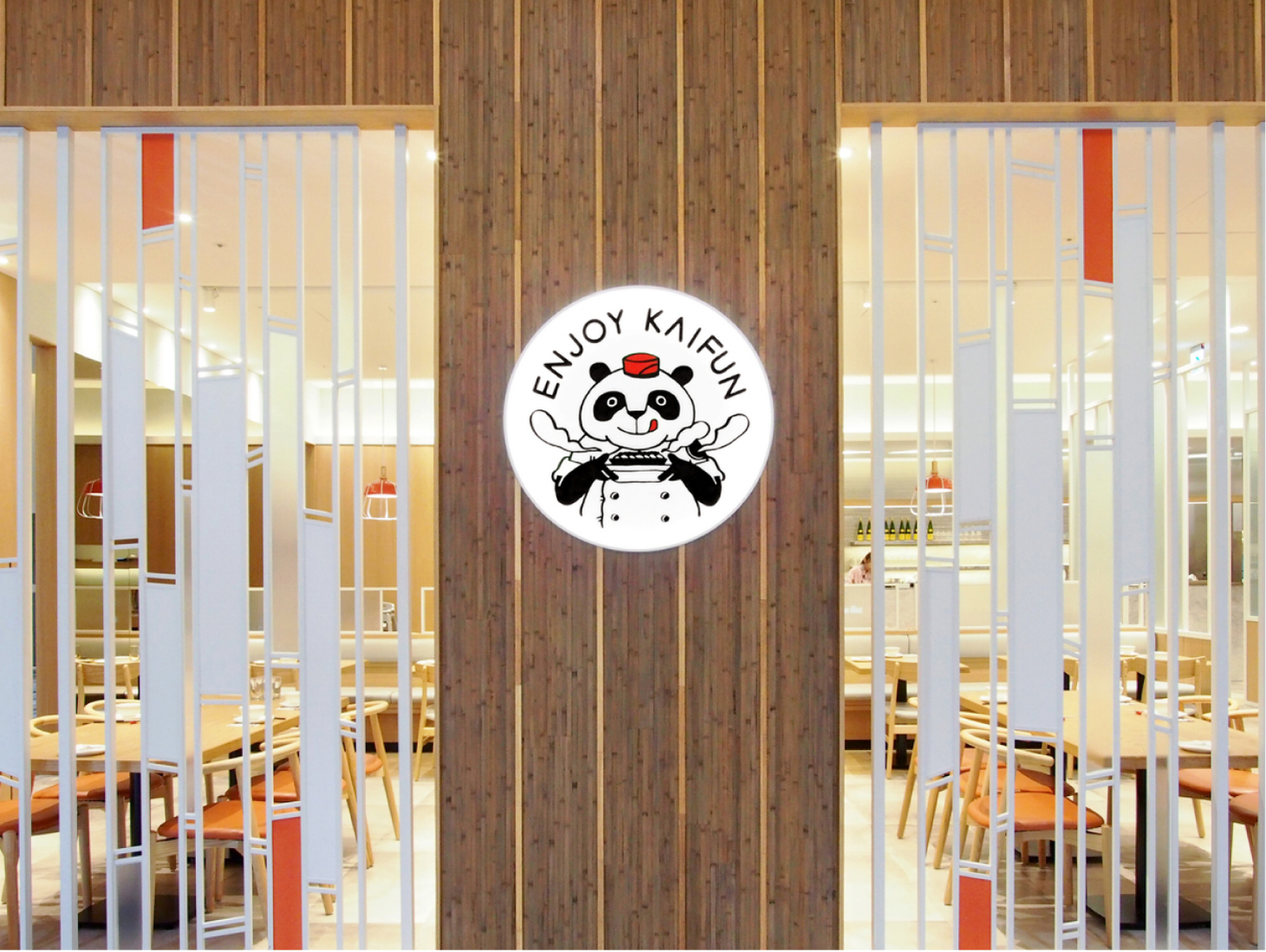
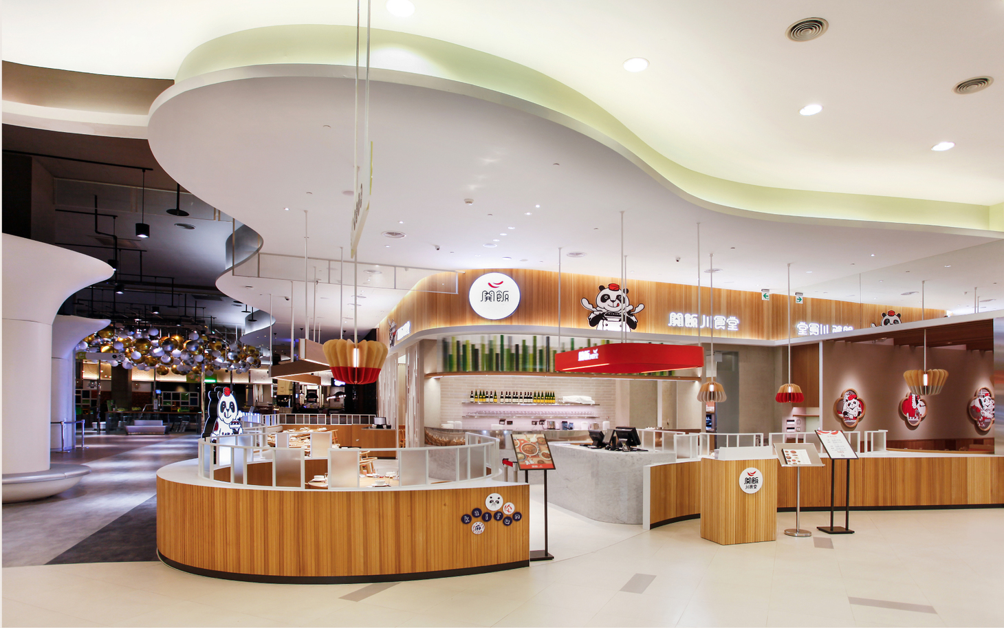
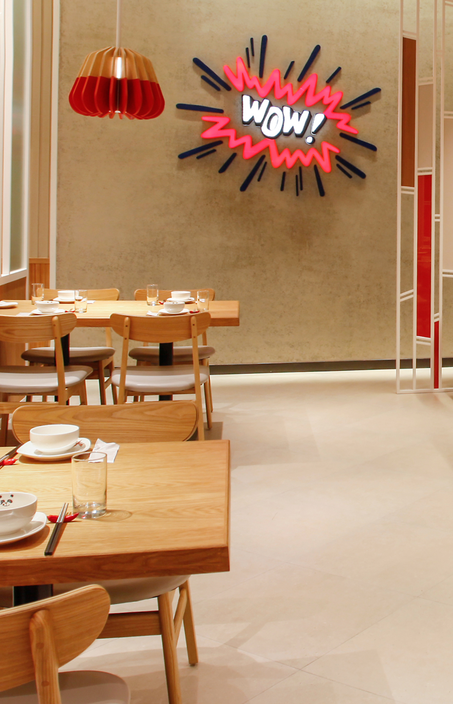
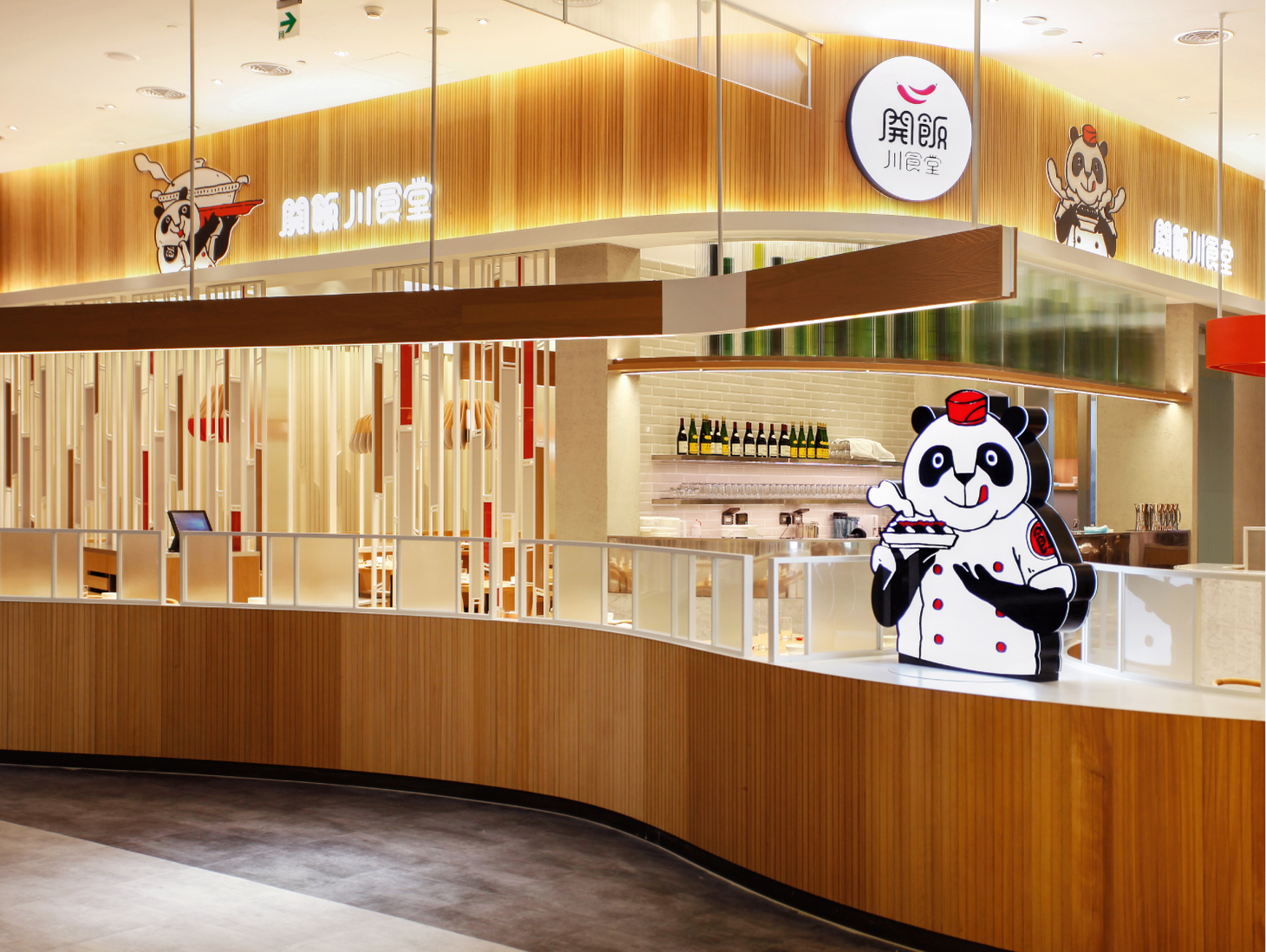
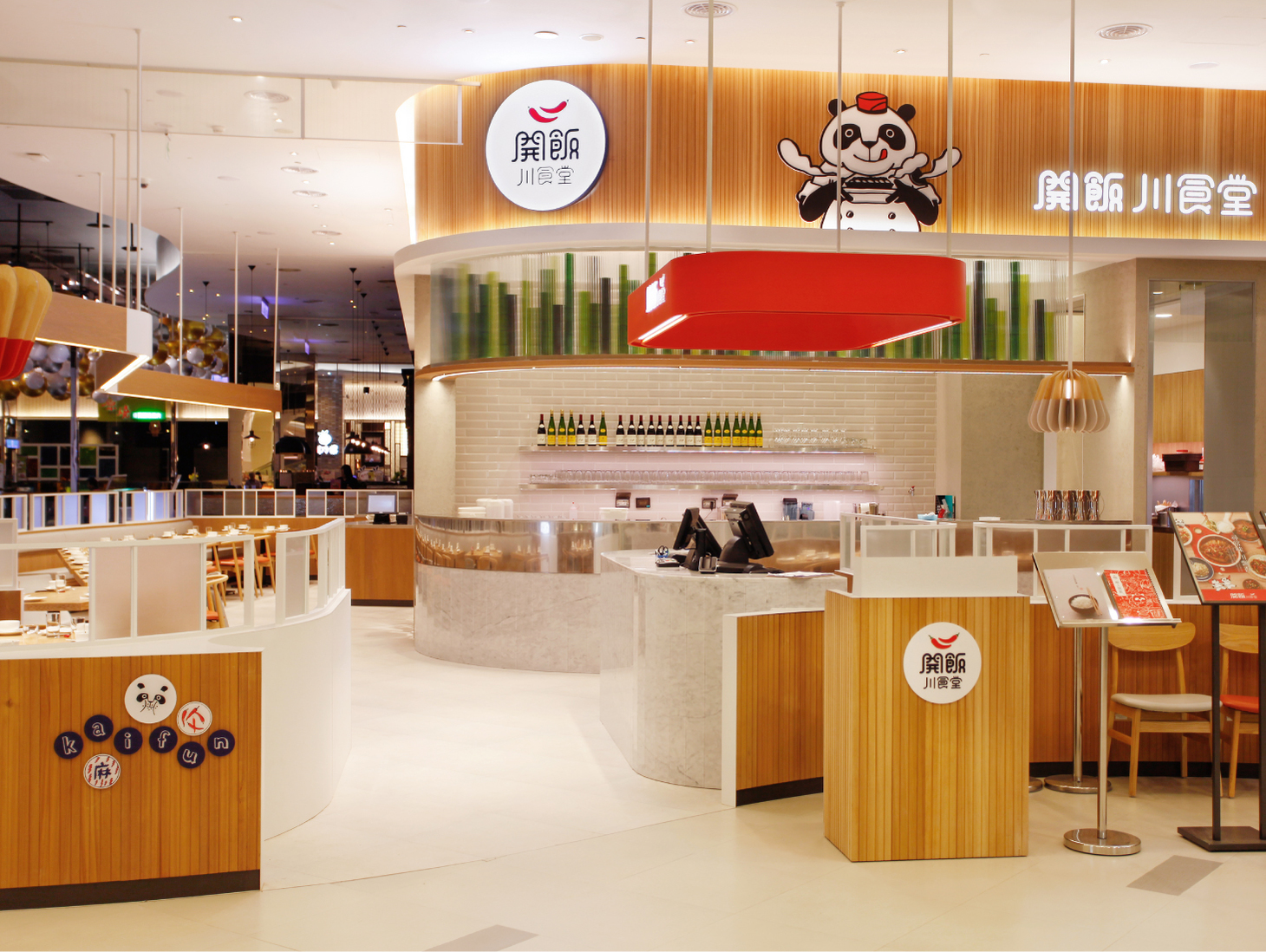
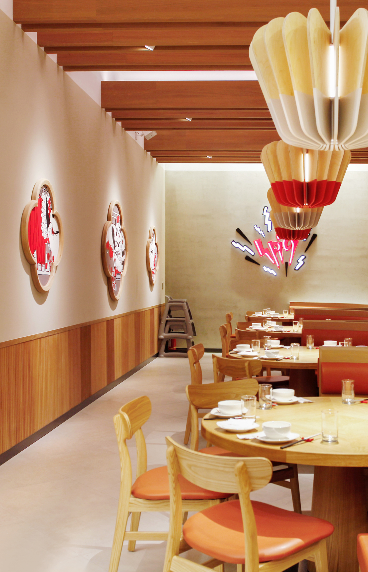
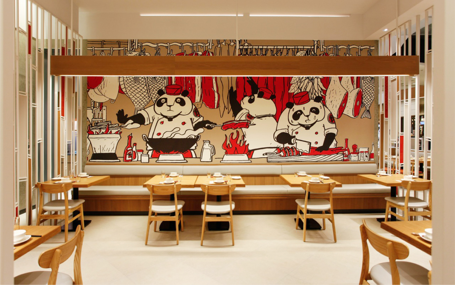
Kaifun’s modern Sichuan dishes are fresh, aromatic, numbing and spicy, making you always want to come back for more! From the entrance of the restaurant to its visual design, color combination and interior styling, we created a new space identity for Kaifun to enhance the uniqueness and memorability of the brand’s space.
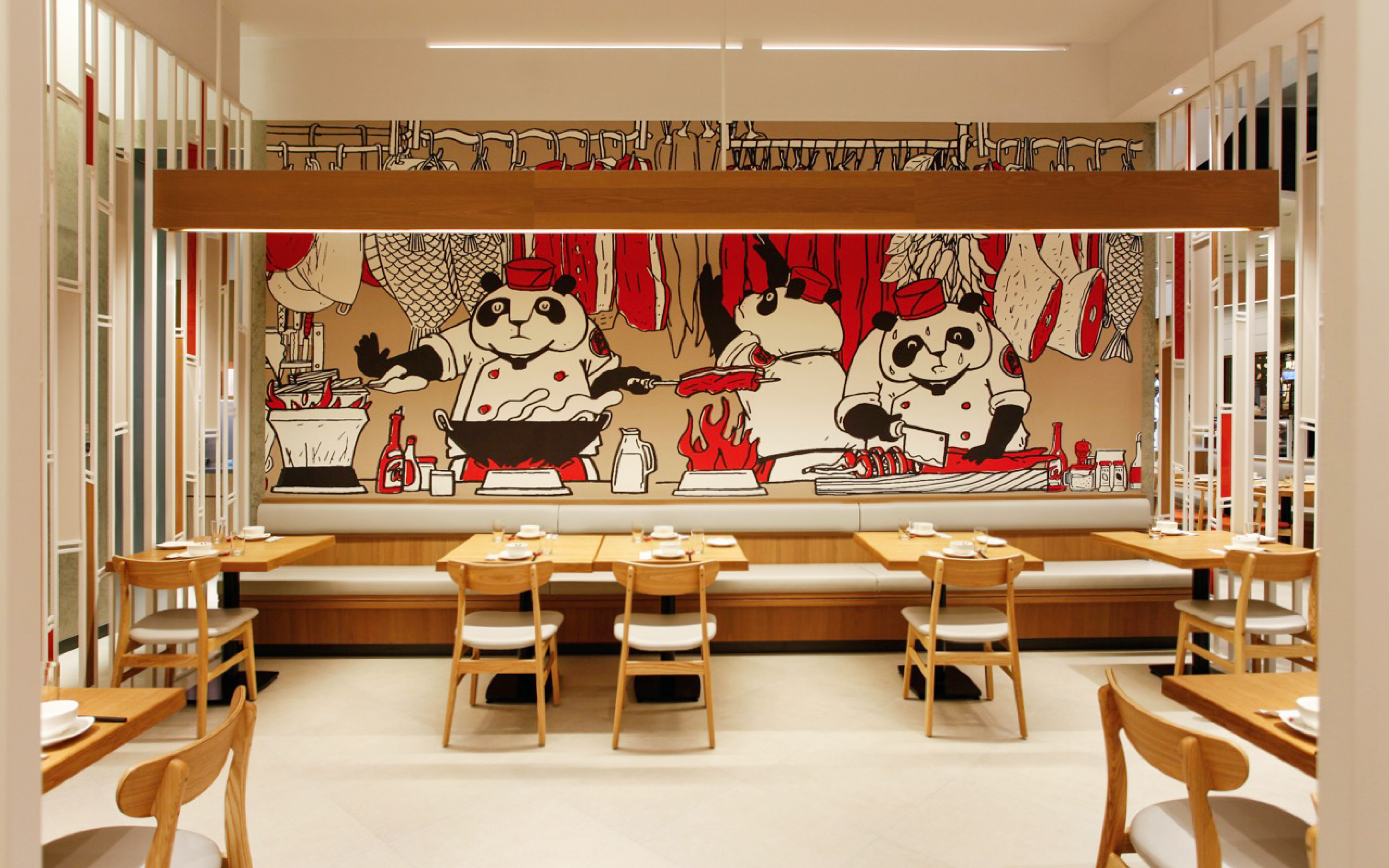
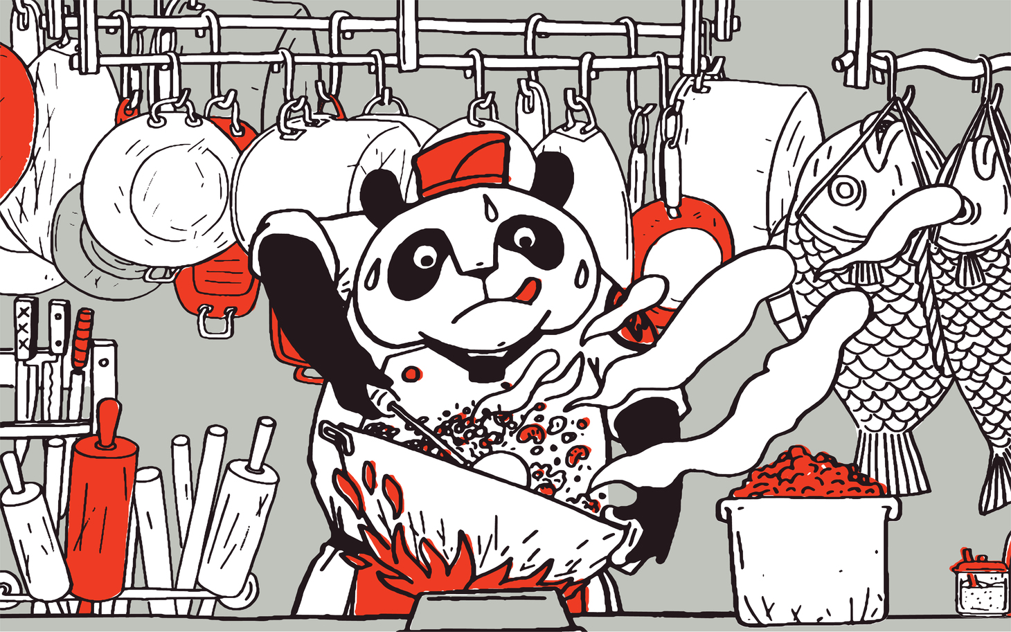
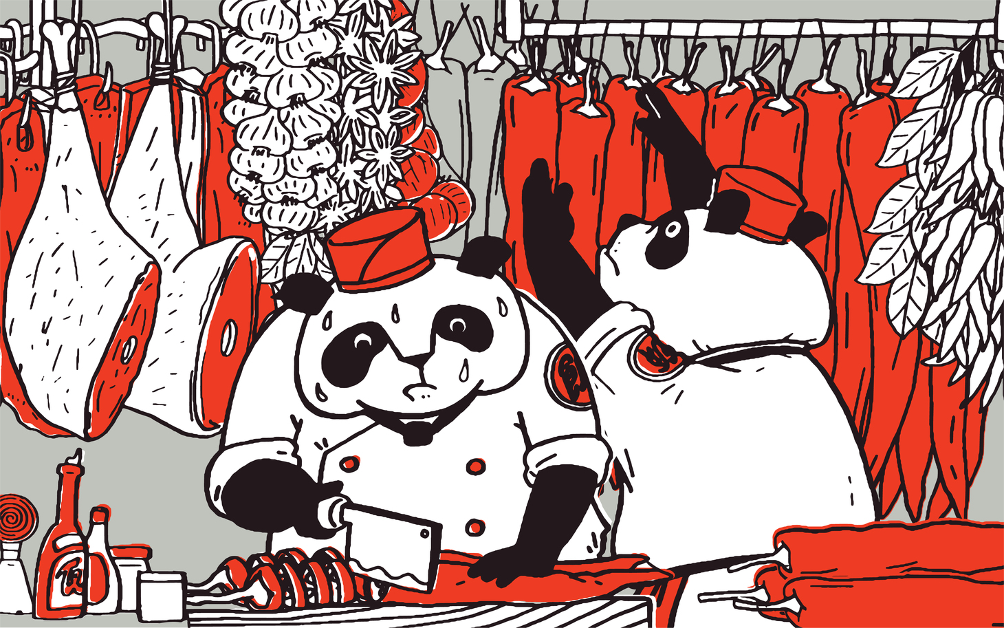
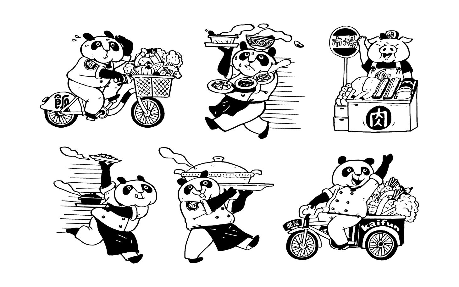
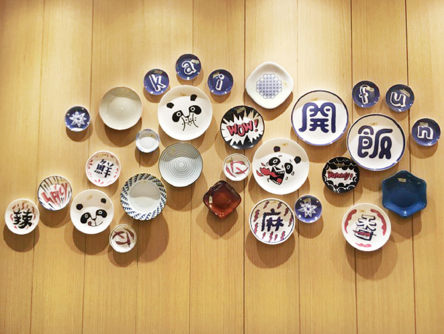
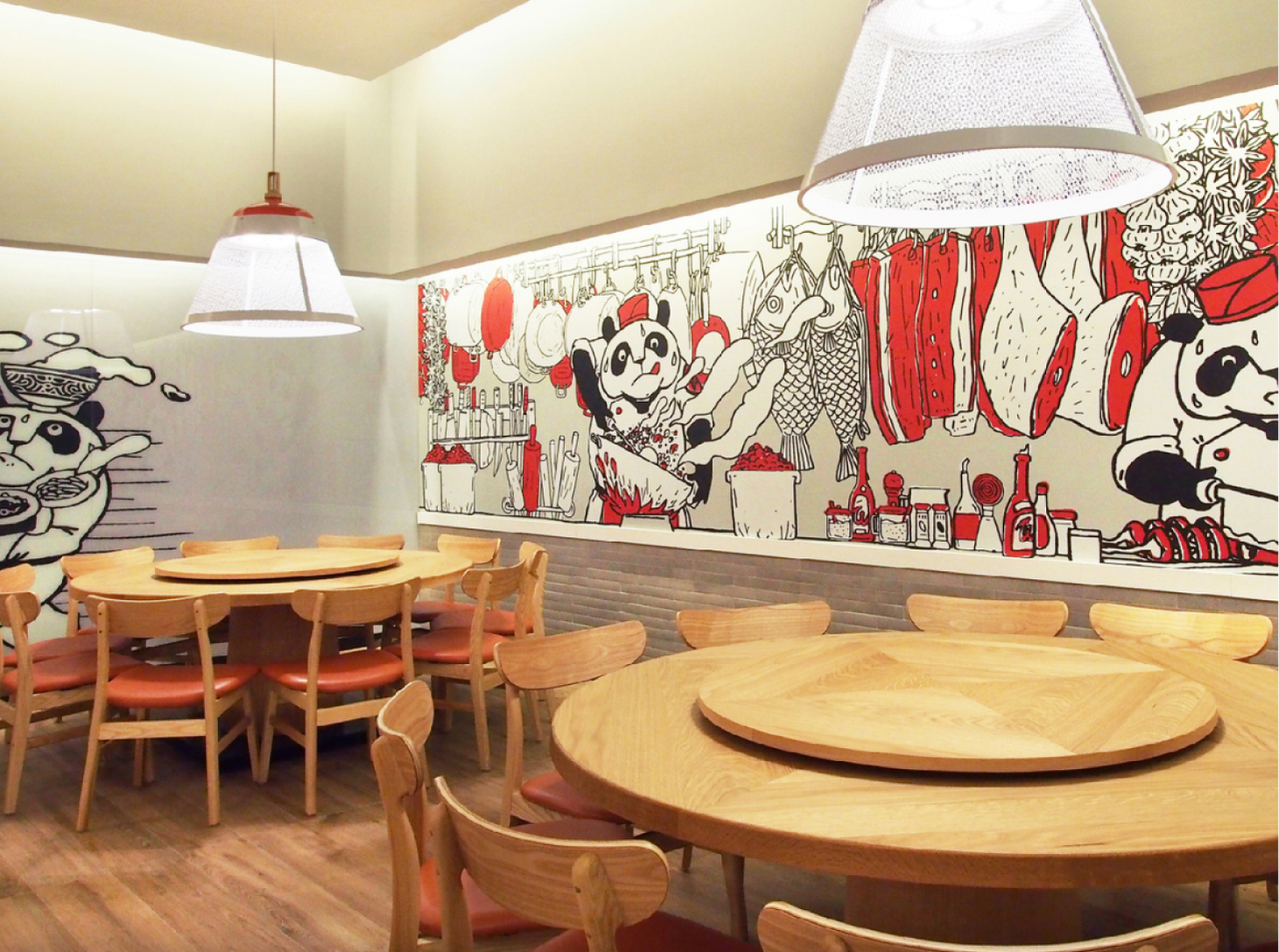
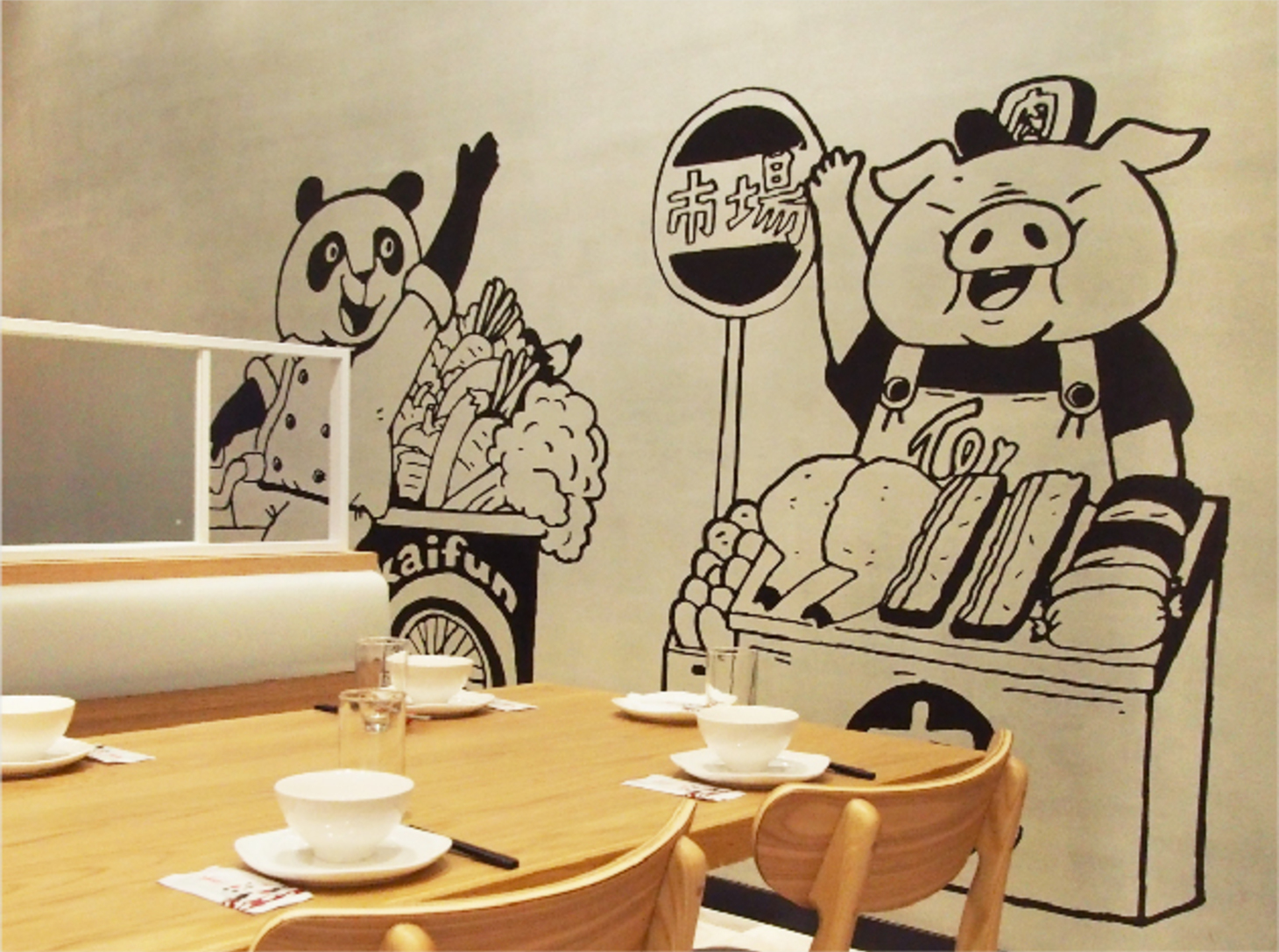
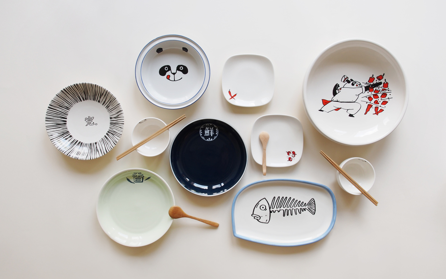
The modern and partially opaque bamboo forest introduces the background of the brand character – Mr. Panda. The duotone illustrations on the murals demonstrate various techniques of Sichuan cuisine and recreate the lively scene in a Sichuan food court. Chinese characters for different tastes are integrated in the installation composed of plates and bowls. When bright, fun visual vocabulary meets modern Chinese-style interior design, Kaifun becomes the perfect place for the younger generation to have new Chinese food brand experiences.
鮮,香,麻,辣再三回味的新川料理,開飯全新空間識別規劃設計,從品牌空間人口形象,視覺設計,色彩應用到軟裝規劃,整體強化品牌空間的獨特性與記憶度。
外觀以現代且半穿透的竹林意象帶出熊貓哥人物的故事起緣,空間視覺以雙色調插畫呈現做菜功夫和川食堂前場的熱鬧情境,同時將豐富的口感文字結合在碗盤的裝置設計中, 透過活潑風趣的視覺語彙搭配現代中式的空間設計,呈現年輕世代的中式餐飲品牌新體驗。
- Creative Director
- Chih-Ling Wang
- Designer
- Yun-Fang Liu
- Yo-Hsin Lin
- Illustrator
- Croter Illustration
