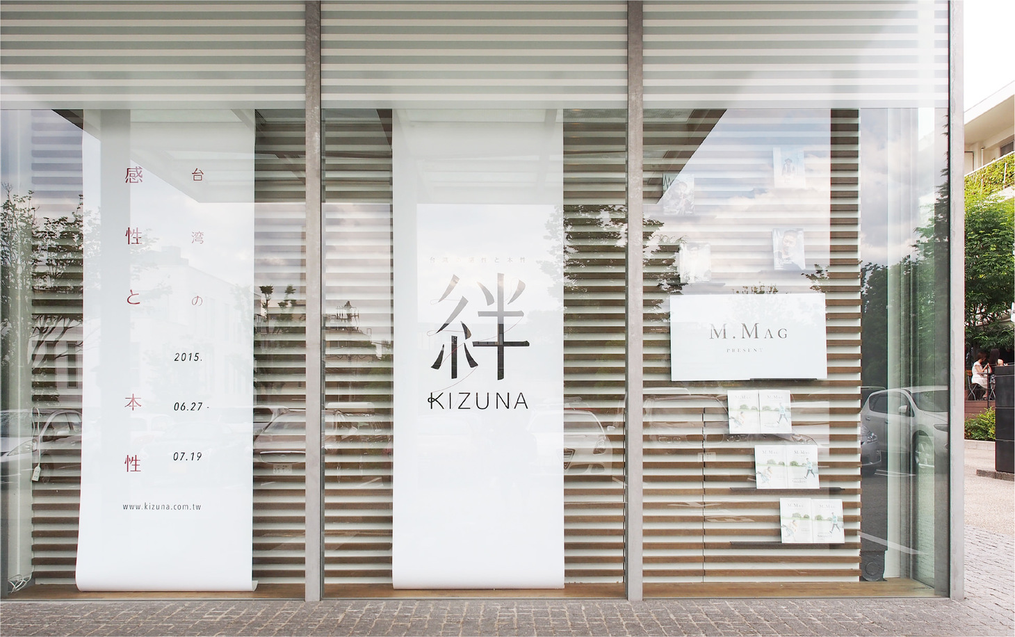
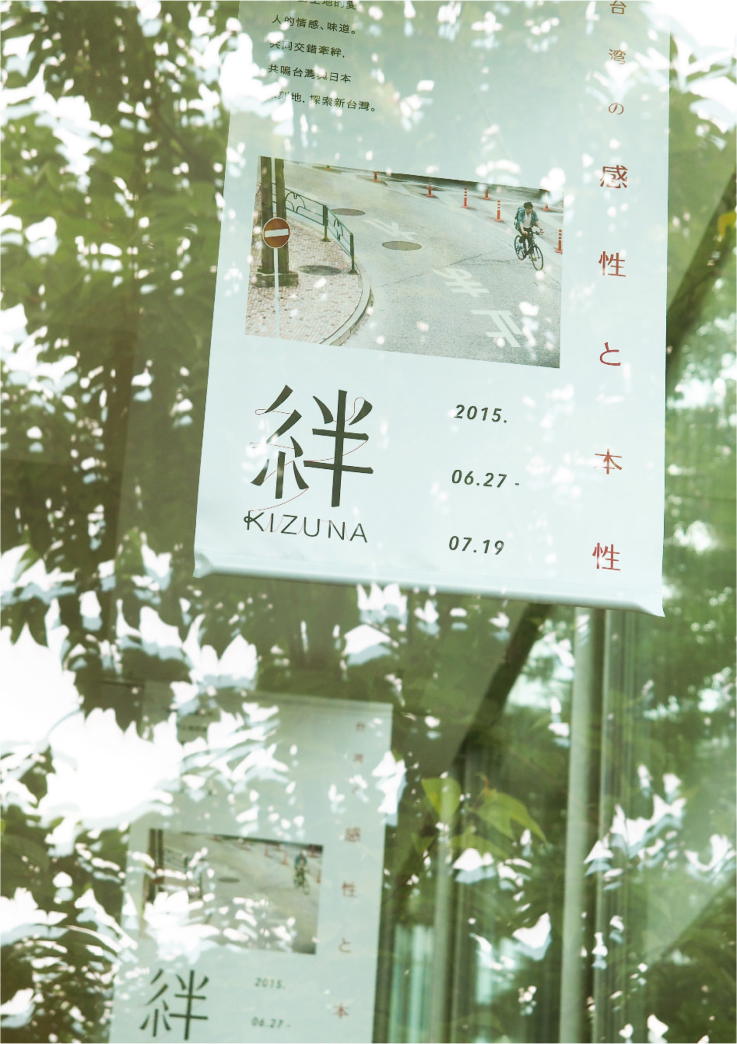
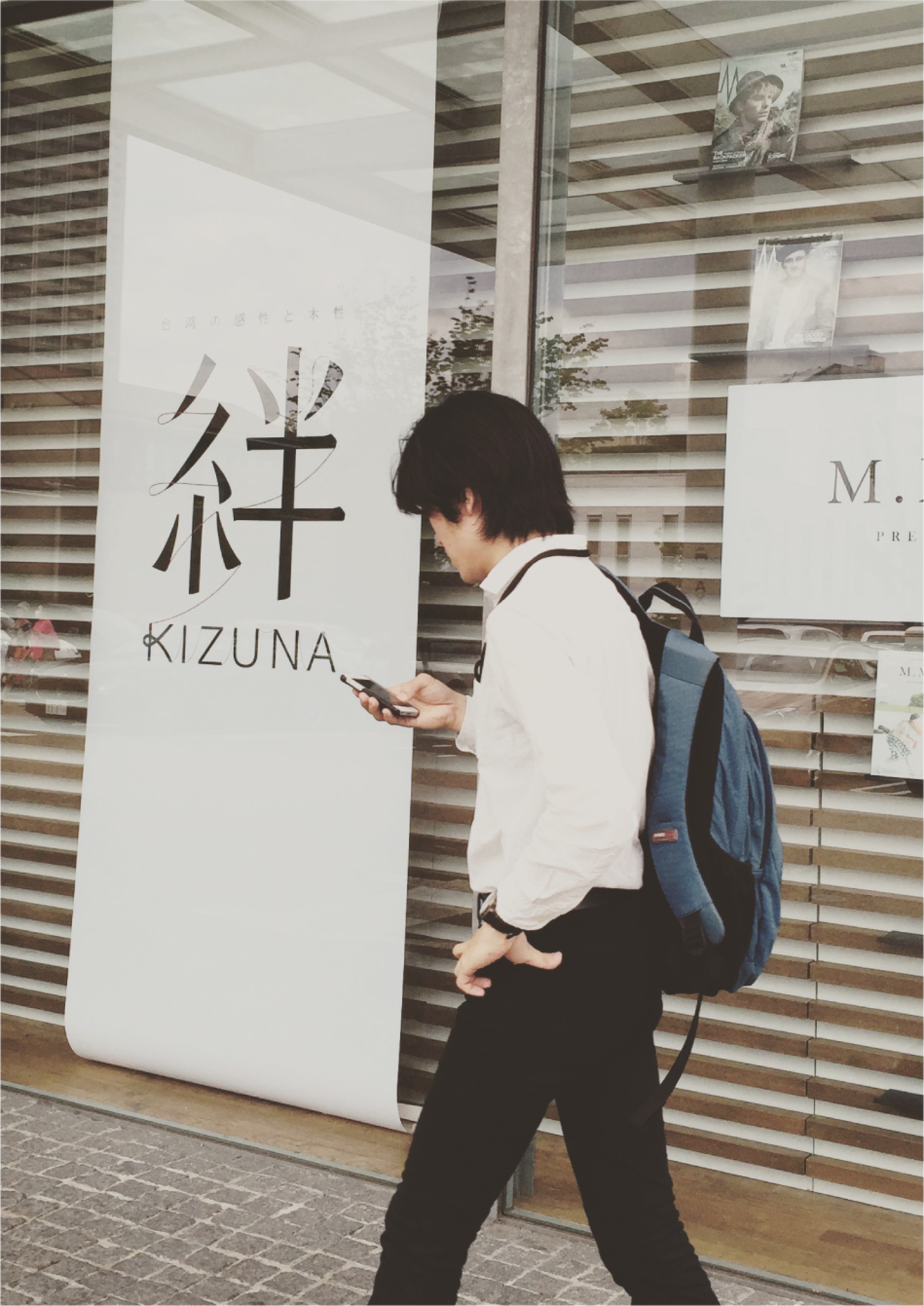
絆

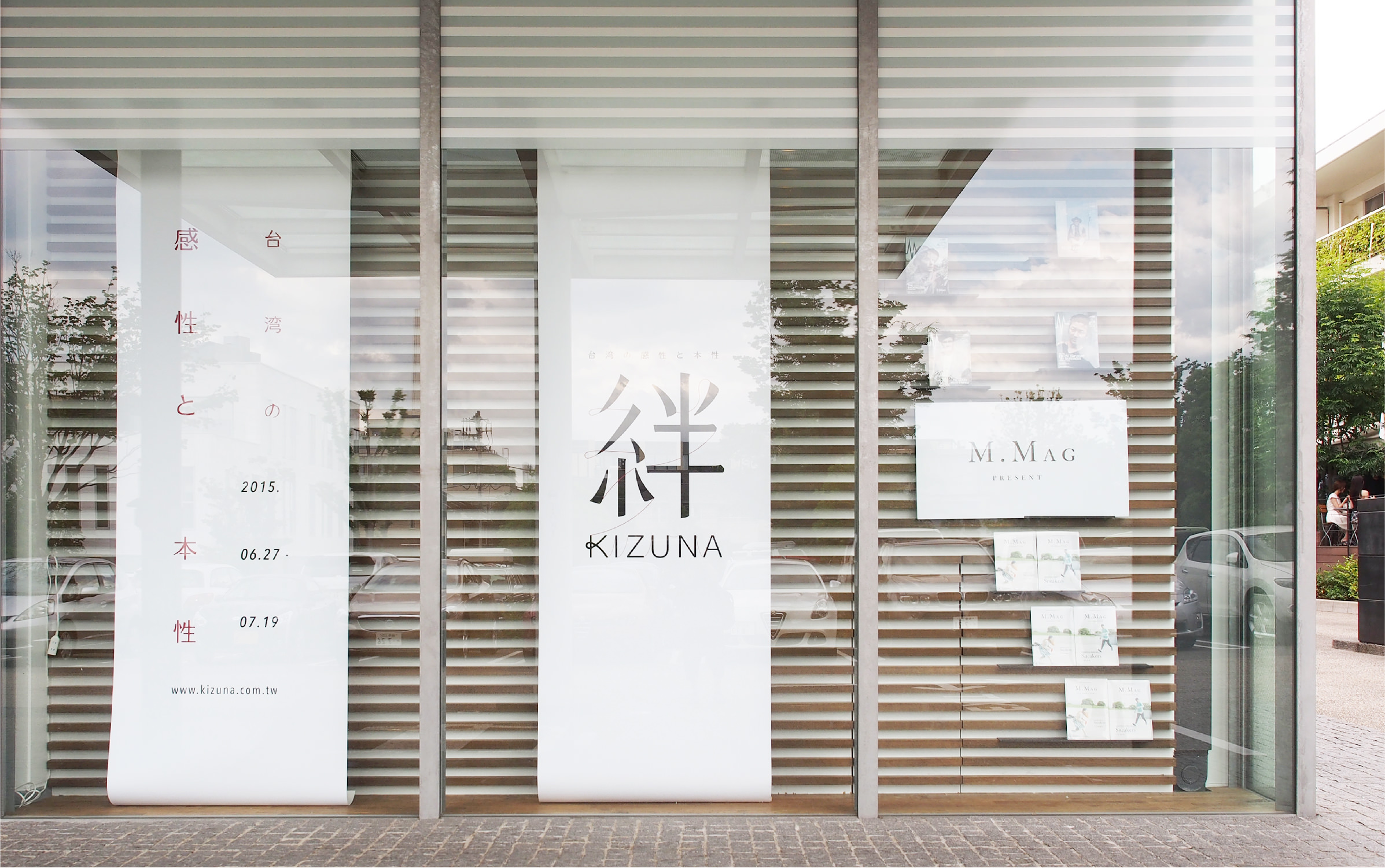
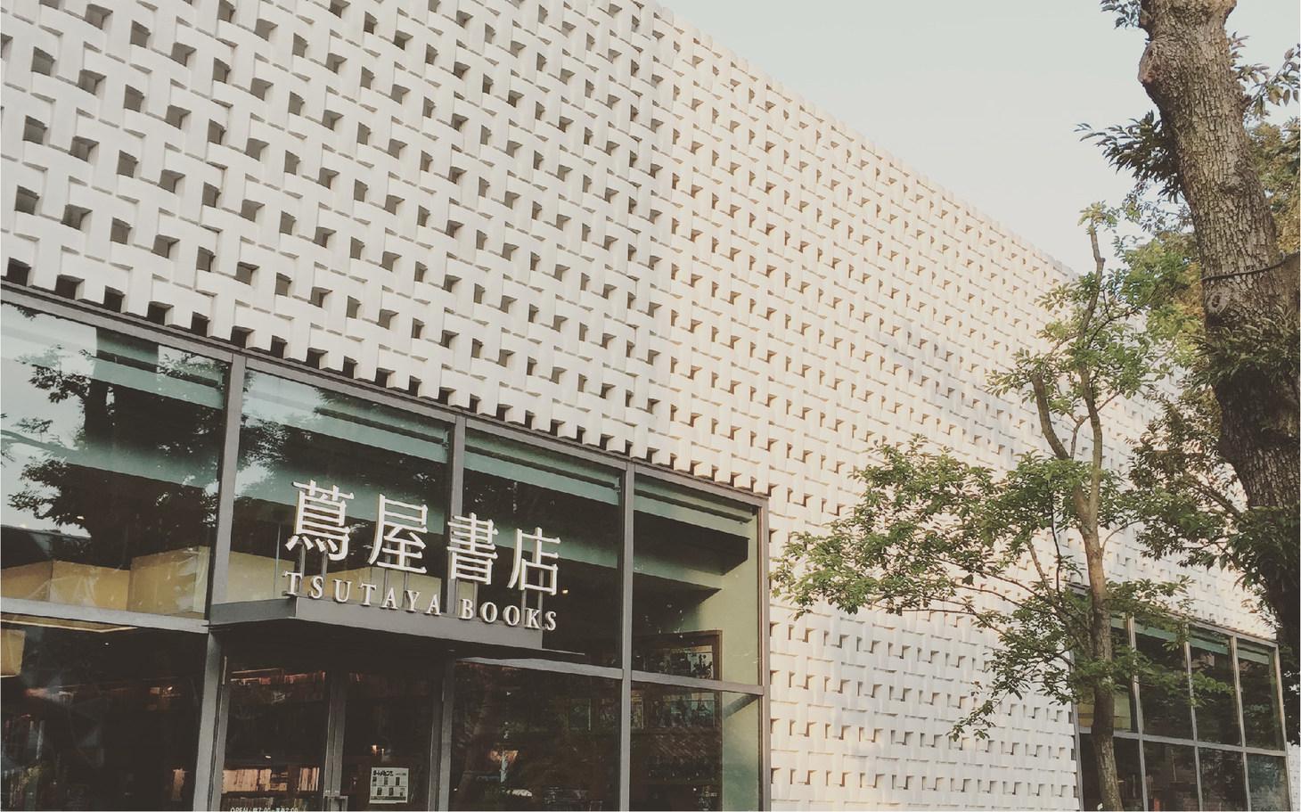
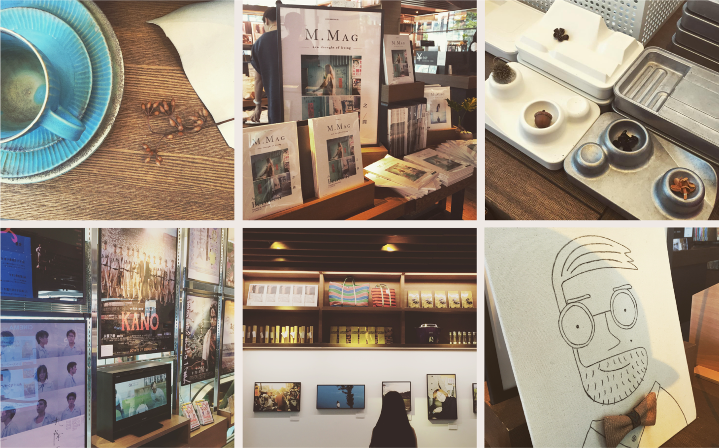
Kizuna Taiwan Fair at Tsutaya Bookstore
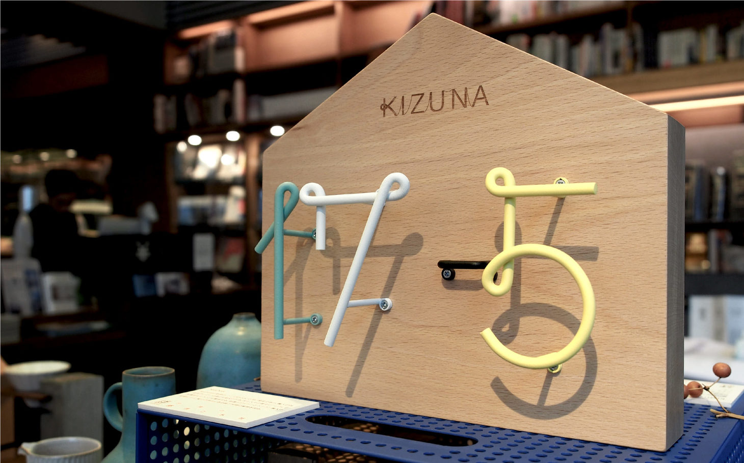
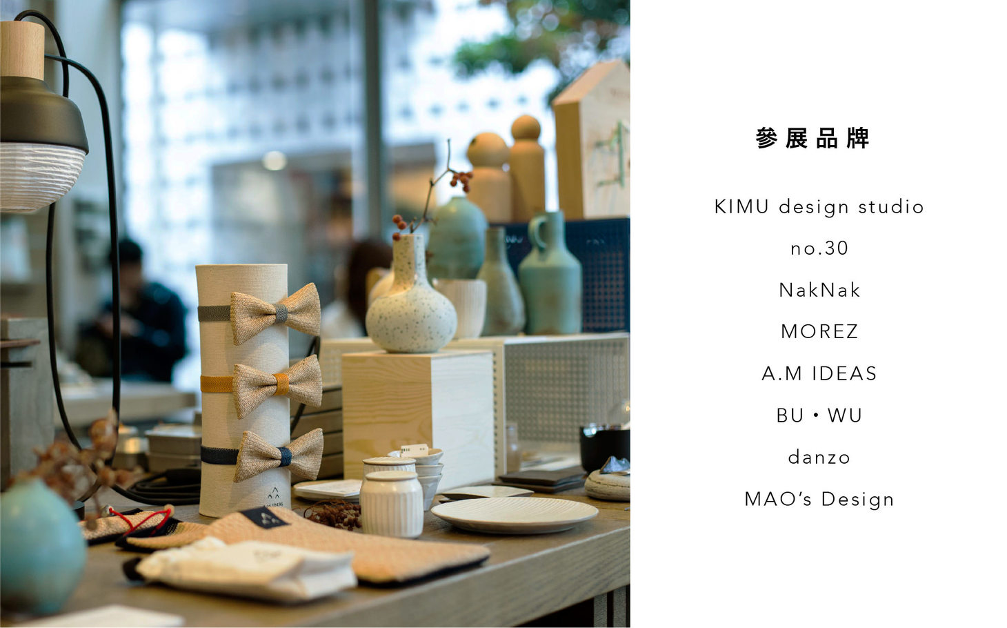
Cizoo designed the logo for “Kizuna Taiwan Fair”. As a “life maker”, Cizoo was also the curator of the design item section. Cizoo brought selected design items from Taiwan to Japan, inviting visitors to explore the close relationship between the items and our lives in various aspects. Every time we use an item, we’re creating new emotional memories of it. Time flies and people change, but life is always there—this is what “kizuna” means. In the logo, different parts of “kizuna” are connected by a red line to express the relationship between the exhibits and life—a rational and emotional bond.
絆 Kizuna 蔦屋書店台灣主題展
囍樹擔任「絆台灣的感性與本性」主題展之 Logo 設計,同時以 Lifemaker 的身份,擔任展覽中設計傢俬區域的選品人;囍樹帶著台灣的設計選物來到日本,從生活的不同面向中去感受設計物件與生活緊緊相連的關係。
每一次使用物件,都是增添新的情感記憶,物件是陪伴的風景,時間或許常流,風景或許常變換,但生活依然常在,這就是「絆」。以紅線貫穿絆的字體設計構成中,傳遞出展品與生活的關係,是理性也是感性的牽絆。
- Creative Director
- Chih-Ling Wang
- Designer
- Yu-Ting Huang
- Elica Tzeng