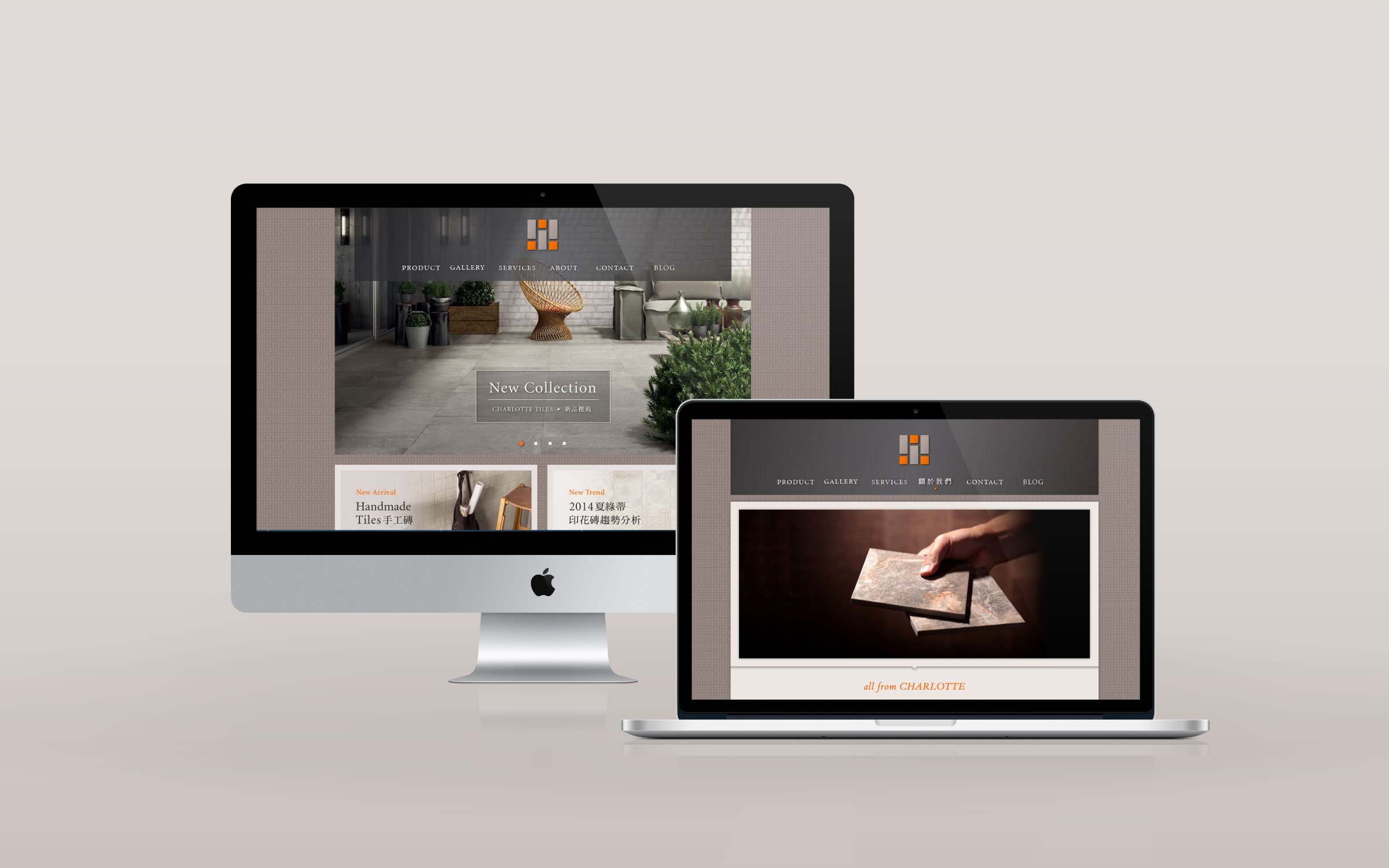
夏綠蒂磁磚
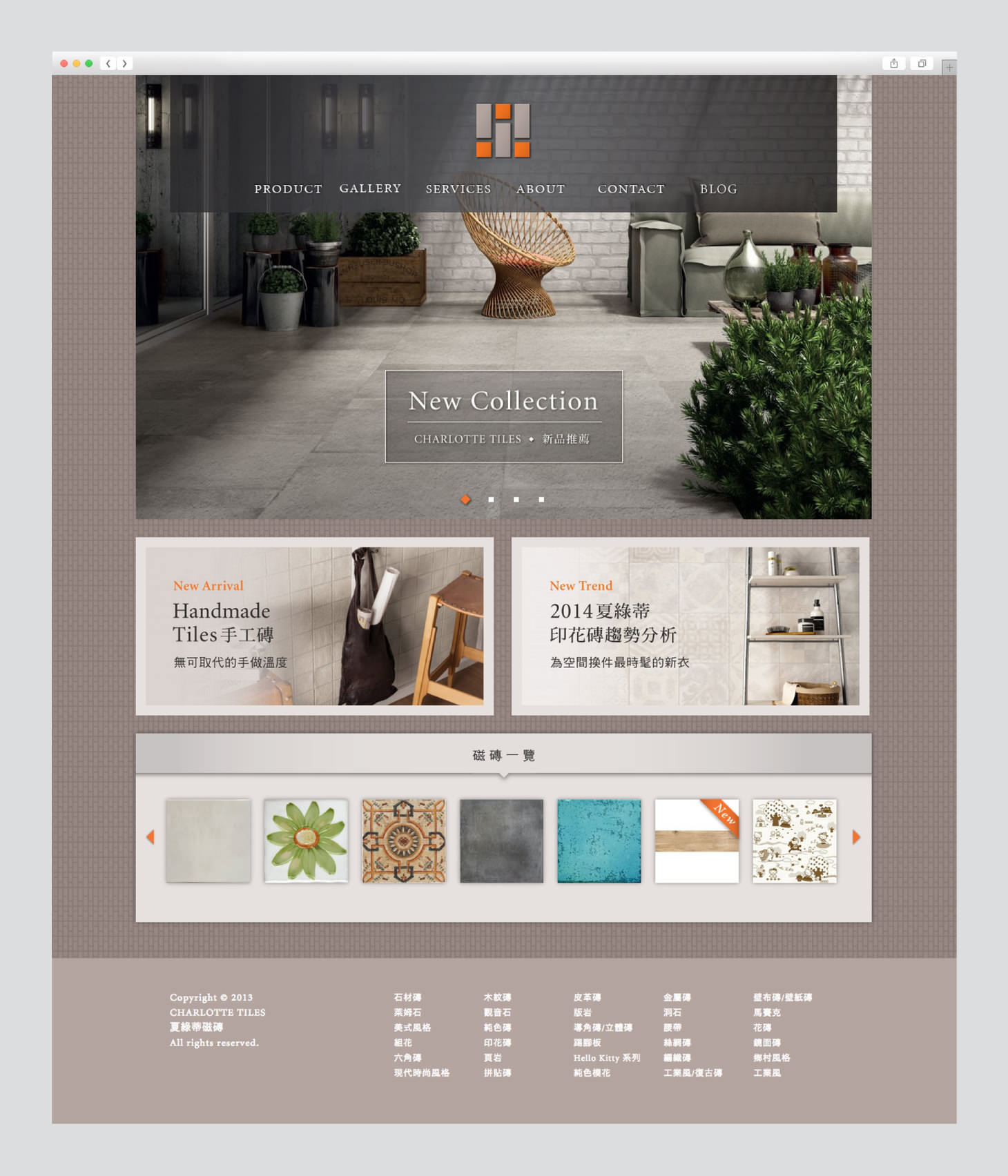
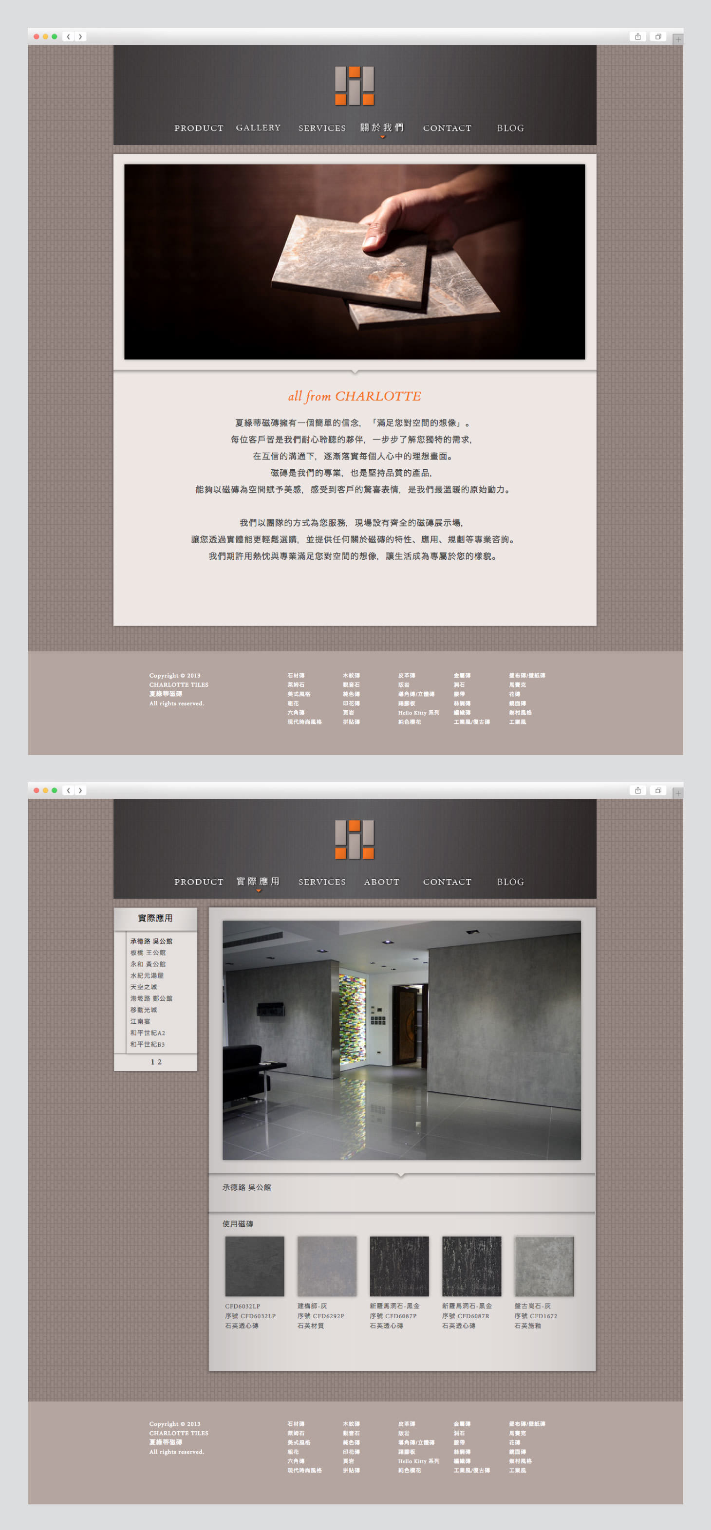
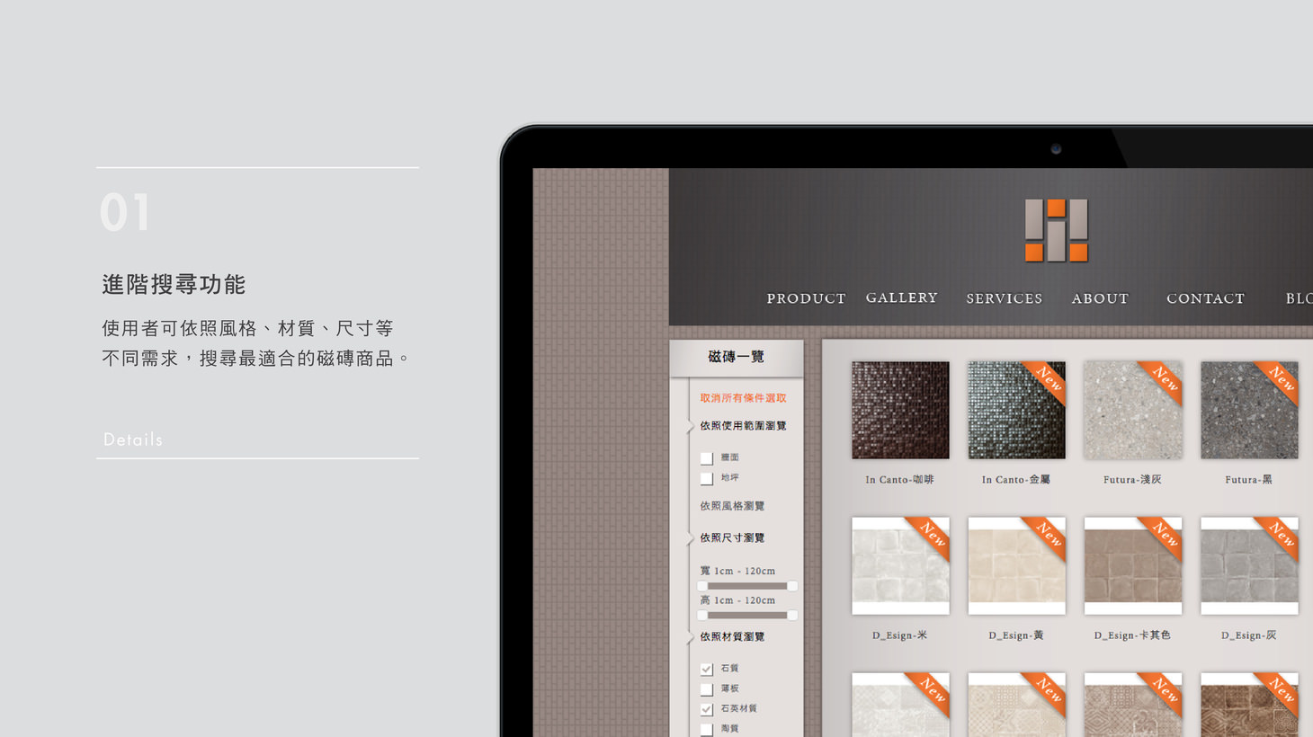
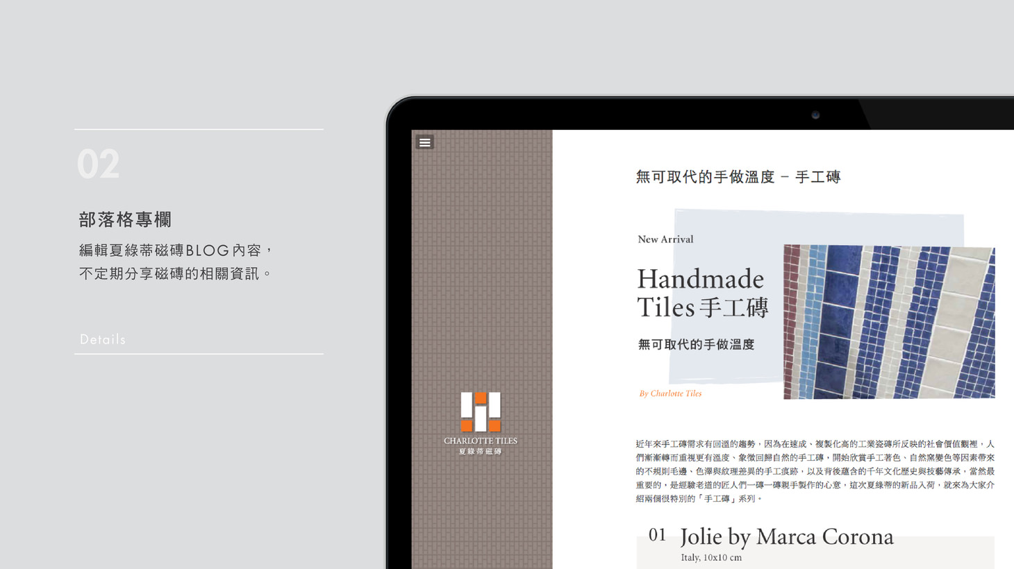
Charlotte Tiles’ visual identity consists of three English letters “I.” They symbolize the key qualities of a space design company, “Interaction (thoughtful response),” “Information (professional knowledge)” and “Impression (impressive products).”The company website provides categorized information, advanced search, and quick screening. There is also a blog that regularly shares special design trends and product information.
- Creative Director
- Chih-Ling Wang
- Designer
- Elica Tzeng
- Web Developer
- Tim Chen
