僑泰興麵粉
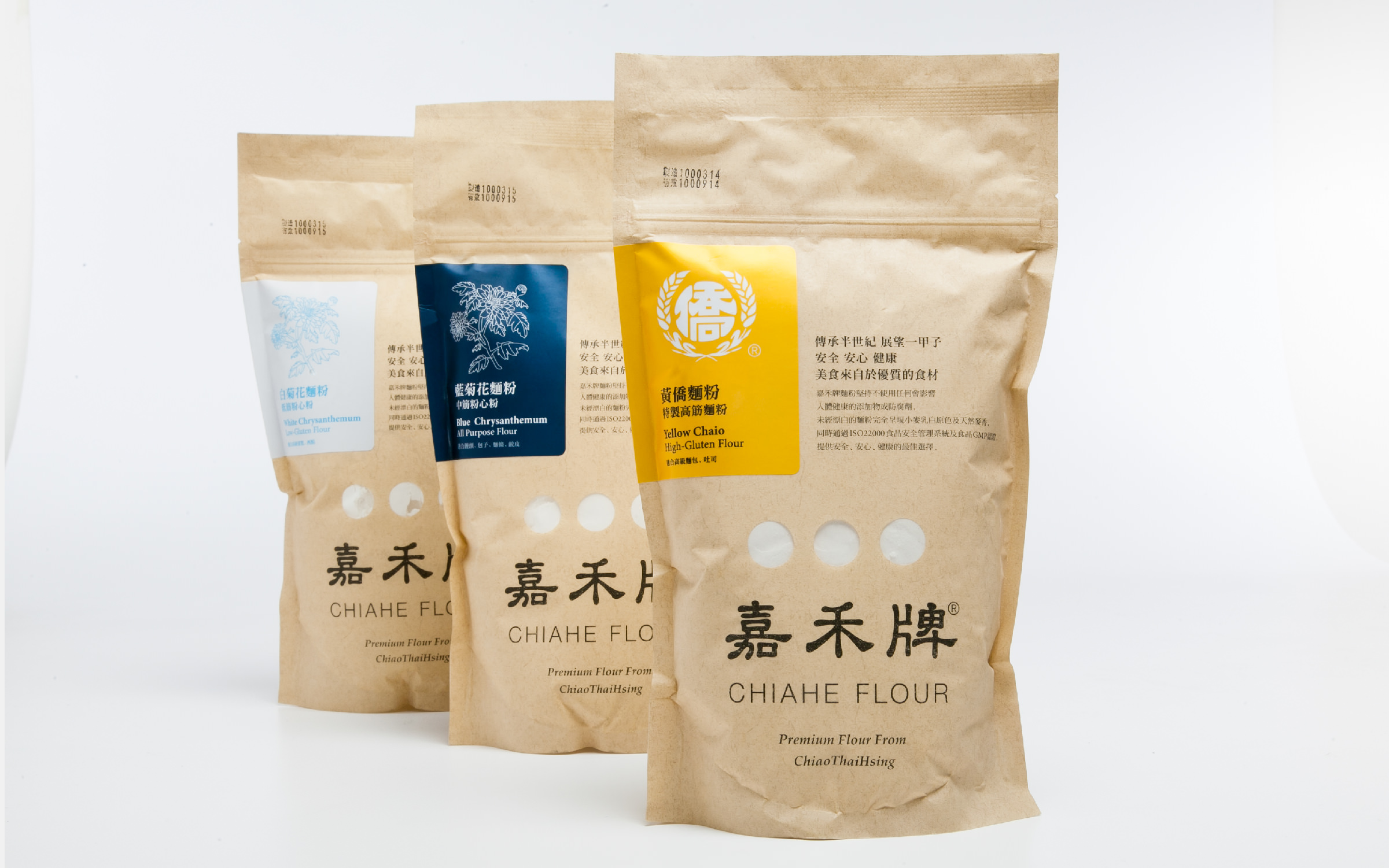
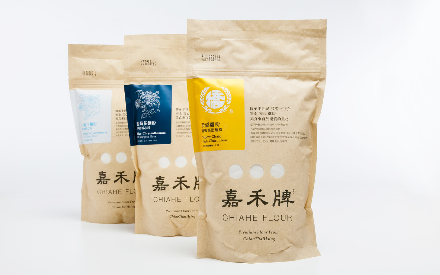
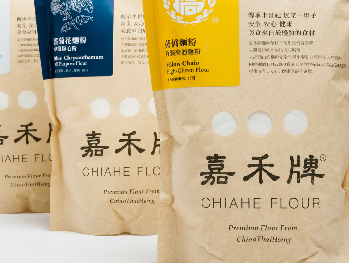
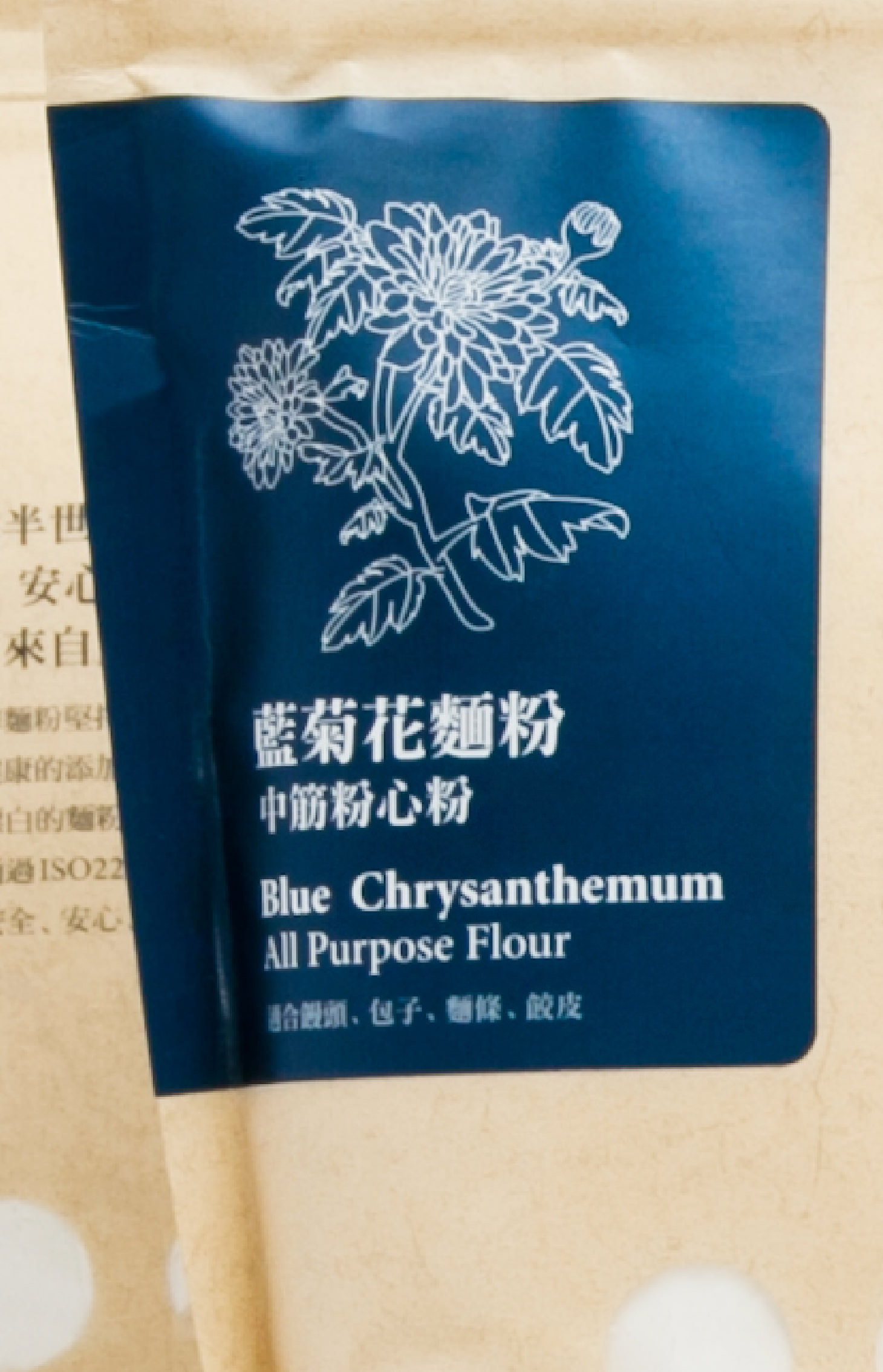
Chiao Thai Hsing’s packaging design derives from its brand identity system. A round typeface and brown paper give a sense of stability. Each flower and color represents a different type of flour: cake, all-purpose and bread.
從品牌識別系統重新規劃延伸至包裝設計,由更加圓融的標準字搭配牛皮紙質包裝, 賦予品牌現代沈穩的形象。並以不同花種圖像與色系,區別中、低、高筋麵粉三種產品。
- Creative Director
- Chia-Hsiao Shih
- Designer
- Yu-Tzu Huang